## Diagram: Comparison of Algorithms
### Overview
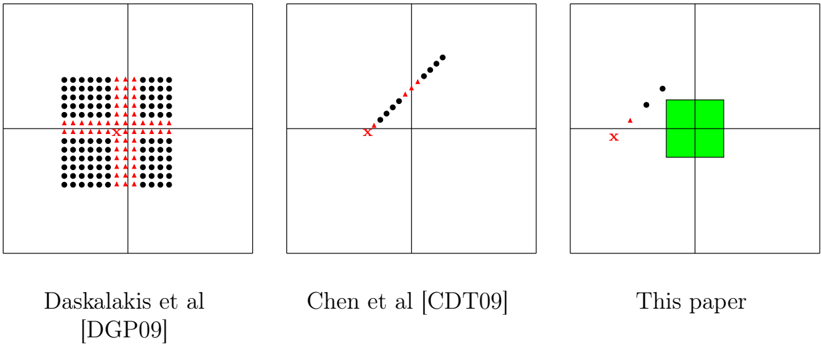
The image presents three diagrams, each representing the performance or behavior of a different algorithm. Each diagram is contained within a square divided into four quadrants. The diagrams use black dots, red triangles, and a red 'X' to represent data points or markers. The third diagram also includes a green square. The diagrams are labeled with the names of the algorithms or their corresponding publications.
### Components/Axes
Each diagram is contained within a square divided into four quadrants by horizontal and vertical lines.
* **Markers:**
* Black dots: Represent data points.
* Red triangles: Represent data points.
* Red 'X': Represents a specific point or origin.
* Green square: Represents an area or region.
* **Labels:**
* Left Diagram: "Daskalakis et al [DGP09]"
* Middle Diagram: "Chen et al [CDT09]"
* Right Diagram: "This paper"
### Detailed Analysis
**Left Diagram: Daskalakis et al [DGP09]**
* A grid of black dots fills the top-left, top-right, bottom-left, and bottom-right quadrants, leaving a vertical space in the center.
* Red triangles are positioned vertically in the center of the square, forming a line.
* A red 'X' is located at the intersection of the horizontal and vertical lines, in the center of the square.
**Middle Diagram: Chen et al [CDT09]**
* Black dots form a line that slopes upwards from the center towards the top-right quadrant.
* Red triangles are positioned along the lower part of the line of black dots, closer to the center.
* A red 'X' is located at the intersection of the horizontal and vertical lines, in the center of the square.
**Right Diagram: This paper**
* A green square is positioned in the center of the square, spanning across all four quadrants.
* Two black dots are located in the top-left quadrant, above the green square.
* One red triangle is located in the bottom-left quadrant, below the black dots.
* A red 'X' is located at the intersection of the horizontal and vertical lines, in the center of the square.
### Key Observations
* The Daskalakis et al diagram shows a clustered distribution of data points with a clear separation in the center.
* The Chen et al diagram shows a linear relationship between data points.
* The "This paper" diagram shows a concentrated area (green square) with a few scattered data points.
### Interpretation
The diagrams likely represent the performance or results of different algorithms in a specific context. The Daskalakis et al algorithm seems to have a clustered behavior, while the Chen et al algorithm shows a linear trend. "This paper" algorithm appears to have a concentrated result, possibly indicating a more focused or localized outcome. The red 'X' likely represents a starting point or a reference point for the algorithms. The red triangles may represent a specific type of data point or a threshold. The green square in the "This paper" diagram could represent a target area or a region of optimal performance.