## Heatmap Grid: Layer Similarity
### Overview
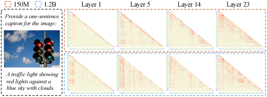
The image presents a grid of heatmaps, arranged in two rows and four columns. The heatmaps visualize the similarity between layers in two different models (150M and 1.2B). Each column represents a specific layer (1, 5, 14, and 23). The heatmaps are triangular, suggesting a comparison of each element with every other element within the layer. The color intensity indicates the degree of similarity, with lighter shades representing lower similarity and darker shades representing higher similarity. To the left of the heatmaps is an image of a traffic light.
### Components/Axes
* **Legend:** Located at the top-left of the image.
* Brown dashed box: 150M model
* Blue dashed box: 1.2B model
* **Columns (Layers):**
* Layer 1
* Layer 5
* Layer 14
* Layer 23
* **Heatmaps:** Triangular matrices representing layer similarity. The color gradient ranges from light yellow to red, indicating increasing similarity.
* **Image:** A photograph of a traffic light showing red lights against a blue sky with clouds.
* **Text:**
* "Provide a one-sentence caption for the image:"
* "A traffic light showing red lights against a blue sky with clouds."
### Detailed Analysis
The heatmaps are arranged as follows:
* **Row 1 (150M Model):**
* **Column 1 (Layer 1):** The heatmap shows a distinct pattern of horizontal lines, indicating similarity between specific elements within the layer.
* **Column 2 (Layer 5):** The heatmap shows a more diffused pattern, with higher similarity concentrated near the top-left corner.
* **Column 3 (Layer 14):** The heatmap shows a pattern similar to Layer 5, but with slightly higher overall similarity.
* **Column 4 (Layer 23):** The heatmap shows the highest overall similarity, with a darker red color across most of the triangle.
* **Row 2 (1.2B Model):**
* **Column 1 (Layer 1):** The heatmap shows a pattern similar to the 150M model, but with less distinct horizontal lines.
* **Column 2 (Layer 5):** The heatmap shows a more diffused pattern, with higher similarity concentrated near the top-left corner.
* **Column 3 (Layer 14):** The heatmap shows a pattern similar to Layer 5, but with slightly higher overall similarity.
* **Column 4 (Layer 23):** The heatmap shows the highest overall similarity, with a darker red color across most of the triangle.
### Key Observations
* The similarity within layers generally increases from Layer 1 to Layer 23 in both models.
* The 1.2B model tends to show slightly higher similarity within layers compared to the 150M model.
* Layer 1 exhibits a distinct pattern of horizontal lines in the 150M model, which is less pronounced in the 1.2B model.
### Interpretation
The heatmaps visualize the internal representations learned by two different sized models (150M and 1.2B) at different layers. The increasing similarity from Layer 1 to Layer 23 suggests that later layers learn more coherent and similar representations. The higher similarity in the 1.2B model may indicate that larger models are better at learning consistent representations. The distinct pattern in Layer 1 of the 150M model could be due to the model's smaller size, leading to more specialized representations in early layers. The image of the traffic light and the associated text are likely used as an example input to the models, but their direct relationship to the heatmaps is not explicitly stated.