## Scatter Plot: Accuracy vs. Time-to-Answer
### Overview
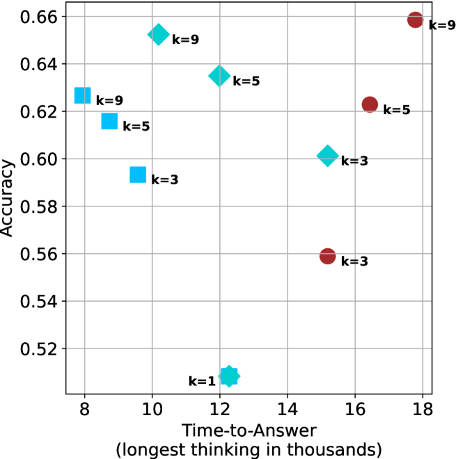
This image is a scatter plot visualizing the relationship between "Time-to-Answer" (x-axis) and "Accuracy" (y-axis). The plot contains ten distinct data points categorized by color (Cyan and Maroon) and shape (Squares, Diamonds, and Circles). Each point is labeled with a "k" value (k=1, k=3, k=5, k=9), likely representing a hyperparameter or model configuration.
### Components/Axes
* **Y-Axis (Vertical):** Labeled "Accuracy". The scale ranges from 0.52 to 0.66, with grid lines at 0.02 intervals.
* **X-Axis (Horizontal):** Labeled "Time-to-Answer (longest thinking in thousands)". The scale ranges from 8 to 18, with grid lines at 2-unit intervals.
* **Data Series:**
* **Cyan Squares:** Three points located in the left-center region.
* **Cyan Diamonds:** Four points located in the center-left to center-right region. One point (k=1) is a distinct star-shaped diamond.
* **Maroon Circles:** Three points located in the right region.
### Detailed Analysis
The data points are distributed across the plot. Below are the approximate coordinates (x, y) for each point:
**Cyan Series (Squares)**
* **k=9:** Located at approximately (8.3, 0.627).
* **k=5:** Located at approximately (8.7, 0.616).
* **k=3:** Located at approximately (9.6, 0.594).
* *Trend:* This series shows a clear **downward trend**; as the time-to-answer increases, the accuracy decreases.
**Cyan Series (Diamonds)**
* **k=9:** Located at approximately (10.3, 0.653).
* **k=5:** Located at approximately (12.0, 0.635).
* **k=1:** Located at approximately (12.3, 0.510). This is a significant outlier, positioned well below the main cluster.
* **k=3:** Located at approximately (15.2, 0.601).
* *Trend:* Excluding the k=1 outlier, this series shows a **downward trend**; accuracy decreases as time-to-answer increases.
**Maroon Series (Circles)**
* **k=3:** Located at approximately (15.2, 0.559).
* **k=5:** Located at approximately (16.5, 0.623).
* **k=9:** Located at approximately (17.8, 0.659).
* *Trend:* This series shows a clear **upward trend**; as the time-to-answer increases, the accuracy increases.
### Key Observations
* **Divergent Behaviors:** The dataset exhibits two distinct behaviors. The Cyan points (Squares and Diamonds) generally show a negative correlation between time and accuracy. Conversely, the Maroon points (Circles) show a positive correlation.
* **Outlier:** The Cyan Diamond (k=1) at (12.3, 0.510) is a significant anomaly, representing the lowest accuracy in the entire dataset despite having a moderate time-to-answer.
* **Clustering:** The Maroon points are clustered on the right side of the chart (higher time-to-answer), while the Cyan points are clustered on the left and center (lower time-to-answer).
### Interpretation
This chart likely compares two different algorithmic approaches or model architectures.
1. **The "Cyan" Approach:** This method appears to be optimized for speed (lower time-to-answer). However, it suffers from a "diminishing returns" or "negative efficiency" problem: as the model is forced to take more time (or as the 'k' parameter changes), the accuracy actually drops. The k=1 configuration is particularly ineffective.
2. **The "Maroon" Approach:** This method appears to be a "slow and steady" approach. It requires significantly more time-to-answer (15k to 18k) compared to the Cyan approach (8k to 15k), but it demonstrates a positive correlation: the more time it is allowed to "think," the more accurate it becomes.
3. **Strategic Trade-off:** The data suggests a fundamental trade-off. If the system requires a fast response, the Cyan approach is necessary, but it has a performance ceiling. If the system requires high accuracy and can tolerate latency, the Maroon approach is superior. The k=9 configuration in the Maroon series achieves the highest accuracy in the plot (~0.66), but at the cost of the highest time-to-answer (~17.8k).