## Chart Type: Pie Chart
### Overview
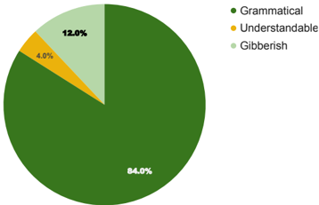
This image is a pie chart that displays the distribution of three categories: Grammatical, Understandable, and Gibberish. The chart visually represents the percentage of each category, with Grammatical dominating the pie.
### Components/Axes
* **Categories:**
* Grammatical (represented by dark green)
* Understandable (represented by yellow)
* Gibberish (represented by light green)
* **Percentages:** The percentages are displayed directly on the pie chart slices.
* **Legend:** Located in the top-right corner, the legend maps the colors to the categories.
### Detailed Analysis
* **Grammatical:** The dark green slice occupies the largest portion of the pie chart, accounting for 84.0%.
* **Understandable:** The yellow slice is the smallest, representing 4.0%.
* **Gibberish:** The light green slice accounts for 12.0%.
### Key Observations
* The vast majority of the data falls into the "Grammatical" category.
* "Understandable" has the smallest representation.
* "Gibberish" makes up a small but noticeable portion.
### Interpretation
The pie chart suggests that the majority of the data being analyzed is grammatically correct. A small fraction is understandable, and a slightly larger fraction is gibberish. This could indicate a high level of accuracy or quality in the data, with only minor issues related to comprehensibility or meaninglessness. The dominance of the "Grammatical" category implies that the data is well-structured from a linguistic perspective.