## Pie Chart: Distribution of Text Categories
### Overview
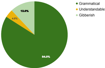
The image displays a pie chart illustrating the distribution of three text categories: Grammatical, Understandable, and Gibberish. The chart uses distinct colors for each category, with percentages labeled directly on the slices. The legend is positioned to the right of the chart for reference.
### Components/Axes
- **Legend**: Located on the right side of the chart, with three entries:
- **Dark Green**: Grammatical (84.0%)
- **Yellow**: Understandable (4.0%)
- **Light Green**: Gibberish (12.0%)
- **Chart Segments**: Three proportional slices representing the categories, with percentages annotated on each slice.
### Detailed Analysis
1. **Grammatical (84.0%)**:
- Color: Dark Green
- Position: Dominates the majority of the pie chart, occupying 84% of the total area.
- Annotation: "84.0%" is clearly marked in white text on the dark green segment.
2. **Understandable (4.0%)**:
- Color: Yellow
- Position: Smallest slice, occupying 4% of the chart.
- Annotation: "4.0%" is marked in white text on the yellow segment.
3. **Gibberish (12.0%)**:
- Color: Light Green
- Position: Second-largest slice, occupying 12% of the chart.
- Annotation: "12.0%" is marked in white text on the light green segment.
### Key Observations
- The **Grammatical** category overwhelmingly dominates the distribution, accounting for 84% of the total.
- The **Understandable** category is the smallest, representing only 4% of the data.
- The **Gibberish** category, while significantly smaller than Grammatical, is 3 times larger than Understandable (12% vs. 4%).
### Interpretation
The data suggests a strong emphasis on **Grammatical** text, which constitutes the vast majority of the analyzed content. The near-absence of **Understandable** text (4%) raises questions about the criteria used to classify text as "understandable" versus "gibberish." The **Gibberish** category (12%) may represent text that is syntactically correct but semantically nonsensical, highlighting a potential gap in the classification system. The stark contrast between Grammatical and Understandable categories could indicate a need for further refinement in text analysis methodologies to better capture nuanced distinctions between meaningful and nonsensical content.