\n
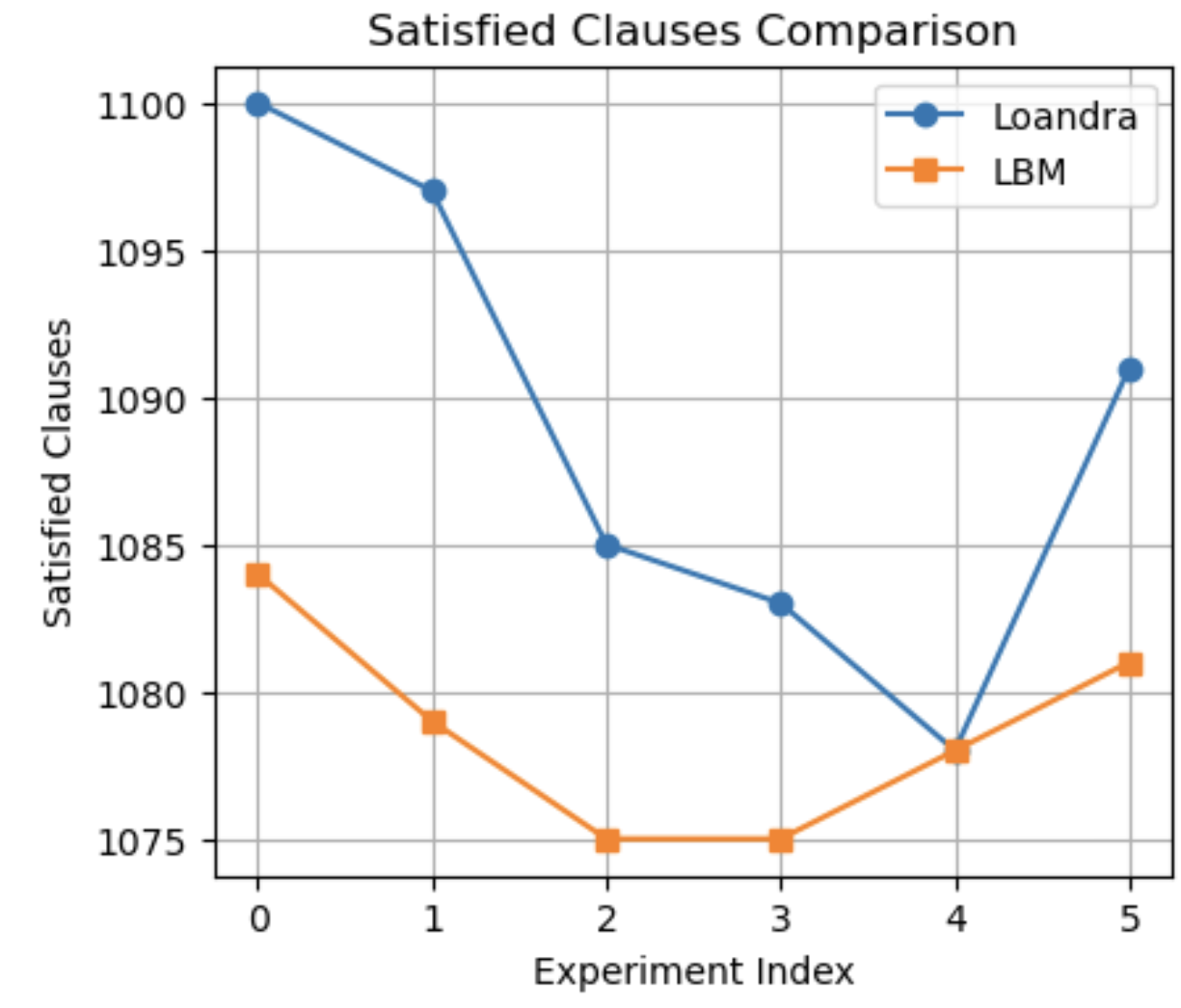
## Line Chart: Satisfied Clauses Comparison
### Overview
The image displays a line chart comparing the performance of two entities, "Loandra" and "LBM," across six discrete experiments. The chart plots the number of "Satisfied Clauses" against an "Experiment Index." The data shows that Loandra consistently achieves a higher number of satisfied clauses than LBM in all experiments except for experiment index 4, where their performance converges.
### Components/Axes
* **Chart Title:** "Satisfied Clauses Comparison" (centered at the top).
* **Y-Axis (Vertical):**
* **Label:** "Satisfied Clauses"
* **Scale:** Linear scale ranging from 1075 to 1100, with major gridlines and labels at intervals of 5 (1075, 1080, 1085, 1090, 1095, 1100).
* **X-Axis (Horizontal):**
* **Label:** "Experiment Index"
* **Scale:** Discrete integer values from 0 to 5, representing six distinct experiments.
* **Legend:** Located in the top-right corner of the plot area.
* **Series 1:** "Loandra" - Represented by a blue line with circular markers.
* **Series 2:** "LBM" - Represented by an orange line with square markers.
* **Grid:** A light gray grid is present for both axes, aiding in value estimation.
### Detailed Analysis
**Data Series: Loandra (Blue Line, Circular Markers)**
* **Trend:** The series shows a general downward trend from experiment 0 to 4, followed by a sharp recovery at experiment 5. It exhibits higher volatility compared to LBM.
* **Data Points (Approximate):**
* Index 0: 1100
* Index 1: ~1097
* Index 2: 1085
* Index 3: ~1083
* Index 4: ~1078
* Index 5: ~1091
**Data Series: LBM (Orange Line, Square Markers)**
* **Trend:** The series shows a steady decline from experiment 0 to 2, plateaus at experiment 3, and then shows a gradual increase through experiments 4 and 5. It is generally more stable and lower in value than Loandra.
* **Data Points (Approximate):**
* Index 0: ~1084
* Index 1: ~1079
* Index 2: 1075
* Index 3: 1075
* Index 4: ~1078
* Index 5: ~1081
### Key Observations
1. **Performance Gap:** Loandra outperforms LBM in 5 out of 6 experiments. The gap is largest at experiment 0 (~16 clauses) and smallest at experiment 4 (convergence at ~1078).
2. **Convergence Point:** At Experiment Index 4, the two lines intersect, indicating identical or nearly identical performance for that specific experiment.
3. **Divergent Recovery:** After the low point at index 4, both series show improvement at index 5, but Loandra's recovery is significantly more pronounced, jumping ~13 clauses compared to LBM's ~3-clause increase.
4. **Minimum Values:** LBM reaches its minimum value (1075) at indices 2 and 3. Loandra's minimum is at index 4 (~1078).
### Interpretation
The chart demonstrates a comparative analysis of two methods or systems (Loandra and LBM) on a metric called "Satisfied Clauses," likely from a computational logic, optimization, or constraint satisfaction problem domain.
* **Relative Effectiveness:** Loandra is generally the more effective method, satisfying more clauses in most test cases. This suggests it may have a superior underlying algorithm or heuristic for the problem class being tested.
* **Stability vs. Peak Performance:** LBM exhibits more stable, predictable performance with less variance between experiments, but at a lower average level. Loandra shows higher volatility, with a significant drop in performance in the middle experiments (2-4) before a strong rebound. This could indicate sensitivity to specific problem instances or parameters that vary across the experiment indices.
* **The Anomaly at Index 4:** The convergence at experiment 4 is a critical data point. It implies that for the specific conditions of that experiment, the inherent advantages of Loandra were nullified, or the problem instance was such that both methods performed equally. Investigating the properties of experiment 4 could reveal important limitations or edge cases for the Loandra method.
* **Experimental Design:** The use of a discrete "Experiment Index" suggests a controlled test suite where each index represents a different problem instance, configuration, or dataset. The chart effectively communicates how the methods' relative performance shifts across these different scenarios.