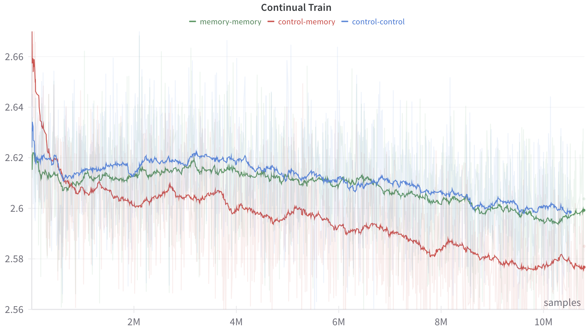
## Line Chart: Continual Train
### Overview
The image displays a line chart titled "Continual Train," plotting a metric (y-axis) against the number of training samples (x-axis). It compares the performance of three distinct experimental conditions or model configurations over the course of a training process. The chart includes smoothed trend lines overlaid on top of noisier, raw data traces (shown as faint, semi-transparent lines in the background).
### Components/Axes
* **Title:** "Continual Train" (top center).
* **Legend:** Positioned at the top center, below the title. It defines three data series:
* `memory-memory` (green line)
* `control-memory` (red line)
* `control-control` (blue line)
* **X-Axis:**
* **Label:** "samples" (bottom right corner).
* **Scale:** Linear scale from 0 to over 10 million (10M) samples.
* **Major Tick Marks:** Labeled at 2M, 4M, 6M, 8M, and 10M.
* **Y-Axis:**
* **Scale:** Linear scale from approximately 2.56 to 2.67.
* **Major Tick Marks:** Labeled at 2.56, 2.58, 2.60, 2.62, 2.64, and 2.66.
* **Interpretation:** The metric is unitless but likely represents a loss function (where lower is better) or a similar performance measure.
### Detailed Analysis
**Trend Verification & Data Points (Approximate):**
1. **`control-memory` (Red Line):**
* **Trend:** Shows a strong, consistent downward slope throughout the training period. It starts as the highest value and ends as the lowest.
* **Key Points:**
* Start (~0 samples): ~2.665
* At 2M samples: ~2.605
* At 4M samples: ~2.595
* At 6M samples: ~2.585
* At 8M samples: ~2.580
* End (~10.5M samples): ~2.575
2. **`memory-memory` (Green Line):**
* **Trend:** Shows a gradual, slight downward trend. It starts in the middle, dips below the blue line around 1M samples, and remains generally between the red and blue lines for the remainder of the chart.
* **Key Points:**
* Start (~0 samples): ~2.620
* At 2M samples: ~2.610
* At 4M samples: ~2.615
* At 6M samples: ~2.610
* At 8M samples: ~2.605
* End (~10.5M samples): ~2.600
3. **`control-control` (Blue Line):**
* **Trend:** Shows a very gradual, slight downward trend, nearly flat for long periods. It starts as the middle value, rises above the green line after ~1M samples, and remains the highest of the three for most of the training after the initial phase.
* **Key Points:**
* Start (~0 samples): ~2.635
* At 2M samples: ~2.615
* At 4M samples: ~2.620
* At 6M samples: ~2.615
* At 8M samples: ~2.605
* End (~10.5M samples): ~2.600
**Spatial Grounding & Component Isolation:**
* **Header Region:** Contains the title and legend. The legend is horizontally aligned, with color-coded dashes preceding each label.
* **Main Chart Region:** Contains the three primary trend lines and their associated shaded variance bands. The faint background lines show high-frequency noise in the raw data.
* **Footer Region:** Contains the x-axis label ("samples") and tick marks.
* **Cross-Reference:** The red line (`control-memory`) is consistently the lowest after the initial ~1M samples. The blue (`control-control`) and green (`memory-memory`) lines converge closely towards the end of the chart, both hovering near 2.600.
### Key Observations
1. **Diverging Performance:** The `control-memory` condition (red) demonstrates significantly better (lower) final performance compared to the other two conditions, with a clear and sustained improvement trajectory.
2. **Initial Volatility:** All three lines show high initial volatility within the first ~500k samples before settling into more stable trends.
3. **Convergence of Baselines:** The `memory-memory` (green) and `control-control` (blue) conditions, while following slightly different paths, end at nearly identical performance levels (~2.600) after 10M+ samples.
4. **Noise Level:** The raw data (faint background lines) exhibits substantial noise across all conditions, but the smoothed trends reveal clear underlying patterns.
### Interpretation
This chart likely visualizes the results of an experiment in machine learning, specifically comparing different strategies for "continual training" or learning over a long sequence of data samples. The y-axis metric is probably a loss value, where a decrease indicates improved model performance.
* **What the data suggests:** The `control-memory` strategy is the most effective for minimizing the loss metric over time. The `control-control` and `memory-memory` strategies are less effective and perform similarly to each other in the long run.
* **Relationship between elements:** The naming convention (`control-memory`, etc.) implies a comparison between models that have access to some form of memory (`memory`) versus those that do not (`control`), and how they are trained (continually on new data vs. a fixed control set). The superior performance of `control-memory` suggests that combining a control mechanism with memory access yields the best continual learning outcome in this setup.
* **Notable Anomalies:** The most striking feature is the consistent and substantial gap between the red line and the other two. This indicates a fundamental difference in the effectiveness of the `control-memory` approach. The near-identical endpoint for the green and blue lines is also notable, suggesting that, despite different intermediate behaviors, the `memory-memory` and `control-control` approaches have equivalent asymptotic performance for this task and metric.