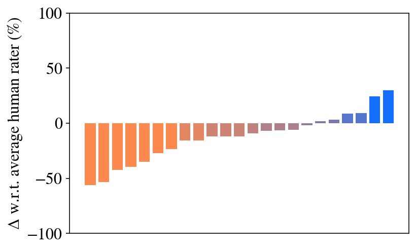
## Bar Chart: Delta w.r.t. average human rater (%)
### Overview
The image is a bar chart displaying the difference (delta) with respect to the average human rater, expressed as a percentage. The bars are arranged along the x-axis, with the y-axis representing the percentage difference. The bars transition in color from orange to blue, indicating a shift from negative to positive differences.
### Components/Axes
* **X-axis:** No explicit labels are provided for the x-axis categories. The bars are arranged sequentially, implying an ordinal or categorical scale.
* **Y-axis:** Labeled as "Δ w.r.t. average human rater (%)". The scale ranges from -100% to 100%, with tick marks at -100, -50, 0, 50, and 100.
* **Bars:** The bars are colored in a gradient from orange to blue. The orange bars represent negative differences (below the average human rater), while the blue bars represent positive differences (above the average human rater).
### Detailed Analysis
The chart shows a series of bars, each representing a different data point. The bars are arranged in ascending order of their values.
* **Orange Bars (Negative Differences):**
* The leftmost orange bar has a value of approximately -58%.
* The orange bars gradually increase in value, with the last orange bar reaching approximately -5%.
* **Gradient Bars (Near Zero Differences):**
* The bars transition from orange to a light purple/gray color, indicating values close to 0%.
* These bars are near the 0% mark on the y-axis.
* **Blue Bars (Positive Differences):**
* The blue bars represent positive differences, indicating values above the average human rater.
* The first blue bar is approximately at 8%.
* The next blue bar is approximately at 22%.
* The last blue bar is approximately at 32%.
### Key Observations
* There is a clear trend from negative to positive differences.
* The majority of the data points show negative differences compared to the average human rater.
* Only a few data points show positive differences.
* The transition from negative to positive differences is gradual.
### Interpretation
The chart suggests that, for most of the data points, the values are lower than the average human rater. The gradual transition from orange to blue indicates a continuous spectrum of differences. The few blue bars suggest that only a small portion of the data points exceed the average human rater's values. The chart could be used to identify areas where the data points significantly deviate from the average human rater, either positively or negatively.