\n
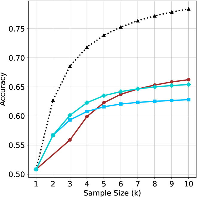
## Line Chart: Accuracy vs. Sample Size
### Overview
This image presents a line chart illustrating the relationship between sample size (in thousands) and accuracy. Four distinct data series are plotted, each represented by a different colored line. The chart appears to demonstrate how accuracy improves with increasing sample size, but at a diminishing rate.
### Components/Axes
* **X-axis:** Labeled "Sample Size (k)", ranging from 1 to 10 (in thousands). The axis is marked with integer values.
* **Y-axis:** Labeled "Accuracy", ranging from 0.50 to 0.76. The axis is marked with values in increments of 0.05.
* **Data Series:** Four lines are present, each representing a different method or condition.
* Black dotted line
* Blue solid line
* Red solid line
* Teal solid line
### Detailed Analysis
Let's analyze each line individually, noting trends and approximate data points.
* **Black Dotted Line:** This line exhibits the steepest upward trend. It starts at approximately (1, 0.52) and rapidly increases to around (2, 0.68), then continues to rise, leveling off towards (10, 0.76).
* **Blue Solid Line:** This line shows a moderate upward trend. It begins at approximately (1, 0.51), rises to around (2, 0.59), and plateaus around (8, 0.63), with a slight increase to (10, 0.63).
* **Red Solid Line:** This line demonstrates a moderate upward trend, but with a slower initial increase than the blue line. It starts at approximately (1, 0.50), rises to around (2, 0.56), and reaches a plateau around (6, 0.65), remaining relatively stable until (10, 0.66).
* **Teal Solid Line:** This line shows a slow upward trend. It begins at approximately (1, 0.51), rises to around (2, 0.58), and reaches a plateau around (4, 0.61), remaining relatively stable until (10, 0.62).
### Key Observations
* The black dotted line consistently outperforms the other three lines across all sample sizes.
* The accuracy improvement diminishes as the sample size increases for all lines. The most significant gains are observed between sample sizes of 1k and 4k.
* The blue, red, and teal lines converge towards the higher sample sizes, indicating similar performance levels.
* All lines start at approximately the same accuracy level (around 0.50-0.52).
### Interpretation
The chart suggests that increasing the sample size generally improves accuracy, but the benefit of larger samples decreases as the sample size grows. The black dotted line likely represents a more effective method or a condition that yields higher accuracy. The convergence of the blue, red, and teal lines at larger sample sizes indicates that these methods or conditions reach a point of diminishing returns.
The data implies that for the methods represented by the blue, red, and teal lines, investing in sample sizes beyond a certain point (around 6k-8k) may not yield significant improvements in accuracy. However, the black dotted line continues to benefit from larger sample sizes, suggesting that it has the potential for further accuracy gains.
This chart could be used to inform decisions about resource allocation for data collection. It highlights the importance of balancing the cost of acquiring larger samples with the potential benefits in terms of improved accuracy. The chart also suggests that exploring the method represented by the black dotted line could be a worthwhile investment.