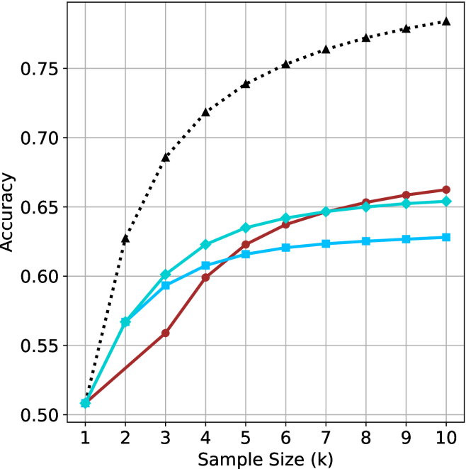
## Line Chart: Accuracy vs. Sample Size
### Overview
The image is a line chart comparing the accuracy of different methods as a function of sample size. The x-axis represents the sample size (k), ranging from 1 to 10. The y-axis represents the accuracy, ranging from 0.50 to 0.75. There are four data series represented by different colored lines with distinct markers.
### Components/Axes
* **X-axis:** Sample Size (k), with values from 1 to 10.
* **Y-axis:** Accuracy, with values from 0.50 to 0.75, incrementing by 0.05.
* **Gridlines:** Present for both x and y axes.
* **Data Series:** Four data series are plotted. The legend is missing, so the exact names of the series are unknown.
### Detailed Analysis
Here's a breakdown of each data series:
1. **Black dotted line with triangle markers:** This line starts at approximately 0.51 at sample size 1 and increases rapidly to approximately 0.68 at sample size 2. It continues to increase, but at a decreasing rate, reaching approximately 0.73 at sample size 4, approximately 0.75 at sample size 6, and approximately 0.77 at sample size 10.
2. **Turquoise line with diamond markers:** This line starts at approximately 0.51 at sample size 1 and increases to approximately 0.57 at sample size 2. It continues to increase, reaching approximately 0.60 at sample size 3, approximately 0.62 at sample size 4, approximately 0.635 at sample size 5, approximately 0.64 at sample size 6, approximately 0.645 at sample size 7, approximately 0.65 at sample size 8, approximately 0.655 at sample size 9, and approximately 0.655 at sample size 10.
3. **Blue line with square markers:** This line starts at approximately 0.51 at sample size 1 and increases to approximately 0.59 at sample size 3. It continues to increase, but at a decreasing rate, reaching approximately 0.61 at sample size 4, approximately 0.62 at sample size 5, approximately 0.625 at sample size 6, approximately 0.625 at sample size 7, approximately 0.628 at sample size 8, approximately 0.628 at sample size 9, and approximately 0.63 at sample size 10.
4. **Brown line with circle markers:** This line starts at approximately 0.51 at sample size 1 and increases to approximately 0.56 at sample size 3. It continues to increase, reaching approximately 0.60 at sample size 4, approximately 0.62 at sample size 5, approximately 0.635 at sample size 6, approximately 0.645 at sample size 7, approximately 0.655 at sample size 8, approximately 0.66 at sample size 9, and approximately 0.665 at sample size 10.
### Key Observations
* The black dotted line (with triangle markers) shows the highest accuracy across all sample sizes and exhibits diminishing returns as the sample size increases.
* The turquoise line (with diamond markers) and the brown line (with circle markers) perform similarly, with the turquoise line consistently slightly higher.
* The blue line (with square markers) shows the lowest accuracy among the three solid lines.
* All lines show an increase in accuracy with increasing sample size, but the rate of increase diminishes as the sample size grows.
### Interpretation
The chart illustrates the relationship between sample size and accuracy for four different methods. The black dotted line represents the most effective method, achieving high accuracy even with smaller sample sizes. The other three methods show lower accuracy and require larger sample sizes to approach the performance of the first method. The diminishing returns observed in all lines suggest that there is a point beyond which increasing the sample size provides only marginal improvements in accuracy. Without a legend, it's impossible to know what each line represents, but the data suggests that the method represented by the black dotted line is superior in terms of accuracy and efficiency.