## Line Chart: Accuracy vs. Sample Size
### Overview
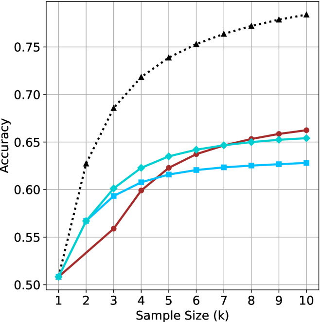
This image is a line chart illustrating the relationship between "Accuracy" (y-axis) and "Sample Size (k)" (x-axis). The chart displays four distinct data series, each represented by a unique color and marker shape.
**Critical Note:** The image does not contain a legend. Therefore, the specific identity of each data series (e.g., model names, algorithm types, or dataset variations) cannot be determined from the visual information provided.
### Components/Axes
* **X-Axis:** Labeled "Sample Size (k)". The scale ranges from 1 to 10, with integer increments.
* **Y-Axis:** Labeled "Accuracy". The scale ranges from 0.50 to 0.75, with grid lines at 0.05 intervals.
* **Grid:** A light gray grid is overlaid on the plot area, intersecting at the major axis ticks.
* **Data Series (Legend Missing):**
* **Series 1 (Black Dotted Line):** Marked with black triangles.
* **Series 2 (Dark Red Solid Line):** Marked with dark red circles.
* **Series 3 (Cyan Solid Line):** Marked with cyan diamonds.
* **Series 4 (Light Blue Solid Line):** Marked with light blue squares.
### Detailed Analysis
All four data series originate from a common starting point at **Sample Size (k) = 1**, with an **Accuracy of approximately 0.51**.
#### Series 1: Black Dotted Line (Triangles)
* **Trend:** This series shows the steepest upward slope and maintains the highest accuracy throughout the entire range. It exhibits a concave-down curve, indicating diminishing returns as the sample size increases.
* **Data Points (Approximate):**
* k=1: 0.51
* k=2: 0.63
* k=3: 0.69
* k=4: 0.72
* k=5: 0.74
* k=6: 0.75
* k=7: 0.76
* k=8: 0.77
* k=9: 0.78
* k=10: 0.785
#### Series 2: Dark Red Solid Line (Circles)
* **Trend:** This series starts with the slowest growth rate among the four. However, it maintains a more consistent upward trajectory compared to the other solid lines. It crosses the Cyan and Light Blue lines between k=4 and k=6, eventually becoming the second-highest performing series.
* **Data Points (Approximate):**
* k=1: 0.51
* k=2: 0.54
* k=3: 0.56
* k=4: 0.60
* k=5: 0.62
* k=6: 0.64
* k=7: 0.65
* k=8: 0.655
* k=9: 0.66
* k=10: 0.665
#### Series 3: Cyan Solid Line (Diamonds)
* **Trend:** This series shows strong initial growth (similar to the Light Blue line) but begins to flatten out significantly after k=4. It is outperformed by the Dark Red line after k=5.
* **Data Points (Approximate):**
* k=1: 0.51
* k=2: 0.57
* k=3: 0.60
* k=4: 0.625
* k=5: 0.635
* k=6: 0.64
* k=7: 0.645
* k=8: 0.65
* k=9: 0.652
* k=10: 0.655
#### Series 4: Light Blue Solid Line (Squares)
* **Trend:** This series follows a trajectory very similar to the Cyan line initially, but it flattens out the earliest and most aggressively. It remains the lowest-performing series from k=3 onwards.
* **Data Points (Approximate):**
* k=1: 0.51
* k=2: 0.57
* k=3: 0.595
* k=4: 0.61
* k=5: 0.615
* k=6: 0.62
* k=7: 0.625
* k=8: 0.627
* k=9: 0.628
* k=10: 0.63
### Key Observations
* **Convergence:** All models perform identically at the smallest sample size (k=1).
* **Performance Gap:** The Black Dotted series is a significant outlier, performing substantially better than the other three series as sample size increases.
* **Scaling Behavior:** The Dark Red series demonstrates better "scaling" properties than the Cyan and Light Blue series; while it starts slower, it continues to improve at a steadier rate, whereas the others plateau quickly.
* **Plateauing:** The Light Blue and Cyan series show signs of saturation (diminishing returns) much earlier than the Black and Red series.
### Interpretation
This chart is characteristic of a machine learning performance evaluation, likely comparing different model architectures or training methods under varying data constraints (few-shot learning).
* **The Black Dotted Model:** This is clearly the superior model. It achieves higher accuracy with less data and continues to improve as more data is added, suggesting it has higher capacity or better generalization capabilities.
* **The "Late Bloomer" (Dark Red):** This model suggests a higher complexity or a different learning dynamic. It performs poorly with very limited data (k=1 to 3) but benefits more from additional data than the other solid-line models.
* **The "Data Saturated" Models (Cyan/Light Blue):** These models appear to be simpler or less capable. They reach a performance ceiling (plateau) very quickly (around k=4 or 5), implying that adding more data beyond this point yields negligible improvements. This is often seen in simpler models that lack the capacity to learn from larger datasets.