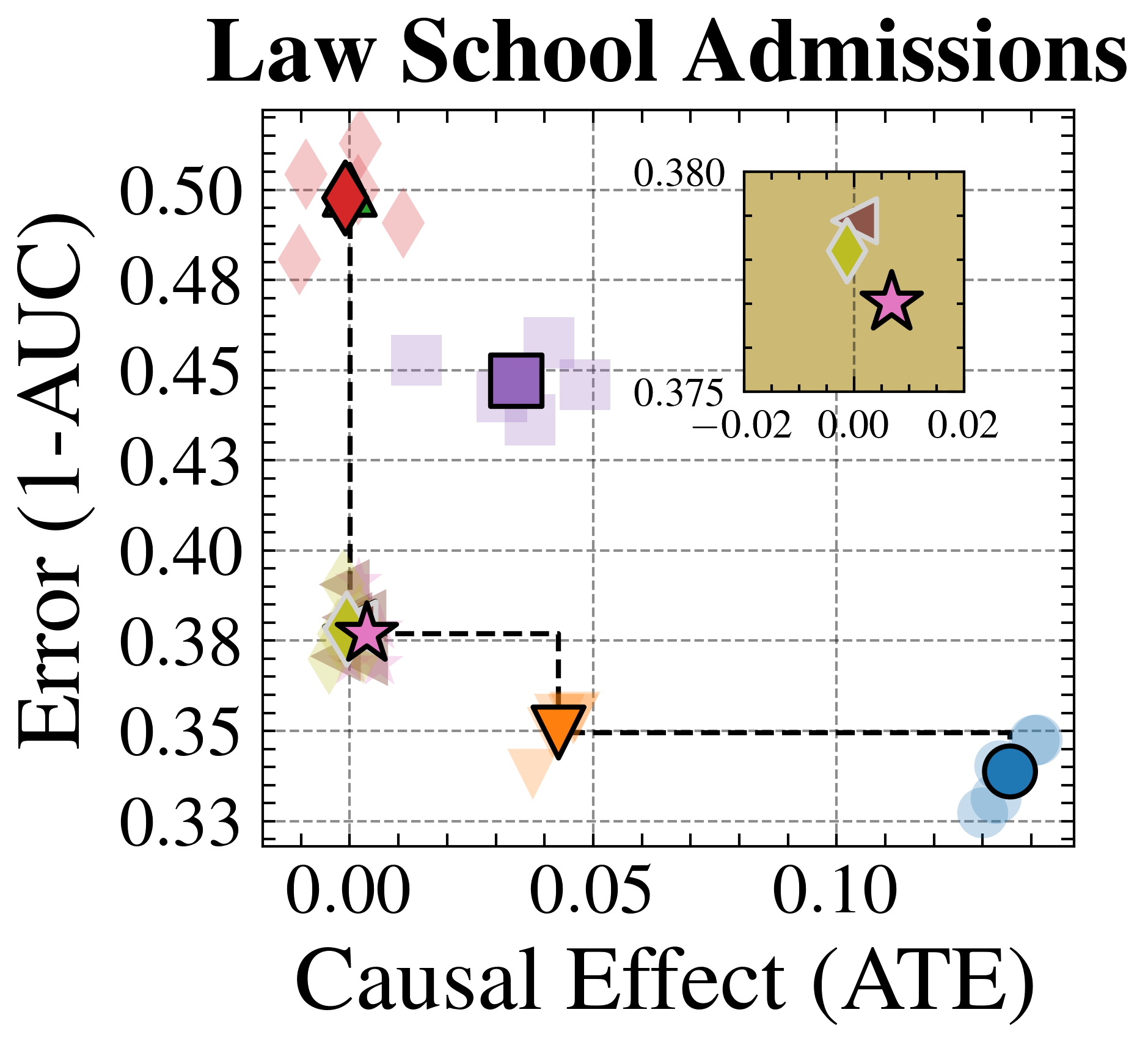
## Scatter Plot: Law School Admissions
### Overview
The image is a scatter plot titled "Law School Admissions". It visualizes the relationship between "Causal Effect (ATE)" on the x-axis and "Error (1-AUC)" on the y-axis. The plot includes several data points represented by different shapes and colors, each potentially corresponding to a different model or condition. A smaller inset plot provides a zoomed-in view of the data points clustered near the origin.
### Components/Axes
* **Title:** Law School Admissions
* **X-axis:** Causal Effect (ATE)
* Scale: 0.00 to 0.10, with tick marks at intervals of 0.025.
* **Y-axis:** Error (1-AUC)
* Scale: 0.33 to 0.50, with tick marks at intervals of 0.025.
* **Data Points:** Represented by different shapes and colors:
* Red Diamond
* Purple Square
* Orange Downward-pointing Triangle
* Blue Circle
* Pink Star
* **Inset Plot:**
* X-axis: -0.02 to 0.02
* Y-axis: 0.375 to 0.380
* Data Points: Yellow Diamond, Brown Diamond, Pink Star
### Detailed Analysis or ### Content Details
**Main Plot Data Points:**
* **Red Diamond:** Located at approximately (0.00, 0.50).
* **Purple Square:** Located at approximately (0.03, 0.45).
* **Orange Downward-pointing Triangle:** Located at approximately (0.05, 0.35).
* **Blue Circle:** Located at approximately (0.12, 0.34).
* **Pink Star:** Located at approximately (0.00, 0.38).
**Inset Plot Data Points:**
* **Yellow Diamond:** Located at approximately (-0.01, 0.379).
* **Brown Diamond:** Located at approximately (0.00, 0.380).
* **Pink Star:** Located at approximately (0.01, 0.377).
**Trend Analysis:**
* The dashed black line connects the Pink Star, Orange Triangle, and Blue Circle, showing a downward trend in Error (1-AUC) as Causal Effect (ATE) increases.
### Key Observations
* The Red Diamond has the highest Error (1-AUC) and the lowest Causal Effect (ATE).
* The Blue Circle has the lowest Error (1-AUC) and the highest Causal Effect (ATE).
* The inset plot provides a closer look at the data points clustered near the origin, revealing slight variations in their positions.
### Interpretation
The scatter plot visualizes the trade-off between causal effect and error in a law school admissions context. The different data points likely represent different models or methods used to predict admissions outcomes. The downward trend suggests that as the causal effect increases, the error decreases, indicating a potential improvement in prediction accuracy. The inset plot highlights the subtle differences between models with very low causal effects. The plot suggests that the blue circle model is the best, as it has the lowest error and highest causal effect.