\n
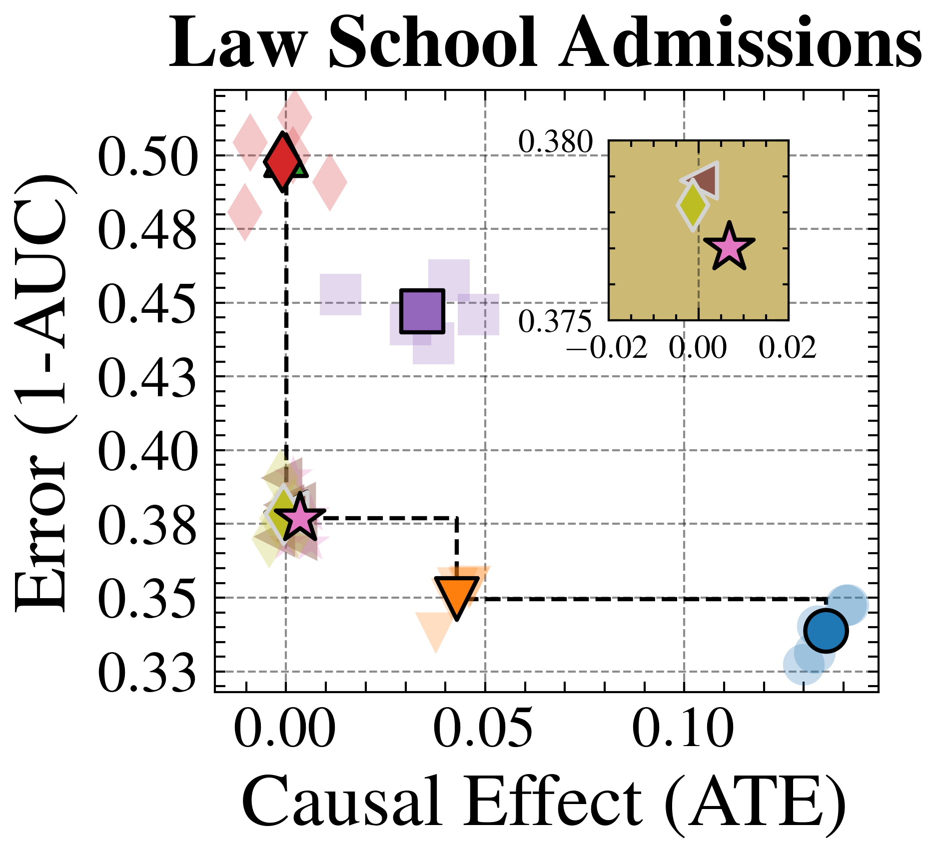
## Scatter Plot: Law School Admissions
### Overview
This image presents a scatter plot visualizing the relationship between "Causal Effect (ATE)" and "Error (1-AUC)" in the context of Law School Admissions. The plot features several data points represented by different geometric shapes and colors. A zoomed-in section highlights a cluster of points near the origin.
### Components/Axes
* **Title:** "Law School Admissions" (Top-center)
* **X-axis:** "Causal Effect (ATE)" - Ranges from approximately -0.02 to 0.12.
* **Y-axis:** "Error (1-AUC)" - Ranges from approximately 0.33 to 0.50.
* **Data Points:** Represented by various shapes (diamond, star, triangle, circle, square) and colors (red, green, orange, blue, purple).
* **Zoomed-in Section:** A rectangular region (approximately from -0.02 to 0.02 on the x-axis and 0.375 to 0.380 on the y-axis) highlights a cluster of data points.
* **Value Label:** "0.380" is displayed within the zoomed-in section.
* **Value Label:** "0.375" is displayed within the zoomed-in section.
### Detailed Analysis
The scatter plot displays the following data points (approximate values, based on visual estimation):
* **Red Diamond:** (Causal Effect: -0.01, Error: 0.49)
* **Light Red Diamond:** (Causal Effect: 0.02, Error: 0.46)
* **Purple Square:** (Causal Effect: 0.04, Error: 0.44)
* **Green Star:** (Causal Effect: -0.01, Error: 0.38)
* **Orange Triangle:** (Causal Effect: 0.06, Error: 0.35)
* **Blue Circle:** (Causal Effect: 0.11, Error: 0.34)
* **Yellow Hexagon:** (Causal Effect: 0.01, Error: 0.378) - Located within the zoomed-in section.
* **Green Star:** (Causal Effect: 0.01, Error: 0.378) - Located within the zoomed-in section.
The overall trend is not strongly linear. There appears to be a general tendency for higher Causal Effect values to correspond with lower Error values, but with significant variation.
### Key Observations
* The data points are scattered, indicating a complex relationship between Causal Effect and Error.
* The zoomed-in section suggests a concentration of data points with low Causal Effect and Error values.
* The red diamond has the highest Error value, while the blue circle has the highest Causal Effect value.
* There is a noticeable spread in Error values for similar Causal Effect values, and vice versa.
### Interpretation
The plot likely represents the performance of different models or methods in estimating the causal effect of some intervention in Law School Admissions, as measured by the Average Treatment Effect (ATE). The Error (1-AUC) represents the model's accuracy.
The data suggests that achieving a higher Causal Effect (more accurately estimating the impact of an intervention) often comes at the cost of increased Error (lower accuracy). The spread of the data points indicates that there is no single "best" method, and the optimal trade-off between Causal Effect and Error depends on the specific application.
The zoomed-in section highlights a region where both Causal Effect and Error are relatively low, suggesting that some methods perform well in this range. The presence of multiple data points in this region indicates that there are several viable options.
The outlier (red diamond) suggests that some methods may have high Error even with a low Causal Effect, potentially due to biases or limitations in the data or model. The blue circle suggests that a high causal effect can be achieved, but at the cost of a higher error.