## Heatmap: Global Wind Anemometer Accuracy (GWA) vs Measured Wind Speeds at 10m Height
### Overview
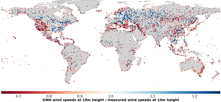
A global map visualizing the ratio of GWA (Global Wind Anemometer) wind speed estimates at 10m height to measured wind speeds at the same height. Data points are color-coded using a gradient from red (low ratio) to blue (high ratio), with a legend indicating values from 0.7 to 1.2. The map highlights regional discrepancies between modeled and observed wind speeds.
### Components/Axes
- **Legend**: Positioned at the bottom center, labeled "GWA wind speeds at 10m height / measured wind speeds at 10m height". Gradient scale ranges from **0.7 (dark red)** to **1.2 (dark blue)**.
- **Map**: World map with country borders in gray. Data points are distributed across continents, with no explicit axis labels (geographic coordinates implied by map projection).
- **Color Coding**:
- **Red (0.7–1.0)**: GWA underestimates measured speeds.
- **Blue (1.1–1.2)**: GWA overestimates measured speeds.
- **Intermediate shades (0.8–1.0)**: Closer agreement between GWA and measurements.
### Detailed Analysis
- **North America**:
- **Eastern US**: Dense blue dots (ratio ~1.1–1.2), suggesting GWA overestimates.
- **Western US**: Mixed red and blue dots (ratio ~0.8–1.0), indicating variable accuracy.
- **Europe**:
- **Western Europe**: Predominantly blue dots (ratio ~1.1–1.2), consistent overestimation.
- **Eastern Europe**: Sparse red dots (ratio ~0.7–0.9), underestimation in some areas.
- **Asia**:
- **East Asia**: Dense red dots (ratio ~0.7–0.9), significant underestimation.
- **South Asia**: Mixed red and blue dots (ratio ~0.8–1.0), variable accuracy.
- **Africa**:
- **Northern Africa**: Sparse red dots (ratio ~0.7–0.9), underestimation.
- **Sub-Saharan Africa**: Limited data points, mostly red (ratio ~0.7–0.9).
- **Oceania**:
- **Australia**: Sparse red dots (ratio ~0.7–0.9), underestimation.
- **Pacific Islands**: Very few data points, mostly red.
- **Oceans**:
- **Atlantic Ocean**: Scattered red and blue dots (ratio ~0.8–1.0), limited data.
- **Pacific Ocean**: Sparse red dots (ratio ~0.7–0.9), underestimation.
- **South America**:
- **Coastal Regions**: Dense red dots (ratio ~0.7–0.9), underestimation.
- **Amazon Basin**: Sparse red dots (ratio ~0.7–0.9).
### Key Observations
1. **Regional Discrepancies**:
- **Overestimation (Blue)**: Dominant in Europe, eastern North America, and parts of Asia.
- **Underestimation (Red)**: Prevalent in South America, Africa, and parts of Asia/Oceania.
2. **Data Sparsity**:
- Oceans and remote regions (e.g., Sahara Desert, Amazon Basin) have fewer data points, likely due to limited measurement infrastructure.
3. **Accuracy Trends**:
- Higher agreement (ratio ~1.0) in mid-latitude regions (e.g., central US, Europe), suggesting better GWA calibration in these areas.
4. **Outliers**:
- **Greenland**: Sparse red dots (ratio ~0.7–0.9), underestimation in polar regions.
- **Southeast Asia**: Mixed red and blue dots, indicating localized variability.
### Interpretation
The data suggests **systematic biases** in GWA wind speed estimates depending on geographic location:
- **Overestimation in Developed Regions**: Europe and eastern North America show consistent overestimation, possibly due to higher-resolution data assimilation in these areas.
- **Underestimation in Developing Regions**: South America, Africa, and parts of Asia exhibit underestimation, potentially linked to sparse ground-truth data or model limitations in complex terrain.
- **Oceanic Gaps**: Limited data in oceans highlights challenges in validating GWA models over open water, where direct measurements are scarce.
- **Model Calibration Needs**: Regions with high agreement (e.g., central US) may serve as benchmarks for improving GWA accuracy in underperforming areas.
The map underscores the importance of **ground-truth validation** for GWA models, particularly in regions with sparse infrastructure. Discrepancies may impact applications like wind energy forecasting, climate modeling, and aviation safety.