## Line Charts: Average maj@K accuracy vs. K
### Overview
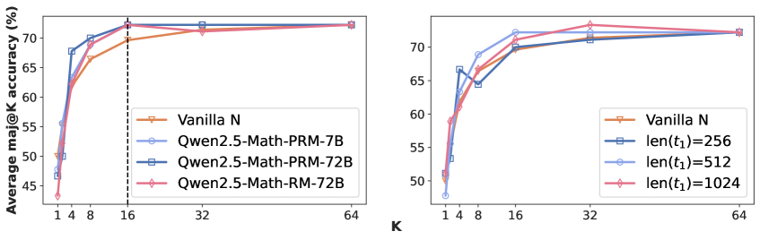
The image contains two line charts comparing the average maj@K accuracy (%) against K. The left chart compares different model architectures (Vanilla N, Qwen2.5-Math-PRM-7B, Qwen2.5-Math-PRM-72B, Qwen2.5-Math-RM-72B). The right chart compares different sequence lengths (len(t1)=256, len(t1)=512, len(t1)=1024) against a baseline (Vanilla N). Both charts share the same x-axis (K) and y-axis (Average maj@K accuracy (%)).
### Components/Axes
**Left Chart:**
* **X-axis:** K, with tick marks at 1, 4, 8, 16, 32, and 64.
* **Y-axis:** Average maj@K accuracy (%), ranging from 45% to 75% with tick marks at 45, 50, 55, 60, 65, and 70.
* **Legend (top-right):**
* Vanilla N (tan line with downward triangle markers)
* Qwen2.5-Math-PRM-7B (light blue line with circle markers)
* Qwen2.5-Math-PRM-72B (dark blue line with square markers)
* Qwen2.5-Math-RM-72B (pink line with diamond markers)
* A vertical dashed line is present at K=16.
**Right Chart:**
* **X-axis:** K, with tick marks at 1, 4, 8, 16, 32, and 64.
* **Y-axis:** Average maj@K accuracy (%), ranging from 45% to 75% with tick marks at 45, 50, 55, 60, 65, and 70.
* **Legend (bottom-right):**
* Vanilla N (tan line with downward triangle markers)
* len(t1)=256 (dark blue line with square markers)
* len(t1)=512 (light blue line with circle markers)
* len(t1)=1024 (pink line with diamond markers)
### Detailed Analysis
**Left Chart:**
* **Vanilla N (tan):** Starts at approximately 48% at K=1, rises to approximately 67% at K=8, and then plateaus around 72% for K=32 and K=64.
* **Qwen2.5-Math-PRM-7B (light blue):** Starts at approximately 48% at K=1, rises to approximately 69% at K=8, and then plateaus around 72% for K=32 and K=64.
* **Qwen2.5-Math-PRM-72B (dark blue):** Starts at approximately 50% at K=1, rises to approximately 70% at K=8, and then plateaus around 71% for K=32 and K=64.
* **Qwen2.5-Math-RM-72B (pink):** Starts at approximately 44% at K=1, rises to approximately 68% at K=8, and then plateaus around 72% for K=32 and K=64.
**Right Chart:**
* **Vanilla N (tan):** Starts at approximately 48% at K=1, rises to approximately 67% at K=8, and then plateaus around 72% for K=32 and K=64.
* **len(t1)=256 (dark blue):** Starts at approximately 52% at K=1, rises to approximately 68% at K=4, and then plateaus around 71% for K=32 and K=64.
* **len(t1)=512 (light blue):** Starts at approximately 48% at K=1, rises to approximately 70% at K=8, and then plateaus around 73% for K=32 and K=64.
* **len(t1)=1024 (pink):** Starts at approximately 51% at K=1, rises to approximately 69% at K=8, and then plateaus around 73% for K=32 and K=64.
### Key Observations
* All models and sequence lengths show a significant increase in average maj@K accuracy as K increases from 1 to 8.
* Beyond K=16, the accuracy plateaus for all models and sequence lengths.
* In the left chart, the Qwen models generally outperform Vanilla N, especially at lower values of K.
* In the right chart, longer sequence lengths (512 and 1024) tend to perform slightly better than the shorter sequence length (256) and Vanilla N.
### Interpretation
The charts suggest that increasing K initially leads to a substantial improvement in the average maj@K accuracy. However, there is a point of diminishing returns, as the accuracy plateaus beyond K=16. The left chart indicates that the Qwen models are more effective than the Vanilla N model, particularly at lower K values. The right chart suggests that longer sequence lengths can lead to slightly better performance compared to shorter sequence lengths and the Vanilla N model. The vertical dashed line at K=16 might indicate a threshold or a point of interest for analysis.