## Line Chart: Accuracy vs. Thinking Compute
### Overview
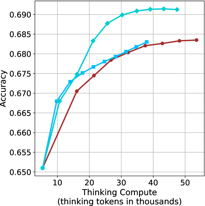
This image is a line chart illustrating the relationship between "Thinking Compute" (measured in thousands of thinking tokens) and model "Accuracy." The chart displays three distinct data series, each represented by a different color and marker shape. All three series originate from a common starting point at low compute and diverge as compute increases, demonstrating diminishing returns in accuracy as more tokens are utilized.
### Components/Axes
* **Y-Axis:** Labeled "Accuracy." The scale ranges from 0.650 to 0.690, with major grid lines at 0.005 intervals.
* **X-Axis:** Labeled "Thinking Compute (thinking tokens in thousands)." The scale ranges from 10 to 50, with major grid lines at 10-unit intervals. The data series begin at approximately 6,000 tokens.
* **Legend:** **Absent.** There is no legend provided in the image to identify what specific models or configurations the three lines represent.
* **Grid:** A light gray grid is overlaid on the plot area to assist in reading values.
### Detailed Analysis
The chart contains three distinct data series. All three series converge at approximately (6, 0.651).
#### Series 1: Cyan Line with Diamond Markers
* **Trend:** This line exhibits the steepest upward slope and reaches the highest accuracy plateau. It shows the most significant gains in accuracy for the least amount of compute.
* **Data Points (Approximate):**
* (6, 0.651)
* (11, 0.668)
* (16, 0.675)
* (21, 0.683)
* (26, 0.688)
* (31, 0.690)
* (36, 0.691)
* (41, 0.6915)
* (48, 0.6915)
#### Series 2: Medium Blue Line with Square Markers
* **Trend:** This line shows a moderate upward slope. It performs better than the Red line but is outperformed by the Cyan line. It terminates at a lower compute value than the other two series.
* **Data Points (Approximate):**
* (6, 0.651)
* (11, 0.668)
* (14, 0.673)
* (17, 0.675)
* (22, 0.677)
* (27, 0.678)
* (30, 0.679)
* (33, 0.681)
* (36, 0.682)
* (38, 0.683)
#### Series 3: Dark Red/Maroon Line with Circle Markers
* **Trend:** This line has the shallowest slope and the lowest accuracy throughout the compute range. It continues to the highest compute value shown on the chart.
* **Data Points (Approximate):**
* (6, 0.651)
* (16, 0.6705)
* (21, 0.6745)
* (26, 0.678)
* (32, 0.680)
* (37, 0.682)
* (43, 0.6825)
* (48, 0.683)
* (54, 0.6835)
### Key Observations
* **Convergence:** All three models start with identical accuracy at the lowest compute level (~6k tokens).
* **Performance Gap:** The performance gap between the Cyan model and the Red model widens significantly as compute increases. At ~35k tokens, the Cyan model is at ~0.691 accuracy, while the Red model is at ~0.681.
* **Diminishing Returns:** All three lines exhibit a concave shape, indicating that as more "thinking tokens" are added, the marginal gain in accuracy decreases. The curves begin to flatten out (plateau) as they approach their respective maximum compute values.
* **Efficiency:** The Cyan model is the most efficient, achieving an accuracy of ~0.683 at roughly 21k tokens, whereas the Red model requires more than double that compute (~48k tokens) to reach the same accuracy level.
### Interpretation
This chart is a classic representation of "inference-time compute scaling." It demonstrates that for the models tested, allowing the model to "think" (generate more tokens) improves accuracy, but this improvement is subject to the law of diminishing returns.
The data suggests that the Cyan model is significantly more capable or better optimized than the Red model, as it achieves higher accuracy with significantly less compute. The absence of a legend prevents identifying the specific models, but the visual evidence strongly implies a comparison between different model architectures, sizes, or training methodologies where one is clearly superior in its ability to utilize thinking compute effectively. The plateauing effect suggests there is a "ceiling" to how much accuracy can be gained simply by increasing thinking time, regardless of the model variant.