## Line Chart: Accuracy vs. Thinking Compute
### Overview
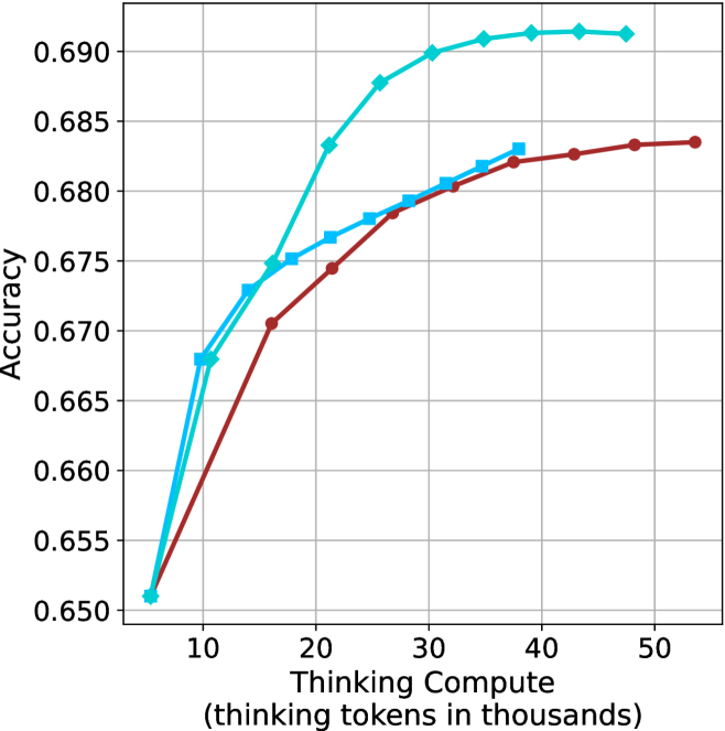
The image is a line chart comparing accuracy against thinking compute (measured in thousands of thinking tokens). There are two data series plotted, represented by a light blue line with diamond markers and a darker red line with circle markers, and a light blue line with square markers. The chart shows how accuracy changes as thinking compute increases.
### Components/Axes
* **Y-axis (Accuracy):** Ranges from 0.650 to 0.690, with increments of 0.005.
* **X-axis (Thinking Compute):** Ranges from 0 to 50 (thousands of thinking tokens), with increments of 10.
* **Data Series 1:** Light blue line with diamond markers.
* **Data Series 2:** Dark red line with circle markers.
* **Data Series 3:** Light blue line with square markers.
* **Gridlines:** Present for both x and y axes.
### Detailed Analysis
* **Light Blue Line with Diamond Markers:**
* Trend: Initially increases rapidly, then plateaus around 0.691.
* Data Points:
* (7, 0.651)
* (15, 0.672)
* (23, 0.688)
* (35, 0.691)
* (45, 0.691)
* **Dark Red Line with Circle Markers:**
* Trend: Increases steadily, then begins to plateau around 0.684.
* Data Points:
* (7, 0.652)
* (18, 0.671)
* (28, 0.679)
* (38, 0.682)
* (52, 0.684)
* **Light Blue Line with Square Markers:**
* Trend: Increases steadily, then begins to plateau around 0.682.
* Data Points:
* (7, 0.652)
* (15, 0.675)
* (23, 0.678)
* (35, 0.682)
### Key Observations
* The light blue line with diamond markers achieves the highest accuracy, plateauing at approximately 0.691.
* The dark red line with circle markers has a slower initial increase in accuracy compared to the light blue line with diamond markers, and plateaus at a lower accuracy of approximately 0.684.
* The light blue line with square markers has a slower initial increase in accuracy compared to the light blue line with diamond markers, and plateaus at a lower accuracy of approximately 0.682.
* All lines show diminishing returns as thinking compute increases beyond 30,000 tokens.
### Interpretation
The chart illustrates the relationship between the amount of "thinking compute" used and the resulting accuracy of a model or system. The light blue line with diamond markers represents a configuration that initially benefits more from increased compute, achieving higher accuracy faster, but eventually plateaus. The dark red line with circle markers represents a configuration that benefits less initially, but still reaches a reasonable accuracy. The light blue line with square markers represents a configuration that benefits less initially, and reaches a lower accuracy. The diminishing returns observed suggest that there is a point beyond which increasing compute provides minimal improvement in accuracy, indicating a need for optimization or alternative strategies.