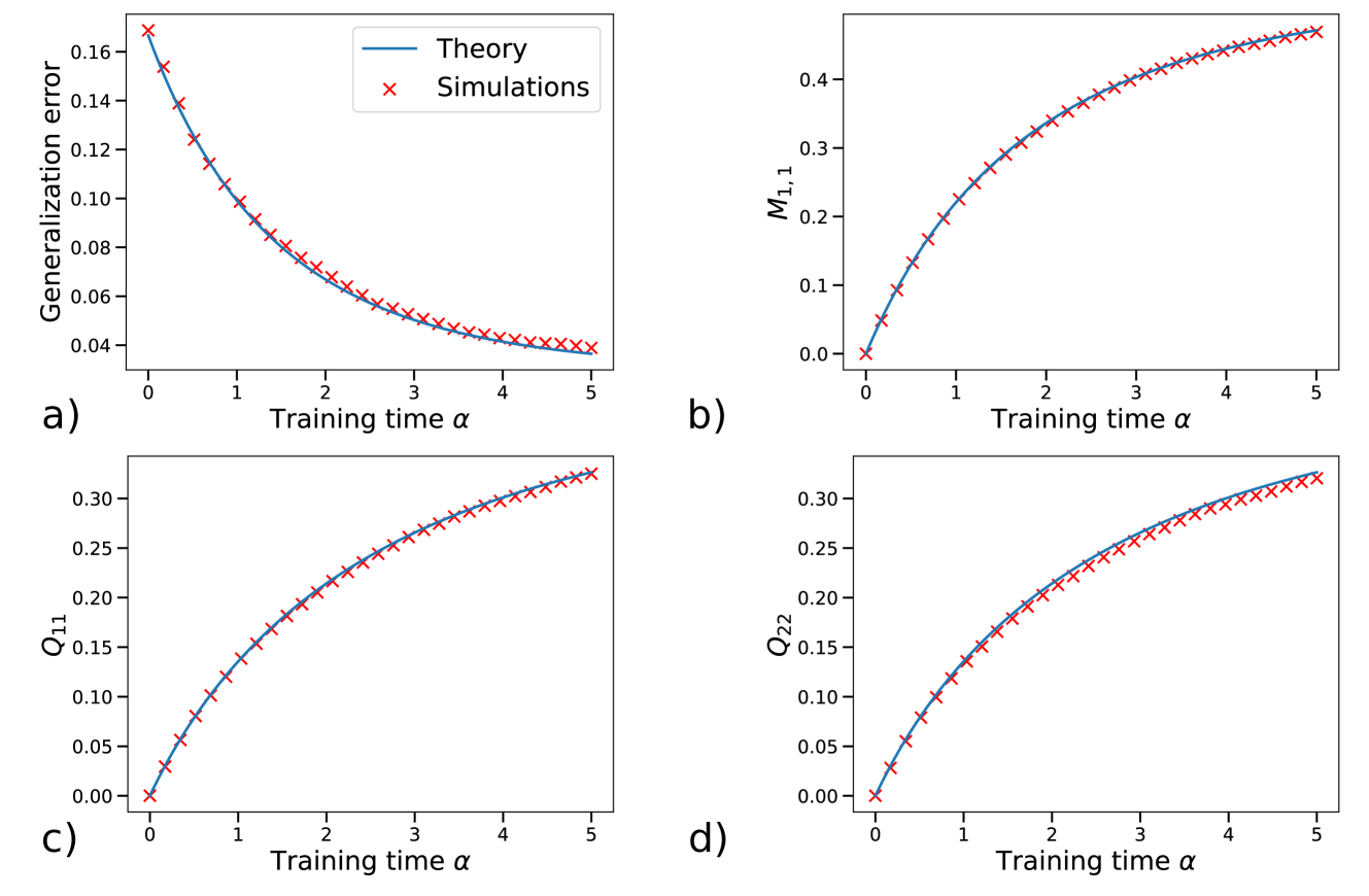
## Chart: Comparison of Theory and Simulations Across Different Metrics
### Overview
The image presents four separate plots (a, b, c, d) comparing theoretical predictions (blue lines) with simulation results (red 'x' markers). Each plot displays a different metric as a function of training time (α). The metrics are: Generalization error, M1,1, Q11, and Q22. The plots show how well the simulations align with the theoretical models for each metric as training time increases.
### Components/Axes
* **Plot a)**
* Y-axis: Generalization error (range: 0.04 to 0.16)
* X-axis: Training time α (range: 0 to 5)
* Legend:
* Blue line: Theory
* Red 'x' markers: Simulations
* **Plot b)**
* Y-axis: M1,1 (range: 0 to 0.4)
* X-axis: Training time α (range: 0 to 5)
* Legend: (Same as plot a)
* Blue line: Theory
* Red 'x' markers: Simulations
* **Plot c)**
* Y-axis: Q11 (range: 0 to 0.3)
* X-axis: Training time α (range: 0 to 5)
* Legend: (Same as plot a)
* Blue line: Theory
* Red 'x' markers: Simulations
* **Plot d)**
* Y-axis: Q22 (range: 0 to 0.3)
* X-axis: Training time α (range: 0 to 5)
* Legend: (Same as plot a)
* Blue line: Theory
* Red 'x' markers: Simulations
### Detailed Analysis
* **Plot a) Generalization Error:**
* Trend: The blue 'Theory' line shows a decreasing trend.
* Trend: The red 'Simulations' markers also show a decreasing trend, closely following the 'Theory' line.
* Data Points:
* At α = 0, Generalization error (Theory) ≈ 0.16
* At α = 0, Generalization error (Simulations) ≈ 0.16
* At α = 5, Generalization error (Theory) ≈ 0.04
* At α = 5, Generalization error (Simulations) ≈ 0.04
* **Plot b) M1,1:**
* Trend: The blue 'Theory' line shows an increasing trend.
* Trend: The red 'Simulations' markers also show an increasing trend, closely following the 'Theory' line.
* Data Points:
* At α = 0, M1,1 (Theory) ≈ 0.0
* At α = 0, M1,1 (Simulations) ≈ 0.0
* At α = 5, M1,1 (Theory) ≈ 0.45
* At α = 5, M1,1 (Simulations) ≈ 0.45
* **Plot c) Q11:**
* Trend: The blue 'Theory' line shows an increasing trend.
* Trend: The red 'Simulations' markers also show an increasing trend, closely following the 'Theory' line.
* Data Points:
* At α = 0, Q11 (Theory) ≈ 0.0
* At α = 0, Q11 (Simulations) ≈ 0.0
* At α = 5, Q11 (Theory) ≈ 0.32
* At α = 5, Q11 (Simulations) ≈ 0.32
* **Plot d) Q22:**
* Trend: The blue 'Theory' line shows an increasing trend.
* Trend: The red 'Simulations' markers also show an increasing trend, closely following the 'Theory' line.
* Data Points:
* At α = 0, Q22 (Theory) ≈ 0.0
* At α = 0, Q22 (Simulations) ≈ 0.0
* At α = 5, Q22 (Theory) ≈ 0.32
* At α = 5, Q22 (Simulations) ≈ 0.32
### Key Observations
* The 'Theory' lines and 'Simulations' markers are very close in all four plots, indicating a strong agreement between the theoretical model and the simulation results.
* The Generalization error decreases with increasing training time, while M1,1, Q11, and Q22 increase with increasing training time.
* The x-axis (Training time α) is consistent across all four plots, allowing for direct comparison of the metrics.
### Interpretation
The data suggests that the theoretical model accurately predicts the behavior of the system as captured by the simulations. The decreasing generalization error with increasing training time indicates that the model is learning and improving its ability to generalize to new data. The increasing values of M1,1, Q11, and Q22 with increasing training time likely reflect the model's adaptation to the training data. The close alignment between theory and simulations across all four metrics strengthens the validity and reliability of the theoretical model. There are no obvious outliers or anomalies.