## Line Chart: Accuracy vs. Ratio for Different Sampling Methods
### Overview
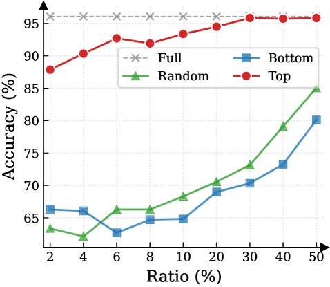
The image is a line chart comparing the performance (Accuracy %) of four different methods or data sampling strategies across a range of ratios (Ratio %). The chart demonstrates how accuracy changes as the ratio increases for each method.
### Components/Axes
* **Chart Type:** Multi-line chart with markers.
* **X-Axis:**
* **Label:** `Ratio (%)`
* **Scale:** Logarithmic or non-linear scale. The marked values are: 2, 4, 6, 8, 10, 20, 30, 40, 50.
* **Y-Axis:**
* **Label:** `Accuracy (%)`
* **Scale:** Linear scale from 65 to 95, with major gridlines at intervals of 5%.
* **Legend:** Located in the top-right quadrant of the chart area. It contains four entries:
1. `Full` - Gray dashed line with 'x' markers.
2. `Random` - Green solid line with upward-pointing triangle markers.
3. `Bottom` - Blue solid line with square markers.
4. `Top` - Red solid line with circle markers.
### Detailed Analysis
**Data Series and Trends:**
1. **Full (Gray, dashed line, 'x' markers):**
* **Trend:** Perfectly horizontal, constant line.
* **Data Points:** Maintains an accuracy of approximately **95%** across all ratio values from 2% to 50%. This appears to be the baseline or upper-bound performance.
2. **Top (Red, solid line, circle markers):**
* **Trend:** Consistently upward-sloping, showing the highest performance among the non-full methods.
* **Data Points (Approximate):**
* Ratio 2%: ~88%
* Ratio 4%: ~90%
* Ratio 6%: ~92.5%
* Ratio 8%: ~92%
* Ratio 10%: ~93%
* Ratio 20%: ~94%
* Ratio 30%: ~95% (converges with the 'Full' line)
* Ratio 40%: ~95%
* Ratio 50%: ~95%
3. **Random (Green, solid line, triangle markers):**
* **Trend:** Initial slight dip, followed by a steady, strong upward slope.
* **Data Points (Approximate):**
* Ratio 2%: ~63%
* Ratio 4%: ~62% (lowest point)
* Ratio 6%: ~66%
* Ratio 8%: ~66%
* Ratio 10%: ~68%
* Ratio 20%: ~70%
* Ratio 30%: ~73%
* Ratio 40%: ~79%
* Ratio 50%: ~85%
4. **Bottom (Blue, solid line, square markers):**
* **Trend:** Initial decline, a period of stagnation, then a steady upward slope.
* **Data Points (Approximate):**
* Ratio 2%: ~66%
* Ratio 4%: ~66%
* Ratio 6%: ~63% (lowest point)
* Ratio 8%: ~65%
* Ratio 10%: ~65%
* Ratio 20%: ~69%
* Ratio 30%: ~70%
* Ratio 40%: ~73%
* Ratio 50%: ~80%
### Key Observations
1. **Performance Hierarchy:** There is a clear and consistent performance order: `Full` > `Top` > `Random` > `Bottom` for almost all ratio values. The `Top` method significantly outperforms `Random` and `Bottom`.
2. **Convergence:** The `Top` method's accuracy converges with the `Full` baseline at a ratio of approximately **30%** and remains equal thereafter.
3. **Low-Ratio Instability:** Both the `Random` and `Bottom` methods show a performance dip or stagnation at very low ratios (between 2% and 10%) before beginning a consistent climb.
4. **Growth Rate:** The `Random` method shows the steepest rate of improvement (slope) from ratio 10% onward, closing some of the gap with the `Top` method at higher ratios. The `Bottom` method improves at a slower, steadier rate.
5. **Legend Placement:** The legend is positioned in the upper right, overlapping slightly with the `Full` and `Top` data lines but not obscuring critical data points.
### Interpretation
This chart likely illustrates the effectiveness of different data selection or sampling strategies for a machine learning or statistical model, where "Ratio (%)" represents the percentage of data used (e.g., for training, fine-tuning, or as a subset for evaluation).
* **`Full`** represents the model's performance using the complete dataset, serving as the gold standard.
* **`Top`** likely refers to selecting data points based on a high-confidence or high-relevance score. Its rapid ascent to match `Full` performance suggests that a small subset (30%) of the most "important" data can be as effective as the entire dataset for this task.
* **`Random`** represents a naive random sampling baseline. Its lower performance indicates that data quality/importance matters more than sheer volume. Its strong improvement with more data shows that random sampling eventually becomes effective, but requires a much larger ratio.
* **`Bottom`** likely refers to selecting the lowest-confidence or least-relevant data points. Its poor performance, especially at low ratios, confirms that low-quality data is detrimental. Its eventual rise suggests that even low-quality data provides some signal when enough of it is used.
**The core insight** is that intelligent data selection (`Top`) is highly efficient, achieving maximum performance with a fraction of the data. This has significant implications for reducing computational costs, training time, and data storage requirements without sacrificing model accuracy. The dip in `Random` and `Bottom` at low ratios may indicate a critical threshold of data needed to overcome noise or establish a reliable pattern.