## Performance Comparison Line Chart: Benchmark Cc vs. Task Difficulty
### Overview
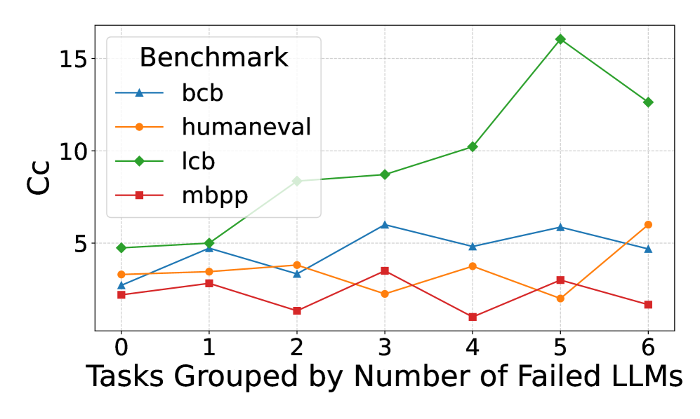
The image is a line chart comparing the performance (measured in "Cc") of four different benchmarks across tasks grouped by the number of Large Language Models (LLMs) that failed them. The chart illustrates how the performance metric varies as task difficulty (in terms of LLM failures) increases.
### Components/Axes
* **Chart Type:** Multi-line chart with markers.
* **X-Axis:** Labeled "Tasks Grouped by Number of Failed LLMs". It has discrete integer markers from 0 to 6.
* **Y-Axis:** Labeled "Cc". It has numerical markers at 0, 5, 10, and 15.
* **Legend:** Located in the top-left corner of the plot area, titled "Benchmark". It contains four entries:
* `bcb`: Blue line with upward-pointing triangle markers.
* `humaneval`: Orange line with circle markers.
* `lcb`: Green line with diamond markers.
* `mbpp`: Red line with square markers.
* **Grid:** A light gray grid is present in the background.
### Detailed Analysis
**1. `bcb` (Blue line, triangle markers):**
* **Trend:** Fluctuates without a strong overall upward or downward trend. It shows a general pattern of rising and falling between adjacent points.
* **Data Points (Approximate):**
* x=0: Cc ≈ 2.5
* x=1: Cc ≈ 4.8
* x=2: Cc ≈ 3.2
* x=3: Cc ≈ 5.9
* x=4: Cc ≈ 4.8
* x=5: Cc ≈ 5.7
* x=6: Cc ≈ 4.7
**2. `humaneval` (Orange line, circle markers):**
* **Trend:** Relatively flat with minor fluctuations for x=0 to x=4, followed by a noticeable dip at x=5 and a sharp increase at x=6.
* **Data Points (Approximate):**
* x=0: Cc ≈ 3.3
* x=1: Cc ≈ 3.4
* x=2: Cc ≈ 3.9
* x=3: Cc ≈ 2.3
* x=4: Cc ≈ 3.8
* x=5: Cc ≈ 1.9
* x=6: Cc ≈ 6.0
**3. `lcb` (Green line, diamond markers):**
* **Trend:** Shows a clear and strong upward trend, especially from x=2 onwards. It peaks at x=5 before declining at x=6. This is the highest-performing series for most of the chart.
* **Data Points (Approximate):**
* x=0: Cc ≈ 4.8
* x=1: Cc ≈ 5.0
* x=2: Cc ≈ 8.3
* x=3: Cc ≈ 8.7
* x=4: Cc ≈ 10.2
* x=5: Cc ≈ 16.0 (Peak)
* x=6: Cc ≈ 12.6
**4. `mbpp` (Red line, square markers):**
* **Trend:** Generally the lowest-performing series. It fluctuates at a low level, with a notable dip at x=4.
* **Data Points (Approximate):**
* x=0: Cc ≈ 2.0
* x=1: Cc ≈ 2.7
* x=2: Cc ≈ 1.0
* x=3: Cc ≈ 3.5
* x=4: Cc ≈ 0.5 (Lowest point on the entire chart)
* x=5: Cc ≈ 2.9
* x=6: Cc ≈ 1.3
### Key Observations
1. **Dominant Series:** The `lcb` benchmark (green) demonstrates significantly higher Cc values than the others, particularly for tasks where 2 or more LLMs failed (x ≥ 2). Its peak at x=5 (Cc ≈ 16) is the highest value recorded.
2. **Lowest Series:** The `mbpp` benchmark (red) consistently shows the lowest Cc values, with its lowest point occurring at x=4.
3. **Divergence at High Difficulty:** At the highest task difficulty shown (x=6), the performance of the benchmarks diverges sharply: `lcb` remains high, `humaneval` spikes upward, while `bcb` and `mbpp` are low.
4. **Anomaly:** The `humaneval` series shows an unexpected sharp increase at x=6 after a dip at x=5, breaking its previously stable trend.
5. **Crossing Points:** The `bcb` and `humaneval` lines cross multiple times (e.g., near x=1, x=3, x=6), indicating similar but alternating performance levels.
### Interpretation
The chart suggests that the "Cc" metric behaves very differently across these four benchmarks as a function of task difficulty (measured by LLM failures).
* **Benchmark Difficulty:** The `lcb` benchmark appears to be the most "sensitive" or responsive to task difficulty in a positive way, as its Cc metric increases substantially with more LLM failures. This could imply that `lcb` is designed to measure a capability that becomes more pronounced or measurable on harder tasks. Conversely, `mbpp` shows consistently low Cc, suggesting it may measure a different, more stable capability or that its tasks are uniformly easier for the models being evaluated.
* **Task Grouping Insight:** The x-axis groups tasks by how many LLMs failed them. The general upward trend for `lcb` and the spike for `humaneval` at x=6 indicate that for the very hardest tasks (those failed by 6 LLMs), certain benchmarks can yield higher Cc scores. This might reflect that these benchmarks are better at differentiating model performance on extremely challenging problems.
* **Relationship Between Benchmarks:** The fluctuating and crossing lines of `bcb` and `humaneval` suggest their performance metrics are less predictable relative to each other and to task difficulty. They may be measuring overlapping but distinct aspects of model performance.
* **Overall Implication:** The choice of benchmark dramatically affects the reported performance metric (Cc) and its relationship to task difficulty. A model's performance profile would look completely different depending on whether it is evaluated on `lcb` versus `mbpp`. This highlights the importance of using multiple, diverse benchmarks for comprehensive evaluation.