## Heatmaps and Process Flow Diagrams: Shallow vs. Deep Layer Analysis
### Overview
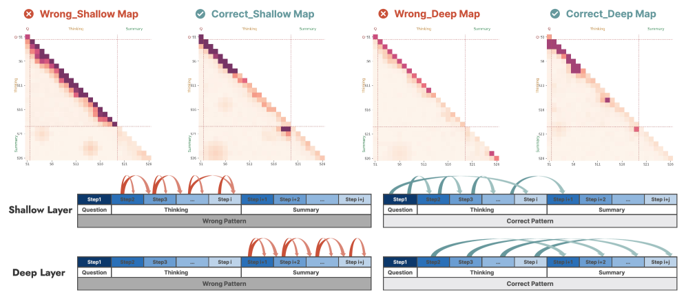
The image presents four heatmaps and two process flow diagrams comparing "Shallow Layer" and "Deep Layer" patterns. The heatmaps visualize data distributions across "Thinking" and "Summary" axes, while the diagrams illustrate step-by-step workflows with directional arrows. Key distinctions are marked with ✅ (Correct) and ❌ (Wrong) labels.
---
### Components/Axes
#### Heatmaps
- **Axes**:
- **X-axis (Thinking)**: Labeled with values `S1` to `S24` (e.g., `S1`, `S6`, `S11`, `S16`, `S21`, `S24`).
- **Y-axis (Summary)**: Labeled with values `Q` to `S26` (e.g., `Q`, `S1`, `S11`, `S16`, `S21`, `S26`).
- **Legend**:
- **Red**: High-intensity data points (dark red to light red gradient).
- **Green**: Checkmark (✅) for Correct patterns; ❌ for Wrong patterns.
- **Placement**:
- Heatmaps occupy the top half of the image, arranged left-to-right: `Wrong_Shallow`, `Correct_Shallow`, `Wrong_Deep`, `Correct_Deep`.
#### Process Flow Diagrams
- **Components**:
- **Steps**: Labeled `Step1` to `Step i+j` (e.g., `Step1`, `Step2`, `Step3`, `...`, `Step i`, `Step i+1`, `Step i+2`).
- **Sections**:
- **Thinking**: Gray background with steps in blue.
- **Summary**: Gray background with steps in darker blue.
- **Arrows**:
- **Red**: Indicate cyclic/incorrect patterns (Wrong).
- **Green**: Indicate linear/correct patterns (Correct).
- **Placement**:
- Diagrams are positioned below the heatmaps, split into "Shallow Layer" (left) and "Deep Layer" (right).
---
### Detailed Analysis
#### Heatmaps
1. **Wrong_Shallow**:
- Dense red shading in the top-left quadrant (high "Thinking," low "Summary").
- Gradual fading toward the bottom-right (lower "Thinking," higher "Summary").
2. **Correct_Shallow**:
- Concentrated red shading in the mid-range of both axes (balanced "Thinking" and "Summary").
- A distinct cluster near `S11` (X-axis) and `S16` (Y-axis).
3. **Wrong_Deep**:
- Similar to Wrong_Shallow but with a broader spread across the top-right quadrant.
4. **Correct_Deep**:
- High-intensity red shading in the bottom-right quadrant (low "Thinking," high "Summary").
- A single prominent data point near `S24` (X-axis) and `S26` (Y-axis).
#### Process Flow Diagrams
1. **Shallow Layer**:
- **Wrong Pattern**: Red arrows loop between `Step1` and `Step i+1`, creating a cyclical flow.
- **Correct Pattern**: Green arrows progress linearly from `Step1` to `Step i+j` without loops.
2. **Deep Layer**:
- **Wrong Pattern**: Red arrows form a tighter loop between `Step1` and `Step i+2`.
- **Correct Pattern**: Green arrows follow a linear path from `Step1` to `Step i+j`, with broader spacing between steps.
---
### Key Observations
1. **Heatmap Trends**:
- Correct patterns (Shallow/Deep) show more focused data distributions compared to Wrong patterns.
- Correct_Deep exhibits the most extreme divergence, with data concentrated in the lowest "Thinking" and highest "Summary" range.
2. **Diagram Flow**:
- Correct patterns (green arrows) emphasize linear progression, while Wrong patterns (red arrows) highlight inefficiency through cyclical loops.
- Deep Layer diagrams show more complex step interactions than Shallow Layer.
---
### Interpretation
1. **Data Implications**:
- The heatmaps suggest that Correct patterns optimize resource allocation:
- **Correct_Shallow** balances "Thinking" and "Summary" efforts.
- **Correct_Deep** minimizes "Thinking" while maximizing "Summary" efficiency.
- Wrong patterns indicate wasted effort, with data spread across less productive ranges.
2. **Process Flow Insights**:
- The diagrams reinforce the heatmap findings: linear workflows (Correct) avoid redundant steps, while cyclical loops (Wrong) suggest inefficiency.
- The Deep Layer’s tighter loops in Wrong patterns may reflect overcomplication, whereas Correct patterns prioritize streamlined execution.
3. **Anomalies**:
- The single data point in Correct_Deep’s bottom-right quadrant (near `S24`/`S26`) could represent an outlier or a critical high-efficiency case.
- The absence of data in the top-right quadrant of Correct_Shallow may indicate a design constraint or intentional focus on mid-range values.
---
### Conclusion
The image demonstrates that Correct patterns—both Shallow and Deep—achieve better performance by concentrating efforts in optimal ranges ("Thinking" vs. "Summary"). The process flow diagrams visually validate this, showing linear progression as a hallmark of efficiency. The use of color (red for errors, green for correctness) and spatial arrangement (heatmaps above diagrams) creates a cohesive narrative linking data distribution to workflow design.