## 3D Bar Chart: Distribution of Absolute Values Across Channels and Tokens
### Overview
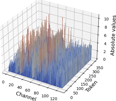
The image depicts a 3D bar chart visualizing the distribution of "Absolute values" across two dimensions: "Channel" (x-axis) and "Token" (y-axis). The z-axis represents the magnitude of absolute values, ranging from 0 to 10. The chart uses two colors (red and blue) to differentiate data series, with a legend in the top-right corner. Bars are clustered densely in the middle ranges of both axes, with red bars generally taller than blue ones.
### Components/Axes
- **X-axis (Channel)**: Labeled "Channel," with values from 0 to 120.
- **Y-axis (Token)**: Labeled "Token," with values from 0 to 350.
- **Z-axis (Absolute values)**: Labeled "Absolute values," with values from 0 to 10.
- **Legend**: Located in the top-right corner, showing two colors:
- **Red**: Unlabeled (likely represents a specific data series).
- **Blue**: Unlabeled (likely represents another data series).
- **Grid**: A 3D grid structure divides the space into cubic cells.
### Detailed Analysis
- **Bar Distribution**:
- Bars are concentrated in the central region of the chart (Channel: ~40–80, Token: ~150–250).
- Red bars dominate in height, with some exceeding 8 on the z-axis. Blue bars are shorter, typically below 6.
- The density of bars decreases toward the edges of the Channel and Token ranges.
- **Color Coding**:
- Red bars are consistently taller than blue bars across all regions.
- No explicit labels for the legend colors are visible in the image.
### Key Observations
1. **Dominance of Red Bars**: Red bars consistently show higher absolute values, suggesting a stronger or more frequent occurrence in the measured metric.
2. **Clustering in Middle Ranges**: The highest concentration of bars occurs in the mid-range of both Channel and Token values, indicating a potential pattern or focal point in the data.
3. **Uneven Distribution**: Some channels (e.g., ~60–80) have significantly more bars than others, while others (e.g., ~0–20, ~100–120) have sparse or no bars.
### Interpretation
The chart likely represents a comparative analysis of two data series (red and blue) across channels and tokens. The red series dominates in magnitude, possibly indicating a primary or more significant dataset. The clustering in the middle ranges suggests that certain channels and tokens are more active or relevant in the context of the measured absolute values. The absence of explicit legend labels limits the ability to definitively interpret the meaning of red and blue, but the visual disparity in bar heights strongly implies a hierarchical relationship between the two series.
**Note**: The image does not provide explicit textual labels for the legend colors, so their exact meaning remains ambiguous. The analysis is based on visual trends and spatial distribution.