## Line Charts: NMSE vs. Frequency (Two Plots)
### Overview
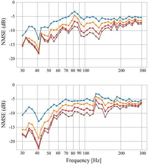
The image contains two line charts, one above the other, both plotting NMSE (Normalized Mean Squared Error) in dB against Frequency in Hz. Each chart displays four data series, represented by different colored lines: blue, orange, red, and brown. The charts appear to show the performance of different systems or configurations across a range of frequencies. The top and bottom charts appear to show similar trends, but may represent different experimental conditions or datasets.
### Components/Axes
* **Y-axis (NMSE (dB))**: Both charts have the same y-axis, labeled "NMSE (dB)". The scale ranges from -20 dB to 0 dB, with gridlines at -15 dB, -10 dB, and -5 dB.
* **X-axis (Frequency [Hz])**: Both charts have the same x-axis, labeled "Frequency [Hz]". The scale ranges from approximately 30 Hz to 300 Hz. Major tick marks are present at 30, 40, 50, 60, 70, 80, 90, 100, 200, and 300 Hz.
* **Data Series**: Four data series are plotted on each chart, distinguished by color:
* Blue
* Orange
* Red
* Brown
* **Legend**: There is no explicit legend in the image. The data series are identified by color only.
### Detailed Analysis
**Top Chart:**
* **Blue Line**: The blue line starts at approximately -12 dB at 30 Hz, decreases to approximately -13 dB at 40 Hz, then increases sharply to a peak of approximately -2 dB around 80 Hz. After the peak, it gradually decreases to approximately -6 dB at 300 Hz.
* 30 Hz: -12 dB
* 40 Hz: -13 dB
* 80 Hz: -2 dB
* 300 Hz: -6 dB
* **Orange Line**: The orange line starts at approximately -14 dB at 30 Hz, decreases to approximately -15 dB at 40 Hz, then increases sharply to a peak of approximately -5 dB around 80 Hz. After the peak, it gradually decreases to approximately -7 dB at 300 Hz.
* 30 Hz: -14 dB
* 40 Hz: -15 dB
* 80 Hz: -5 dB
* 300 Hz: -7 dB
* **Red Line**: The red line starts at approximately -15 dB at 30 Hz, decreases to approximately -17 dB at 40 Hz, then increases sharply to a peak of approximately -8 dB around 80 Hz. After the peak, it gradually decreases to approximately -8 dB at 300 Hz.
* 30 Hz: -15 dB
* 40 Hz: -17 dB
* 80 Hz: -8 dB
* 300 Hz: -8 dB
* **Brown Line**: The brown line starts at approximately -16 dB at 30 Hz, decreases to approximately -18 dB at 40 Hz, then increases sharply to a peak of approximately -10 dB around 80 Hz. After the peak, it gradually decreases to approximately -9 dB at 300 Hz.
* 30 Hz: -16 dB
* 40 Hz: -18 dB
* 80 Hz: -10 dB
* 300 Hz: -9 dB
**Bottom Chart:**
* **Blue Line**: The blue line starts at approximately -11 dB at 30 Hz, decreases to approximately -12 dB at 40 Hz, then increases sharply to a peak of approximately -4 dB around 80 Hz. After the peak, it gradually decreases to approximately -6 dB at 300 Hz.
* 30 Hz: -11 dB
* 40 Hz: -12 dB
* 80 Hz: -4 dB
* 300 Hz: -6 dB
* **Orange Line**: The orange line starts at approximately -16 dB at 30 Hz, decreases to approximately -17 dB at 40 Hz, then increases sharply to a peak of approximately -6 dB around 80 Hz. After the peak, it gradually decreases to approximately -7 dB at 300 Hz.
* 30 Hz: -16 dB
* 40 Hz: -17 dB
* 80 Hz: -6 dB
* 300 Hz: -7 dB
* **Red Line**: The red line starts at approximately -17 dB at 30 Hz, decreases to approximately -21 dB at 40 Hz, then increases sharply to a peak of approximately -8 dB around 80 Hz. After the peak, it gradually decreases to approximately -8 dB at 300 Hz.
* 30 Hz: -17 dB
* 40 Hz: -21 dB
* 80 Hz: -8 dB
* 300 Hz: -8 dB
* **Brown Line**: The brown line starts at approximately -18 dB at 30 Hz, decreases to approximately -22 dB at 40 Hz, then increases sharply to a peak of approximately -11 dB around 80 Hz. After the peak, it gradually decreases to approximately -9 dB at 300 Hz.
* 30 Hz: -18 dB
* 40 Hz: -22 dB
* 80 Hz: -11 dB
* 300 Hz: -9 dB
### Key Observations
* All lines in both charts show a similar trend: a decrease in NMSE from 30 Hz to 80 Hz, followed by a gradual decrease from 80 Hz to 300 Hz.
* The blue line consistently exhibits the highest NMSE values across the frequency range in both charts.
* The brown line consistently exhibits the lowest NMSE values across the frequency range in both charts.
* The NMSE values are generally lower (better) at higher frequencies (200-300 Hz) compared to lower frequencies (30-40 Hz).
* There is a significant dip in NMSE around 40 Hz for all lines in both charts.
* The bottom chart has lower NMSE values at 40 Hz compared to the top chart.
### Interpretation
The charts likely represent the performance of different signal processing or communication systems across a range of frequencies. The NMSE metric indicates the level of distortion or error in the signal. Lower NMSE values indicate better performance.
The consistent trend across all data series suggests that there is a common characteristic in the systems' behavior with respect to frequency. The peak in NMSE around 80 Hz could indicate a resonance or a frequency-dependent limitation in the systems. The lower NMSE at higher frequencies suggests that the systems perform better at those frequencies.
The differences between the data series (blue, orange, red, brown) likely represent different configurations, parameters, or algorithms used in the systems. The blue line consistently showing the highest NMSE suggests that the corresponding configuration is the least effective. Conversely, the brown line suggests the most effective configuration.
The two charts may represent different experimental conditions or datasets. The bottom chart showing lower NMSE values at 40 Hz suggests that the conditions in the bottom chart are more favorable for performance at that frequency.