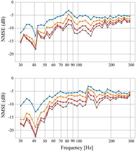
## Chart: NMSE vs. Frequency
### Overview
The image presents two identical line charts displaying Normalized Mean Squared Error (NMSE) in decibels (dB) as a function of Frequency in Hertz (Hz). Both charts show multiple lines representing different conditions or algorithms, with the NMSE generally decreasing with increasing frequency up to a certain point, then stabilizing or slightly increasing. The charts are stacked vertically, with the second chart directly below the first.
### Components/Axes
* **X-axis:** Frequency [Hz], ranging from approximately 30 Hz to 300 Hz. The axis is marked with tick labels at 30, 40, 50, 60, 70, 80, 90, 100, 200, and 300 Hz.
* **Y-axis:** NMSE [dB], ranging from approximately -20 dB to 0 dB. The axis is marked with tick labels at -20, -15, -10, -5, and 0 dB.
* **Lines:** Four distinct lines are present in each chart, each with a different color. There is no explicit legend, but the colors appear consistent between the two charts.
* Blue Line
* Orange Line
* Red Line
* Dark Red/Brown Line
### Detailed Analysis or Content Details
**Chart 1 (Top)**
* **Blue Line:** Starts at approximately -13 dB at 30 Hz, decreases to a minimum of approximately -18 dB around 45 Hz, then increases to approximately -3 dB at 300 Hz. There is a noticeable peak around 70-80 Hz, reaching approximately -1 dB.
* **Orange Line:** Starts at approximately -10 dB at 30 Hz, decreases to a minimum of approximately -16 dB around 45 Hz, then increases to approximately -5 dB at 300 Hz. It exhibits a peak around 70-80 Hz, reaching approximately -2 dB.
* **Red Line:** Starts at approximately -15 dB at 30 Hz, decreases to a minimum of approximately -20 dB around 45 Hz, then increases to approximately -8 dB at 300 Hz. It has a peak around 70-80 Hz, reaching approximately -4 dB.
* **Dark Red/Brown Line:** Starts at approximately -12 dB at 30 Hz, decreases to a minimum of approximately -17 dB around 45 Hz, then increases to approximately -7 dB at 300 Hz. It shows a peak around 70-80 Hz, reaching approximately -3 dB.
**Chart 2 (Bottom)**
The lines in the second chart follow the same trends as the first chart, with very similar values.
* **Blue Line:** Starts at approximately -13 dB at 30 Hz, decreases to a minimum of approximately -18 dB around 45 Hz, then increases to approximately -3 dB at 300 Hz. There is a noticeable peak around 70-80 Hz, reaching approximately -1 dB.
* **Orange Line:** Starts at approximately -10 dB at 30 Hz, decreases to a minimum of approximately -16 dB around 45 Hz, then increases to approximately -5 dB at 300 Hz. It exhibits a peak around 70-80 Hz, reaching approximately -2 dB.
* **Red Line:** Starts at approximately -15 dB at 30 Hz, decreases to a minimum of approximately -20 dB around 45 Hz, then increases to approximately -8 dB at 300 Hz. It has a peak around 70-80 Hz, reaching approximately -4 dB.
* **Dark Red/Brown Line:** Starts at approximately -12 dB at 30 Hz, decreases to a minimum of approximately -17 dB around 45 Hz, then increases to approximately -7 dB at 300 Hz. It shows a peak around 70-80 Hz, reaching approximately -3 dB.
### Key Observations
* All four lines exhibit a similar U-shaped curve, indicating a common behavior across the different conditions.
* The minimum NMSE values are achieved around 45 Hz for all lines.
* The lines generally converge at higher frequencies (around 200-300 Hz).
* The orange and blue lines consistently have lower NMSE values (better performance) than the red and dark red/brown lines across most of the frequency range.
* The two charts are nearly identical, suggesting the results are consistent.
### Interpretation
The charts likely represent the performance of different signal processing algorithms or noise reduction techniques at varying frequencies. The NMSE metric quantifies the difference between the original signal and the processed signal, with lower values indicating better performance.
The U-shaped curve suggests that the algorithms perform best at lower frequencies (around 45 Hz) and their performance degrades at very low and very high frequencies. The peak around 70-80 Hz could indicate a resonance or a frequency range where the algorithms struggle to accurately process the signal.
The consistent difference between the orange/blue lines and the red/dark red lines suggests that the algorithms represented by those lines are inherently more effective than the others. The fact that the two charts are nearly identical suggests that the results are robust and not sensitive to minor variations in the experimental setup.
The data suggests that the choice of algorithm should be tailored to the frequency content of the signal being processed. For signals dominated by low frequencies, the orange or blue algorithms would be preferred. For signals with a broader frequency spectrum, the performance differences may be less significant.