## Line Chart: Probability Distribution Comparison
### Overview
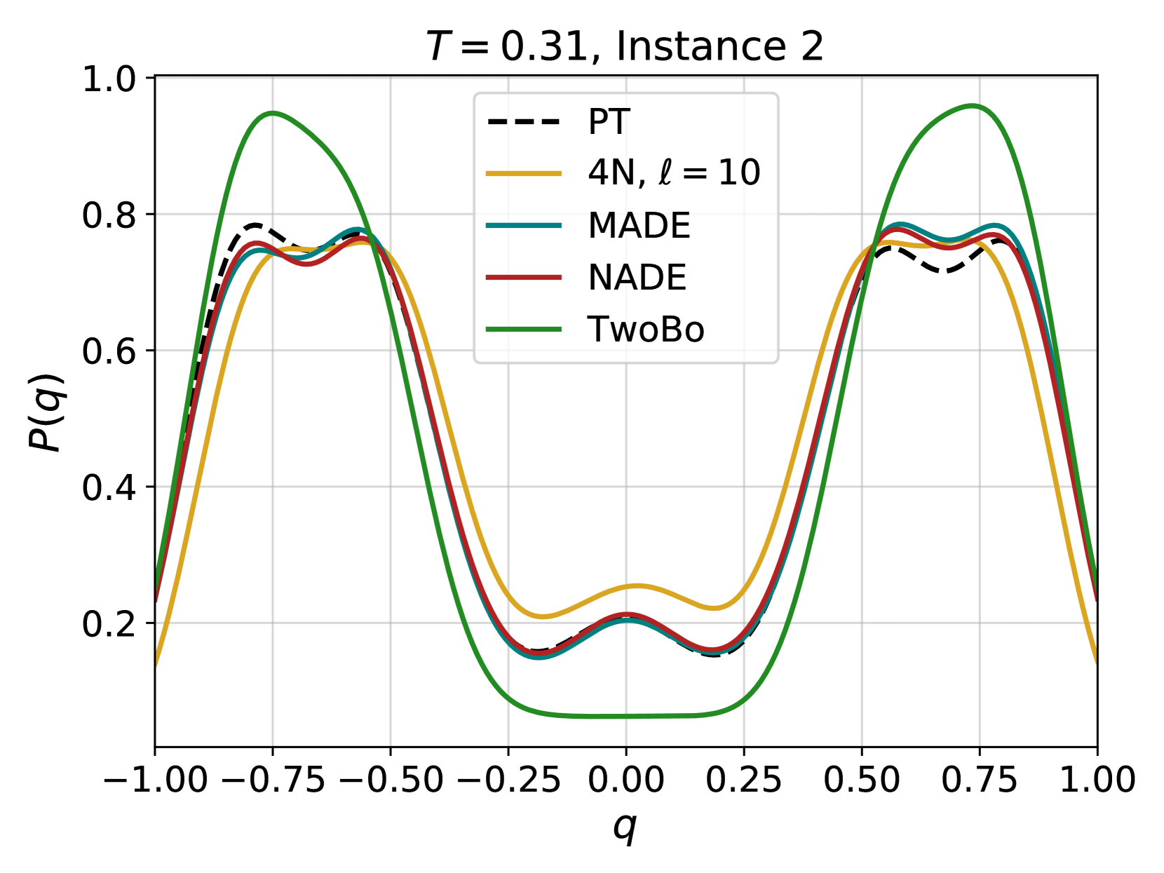
The image presents a line chart comparing the probability distributions of several models (PT, 4N, MADE, NADE, and TwoBo) for a given set of parameters (T = 0.31, Instance 2). The x-axis represents the variable 'q', ranging from -1.00 to 1.00, and the y-axis represents the probability P(q), ranging from 0.0 to 1.0. The chart displays the shape of each distribution and allows for a visual comparison of their similarities and differences.
### Components/Axes
* **Title:** "T = 0.31, Instance 2" - positioned at the top-center of the chart.
* **X-axis Label:** "q" - positioned at the bottom-center of the chart.
* **Y-axis Label:** "P(q)" - positioned at the center-left of the chart.
* **Legend:** Located at the top-right of the chart, listing the models and their corresponding line styles/colors:
* PT (black dashed line)
* 4N, ℓ = 10 (yellow solid line)
* MADE (light blue solid line)
* NADE (maroon solid line)
* TwoBo (green solid line)
* **Gridlines:** A light gray grid is present, aiding in the reading of values.
* **X-axis Markers:** -1.00, -0.75, -0.50, -0.25, 0.00, 0.25, 0.50, 0.75, 1.00
* **Y-axis Markers:** 0.0, 0.2, 0.4, 0.6, 0.8, 1.0
### Detailed Analysis
The chart shows five distinct lines, each representing a different model's probability distribution.
* **PT (Black Dashed Line):** This line exhibits a generally decreasing trend from q = -1.00 to approximately q = 0.00, then increases to q = 1.00. It has two local maxima around q = -0.50 and q = 0.75, with values approximately 0.82 and 0.78 respectively. It has a local minima around q = 0.00 with a value of approximately 0.22.
* **4N, ℓ = 10 (Yellow Solid Line):** This line shows a similar pattern to PT, with two peaks and a valley. The peaks are located around q = -0.50 and q = 0.75, with values approximately 0.85 and 0.80 respectively. The valley is around q = 0.00 with a value of approximately 0.25.
* **MADE (Light Blue Solid Line):** This line closely follows the PT and 4N lines, with peaks around q = -0.50 and q = 0.75, reaching values of approximately 0.84 and 0.79 respectively. The valley is around q = 0.00 with a value of approximately 0.23.
* **NADE (Maroon Solid Line):** This line also mirrors the shape of the other lines, with peaks around q = -0.50 and q = 0.75, reaching values of approximately 0.83 and 0.78 respectively. The valley is around q = 0.00 with a value of approximately 0.24.
* **TwoBo (Green Solid Line):** This line deviates significantly from the others. It has a peak around q = -0.50 with a value of approximately 0.75, but then drops sharply to a minimum around q = 0.00 with a value of approximately 0.18. It then rises again, but not as high as the other lines, reaching a value of approximately 0.50 at q = 1.00.
### Key Observations
* The PT, 4N, MADE, and NADE models exhibit very similar probability distributions, with slight variations in peak heights and valley depths.
* The TwoBo model has a distinctly different distribution, with a much lower probability around q = 0.00.
* All models show a roughly symmetrical distribution around q = 0.00.
* The peaks of the distributions are consistently located around q = -0.50 and q = 0.75.
### Interpretation
The chart demonstrates a comparison of different probabilistic models' ability to represent the distribution of the variable 'q' under the specified conditions (T = 0.31, Instance 2). The close similarity between the PT, 4N, MADE, and NADE models suggests that they capture the underlying distribution of 'q' in a comparable manner. The significant difference in the TwoBo model's distribution indicates that it may not be as well-suited for representing this particular data or may be using a different underlying assumption. The symmetrical nature of the distributions suggests that the variable 'q' is centered around zero. The peaks and valleys likely represent regions of higher and lower probability, respectively, indicating the most and least likely values of 'q' given the model and parameters. The differences in peak heights and valley depths could be attributed to the models' varying levels of complexity or their ability to capture subtle nuances in the data.