## Line Chart: Probability Distribution P(q) for Different Models at T=0.31, Instance 2
### Overview
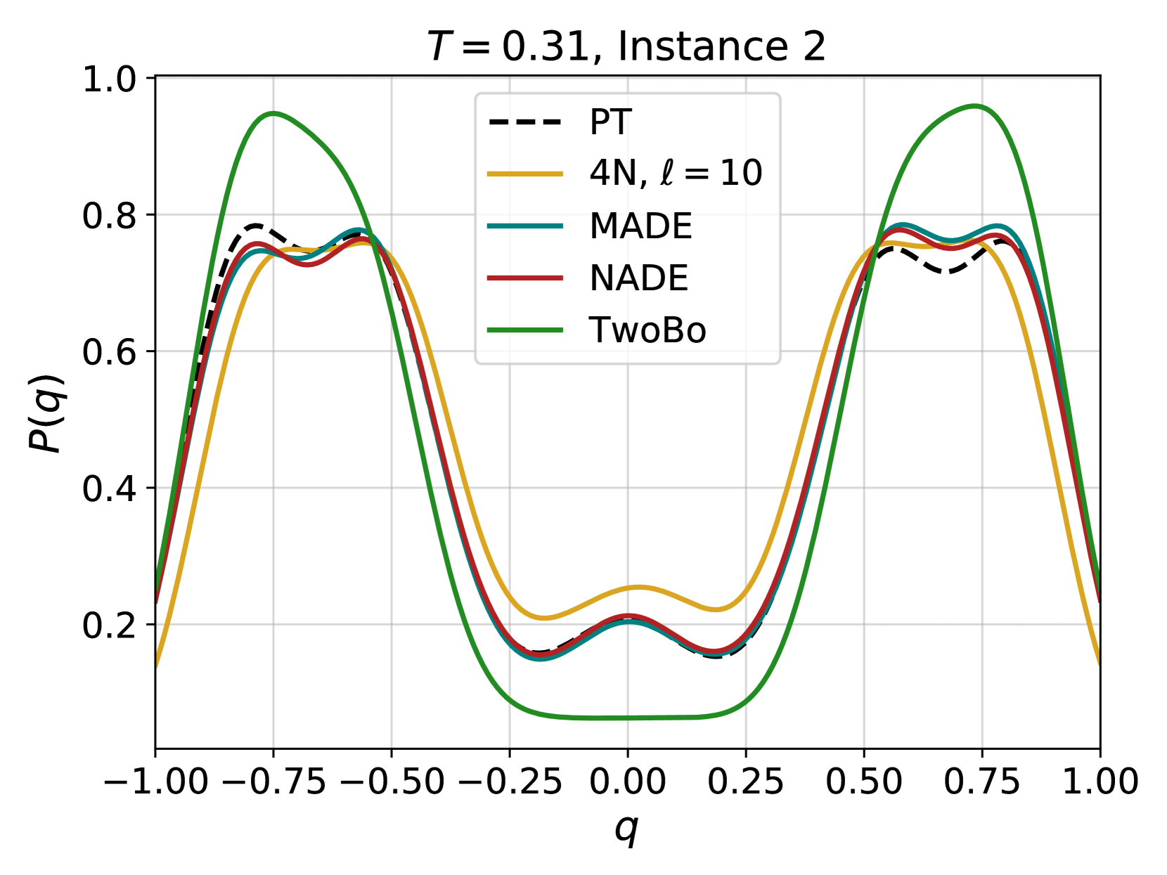
The image displays a line chart comparing the probability distribution \( P(q) \) across the variable \( q \) for five different models or methods. The chart is titled "T = 0.31, Instance 2," suggesting it represents a specific experimental condition or data instance. All curves exhibit a bimodal (two-peaked) distribution, with peaks located symmetrically around \( q = -0.75 \) and \( q = 0.75 \), and a central trough near \( q = 0 \).
### Components/Axes
* **Title:** "T = 0.31, Instance 2" (Top-center).
* **X-axis:** Labeled **"q"**. The scale runs from **-1.00** to **1.00**, with major tick marks and grid lines at intervals of 0.25 (-1.00, -0.75, -0.50, -0.25, 0.00, 0.25, 0.50, 0.75, 1.00).
* **Y-axis:** Labeled **"P(q)"**. The scale runs from **0.0** to **1.0**, with major tick marks and grid lines at intervals of 0.2 (0.0, 0.2, 0.4, 0.6, 0.8, 1.0).
* **Legend:** Positioned in the **top-center** of the plot area, slightly offset to the right. It contains five entries:
1. **PT**: Represented by a **black dashed line** (`---`).
2. **4N, ℓ = 10**: Represented by a **solid yellow/gold line**.
3. **MADE**: Represented by a **solid teal/blue-green line**.
4. **NADE**: Represented by a **solid red line**.
5. **TwoBo**: Represented by a **solid green line**.
### Detailed Analysis
The chart plots five distinct data series. Below is an analysis of each, including trend description and approximate key data points.
1. **PT (Black Dashed Line):**
* **Trend:** Forms a symmetric bimodal distribution. Rises steeply from the left edge, peaks, dips to a local minimum at the center, rises to a second symmetric peak, and falls steeply to the right edge.
* **Key Points (Approximate):**
* Left Peak: \( q \approx -0.75 \), \( P(q) \approx 0.78 \)
* Central Trough: \( q \approx 0.00 \), \( P(q) \approx 0.20 \)
* Right Peak: \( q \approx 0.75 \), \( P(q) \approx 0.76 \)
2. **4N, ℓ = 10 (Yellow Line):**
* **Trend:** Follows a similar bimodal shape but with lower peak heights and a shallower central trough compared to most other series.
* **Key Points (Approximate):**
* Left Peak: \( q \approx -0.75 \), \( P(q) \approx 0.74 \)
* Central Trough: \( q \approx 0.00 \), \( P(q) \approx 0.25 \)
* Right Peak: \( q \approx 0.75 \), \( P(q) \approx 0.74 \)
3. **MADE (Teal Line):**
* **Trend:** Very closely follows the NADE (red) line, nearly overlapping it throughout the range. Its peaks are slightly higher than PT's.
* **Key Points (Approximate):**
* Left Peak: \( q \approx -0.75 \), \( P(q) \approx 0.79 \)
* Central Trough: \( q \approx 0.00 \), \( P(q) \approx 0.20 \)
* Right Peak: \( q \approx 0.75 \), \( P(q) \approx 0.79 \)
4. **NADE (Red Line):**
* **Trend:** Nearly identical to the MADE (teal) line, forming a tight cluster with it and the PT line at the peaks.
* **Key Points (Approximate):**
* Left Peak: \( q \approx -0.75 \), \( P(q) \approx 0.78 \)
* Central Trough: \( q \approx 0.00 \), \( P(q) \approx 0.21 \)
* Right Peak: \( q \approx 0.75 \), \( P(q) \approx 0.78 \)
5. **TwoBo (Green Line):**
* **Trend:** Exhibits the most extreme bimodal distribution. It has the highest peaks and the deepest central trough, deviating significantly from the other four series.
* **Key Points (Approximate):**
* Left Peak: \( q \approx -0.75 \), \( P(q) \approx 0.95 \)
* Central Trough: \( q \approx 0.00 \), \( P(q) \approx 0.10 \)
* Right Peak: \( q \approx 0.75 \), \( P(q) \approx 0.95 \)
### Key Observations
* **Bimodal Symmetry:** All five distributions are symmetric around \( q = 0 \).
* **Clustering:** The PT, MADE, and NADE lines form a tight cluster, especially at the peaks and central trough, indicating similar performance or output for this instance.
* **Outlier Series:** The **TwoBo (green)** line is a clear outlier, showing much sharper probability peaks (higher confidence) and a deeper central minimum (lower probability) than the other methods.
* **4N Performance:** The **4N, ℓ = 10 (yellow)** line shows the lowest peak probabilities and the highest central trough probability among the group, suggesting a more "flattened" or less confident distribution.
* **Grid and Scale:** The chart uses a clear grid, making approximate value reading straightforward. The y-axis scale (0 to 1) is appropriate for a probability measure.
### Interpretation
This chart likely compares the output probability distributions of different machine learning models (e.g., neural autoregressive models like MADE/NADE, parallel tempering PT, and a method called TwoBo) on a specific task or dataset instance, under a temperature parameter \( T = 0.31 \).
* **What the data suggests:** The variable \( q \) appears to be an order parameter or a latent variable where the system has two stable states (at \( q \approx \pm 0.75 \)). The models are estimating the probability \( P(q) \) of the system being in a state characterized by value \( q \).
* **Model Relationships:** PT, MADE, and NADE produce very similar, moderate-confidence bimodal distributions. The 4N model yields a less decisive distribution. The TwoBo model, however, predicts a much more polarized scenario with very high probability concentrated at the two peaks and very low probability in the disordered central state (\( q=0 \)).
* **Significance:** The stark difference of the TwoBo curve suggests it may be capturing a different aspect of the underlying data or using a fundamentally different approach that leads to more extreme probability assignments. The similarity between MADE and NADE is expected, as NADE is often an extension of MADE. The parameter \( T=0.31 \) might represent a noise or temperature level in a physical system simulation or a sampling process; the chart shows how different algorithms interpret the state distribution at this specific condition.