## Pie Chart: Relevance Distribution
### Overview
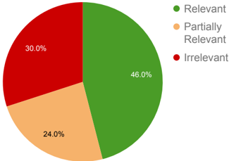
The image is a pie chart illustrating the distribution of relevance across three categories: Relevant, Partially Relevant, and Irrelevant. The chart shows the percentage of each category.
### Components/Axes
* **Categories:**
* Relevant (Green)
* Partially Relevant (Light Orange)
* Irrelevant (Red)
* **Percentages:**
* Relevant: 46.0%
* Partially Relevant: 24.0%
* Irrelevant: 30.0%
* **Legend:** Located on the top-right of the chart.
### Detailed Analysis
* **Relevant (Green):** The largest slice of the pie chart, representing 46.0% of the total.
* **Partially Relevant (Light Orange):** The second largest slice, representing 24.0% of the total.
* **Irrelevant (Red):** The smallest slice, representing 30.0% of the total.
### Key Observations
* The "Relevant" category constitutes the largest portion of the pie chart.
* The "Irrelevant" category is slightly larger than the "Partially Relevant" category.
### Interpretation
The pie chart indicates that nearly half (46.0%) of the items assessed are considered "Relevant." A significant portion (30.0%) is deemed "Irrelevant," while almost a quarter (24.0%) are "Partially Relevant." This suggests that while a substantial amount is directly applicable, a considerable portion is not, and a smaller fraction has some degree of relevance.