## Pie Chart: Data Relevance Distribution
### Overview
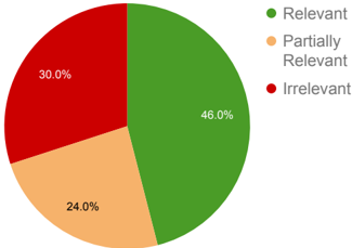
The image displays a pie chart illustrating the distribution of data relevance across three categories: "Relevant," "Partially Relevant," and "Irrelevant." The chart uses distinct colors to differentiate categories, with a legend positioned to the right of the chart.
### Components/Axes
- **Legend**: Located on the right side of the chart, with three entries:
- Green circle labeled "Relevant"
- Orange circle labeled "Partially Relevant"
- Red circle labeled "Irrelevant"
- **Segments**:
- Green segment (46.0%) occupying the largest portion of the chart.
- Orange segment (24.0%) positioned adjacent to the green segment.
- Red segment (30.0%) completing the chart, adjacent to both green and orange segments.
### Detailed Analysis
- **Relevant (Green)**: 46.0% of the data is classified as fully relevant. This segment is the largest, occupying slightly less than half of the pie chart.
- **Partially Relevant (Orange)**: 24.0% of the data falls into this category, represented by the second-largest segment.
- **Irrelevant (Red)**: 30.0% of the data is marked as irrelevant, forming the third segment. This is larger than the "Partially Relevant" category but smaller than "Relevant."
### Key Observations
1. **Dominance of Relevant Data**: The "Relevant" category constitutes nearly half of the dataset, indicating a majority of items meet full relevance criteria.
2. **Irrelevant Data Proportion**: The "Irrelevant" category (30.0%) is notably larger than "Partially Relevant" (24.0%), suggesting a significant portion of data lacks relevance.
3. **Color Consistency**: All segments align with their corresponding legend labels (green = relevant, orange = partially relevant, red = irrelevant).
### Interpretation
The data suggests a dataset where relevance is unevenly distributed. While the majority of items are fully relevant, a substantial minority (30%) are entirely irrelevant, outnumbering the "Partially Relevant" group. This could imply challenges in data quality or filtering processes. The "Partially Relevant" category, though smaller than "Irrelevant," may represent items requiring further refinement or contextual analysis. The chart highlights the need for targeted improvements in data curation to reduce irrelevance while leveraging the dominant relevant portion effectively.