## Heatmap: Targets vs. Outputs Over Time
### Overview
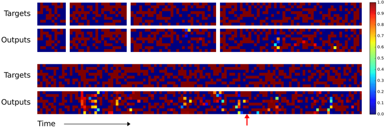
The image presents a series of heatmaps comparing "Targets" and "Outputs" over time. The heatmaps are arranged in pairs, with "Targets" above "Outputs" in each pair. The color intensity represents a value, ranging from 0.0 (dark blue) to 1.0 (dark red), as indicated by the colorbar on the right. The x-axis represents time, and an arrow points to a specific time point in the last "Outputs" heatmap.
### Components/Axes
* **Y-Axis Labels:** "Targets", "Outputs" (repeated twice)
* **X-Axis:** "Time" (with an arrow indicating direction)
* **Colorbar:** Ranges from 0.0 (dark blue) to 1.0 (dark red), with intermediate values labeled (0.1, 0.2, 0.3, 0.4, 0.5, 0.6, 0.7, 0.8, 0.9).
* **Heatmap Structure:** Each heatmap is a grid of cells, with color indicating the value at that time point.
### Detailed Analysis or ### Content Details
**First Pair (Top):**
* **Targets:** The first "Targets" heatmap shows two distinct white blocks, indicating a value of 1.0. The rest of the heatmap is a mix of red and blue, indicating values close to 0.0 and 1.0.
* **Outputs:** The first "Outputs" heatmap shows a similar pattern to the "Targets" heatmap, but with less distinct blocks. There are some scattered yellow and green pixels, indicating values between 0.6 and 0.8.
**Second Pair (Bottom):**
* **Targets:** The second "Targets" heatmap shows a more dispersed pattern of red and blue, with no distinct blocks.
* **Outputs:** The second "Outputs" heatmap shows a more structured pattern, with a concentration of yellow, green, and light blue pixels at the beginning, indicated by the red arrow. This suggests a higher output value at that time point.
**Colorbar Values:**
* 1. 0: Dark Red
* 0.9: Red
* 0.8: Orange
* 0.7: Yellow-Orange
* 0.6: Yellow
* 0.5: Light Green
* 0.4: Green
* 0.3: Light Blue
* 0.2: Blue
* 0.1: Dark Blue
* 0.0: Very Dark Blue
### Key Observations
* The "Targets" heatmaps show a mix of high and low values, with some distinct blocks in the first heatmap.
* The "Outputs" heatmaps show a more dispersed pattern, with a concentration of higher values at the beginning of the second heatmap.
* The color intensity varies across the heatmaps, indicating different values at different time points.
### Interpretation
The heatmaps likely represent the target and output values of a system over time. The first pair of heatmaps shows a more distinct pattern in the "Targets" heatmap, suggesting a clear input signal. The second pair of heatmaps shows a more dispersed pattern in the "Targets" heatmap, suggesting a more complex input signal. The concentration of higher values at the beginning of the second "Outputs" heatmap suggests that the system is responding to the input signal at that time point. The red arrow highlights a specific time point where the output is particularly high. The data suggests that the system is learning or adapting over time, as the output pattern changes between the first and second pairs of heatmaps.