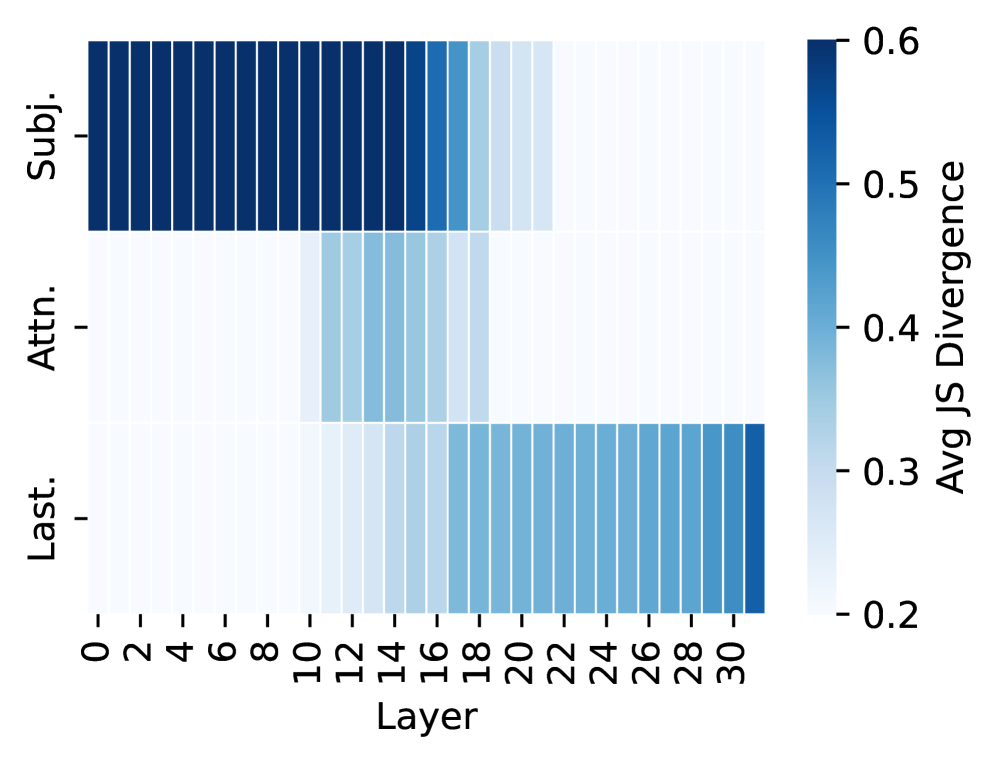
## Heatmap: Avg JS Divergence by Layer
### Overview
The image is a heatmap visualizing the average Jensen-Shannon (JS) divergence across different layers (0-30) for three categories: "Subj.", "Attn.", and "Last.". The heatmap uses a color gradient from light blue to dark blue, representing lower to higher JS divergence values, respectively.
### Components/Axes
* **Y-axis:** Categorical labels: "Subj.", "Attn.", "Last." (from top to bottom).
* **X-axis:** Numerical labels representing layers, ranging from 0 to 30 in increments of 2.
* **Color Scale (Legend):** Located on the right side of the heatmap.
* Dark Blue: Represents a high Avg JS Divergence of approximately 0.6.
* Light Blue: Represents a low Avg JS Divergence of approximately 0.2.
* **Axis Title:** "Avg JS Divergence" on the right side, and "Layer" on the bottom.
### Detailed Analysis
* **Subj.:** The "Subj." category shows a consistently high Avg JS Divergence across all layers (0-30). The color is dark blue, indicating values close to 0.6. There is a slight decrease in JS divergence around layers 18-20, where the color becomes slightly lighter blue.
* **Attn.:** The "Attn." category shows a low Avg JS Divergence (light blue, approximately 0.2) from layers 0 to approximately 8-10. The JS divergence then increases to a medium value (medium blue, approximately 0.3-0.4) from layers 10 to 20, and then returns to a low value (light blue, approximately 0.2) from layers 20 to 30.
* **Last.:** The "Last." category shows a low Avg JS Divergence (light blue, approximately 0.2) from layers 0 to approximately 18-20. The JS divergence then increases to a medium value (medium blue, approximately 0.3-0.4) from layers 20 to 30.
### Key Observations
* The "Subj." category consistently exhibits the highest Avg JS Divergence across all layers.
* The "Attn." and "Last." categories show a similar pattern: low JS divergence in the initial layers, an increase in the middle layers, and then a return to low values in the later layers.
* The transition points for "Attn." and "Last." are slightly different, with "Attn." increasing earlier than "Last.".
### Interpretation
The heatmap suggests that the "Subj." category has a significantly different distribution compared to "Attn." and "Last." across all layers. The "Attn." and "Last." categories show a change in distribution in the middle layers, possibly indicating a shift in the information being processed by those layers. The JS divergence measures the similarity between probability distributions; therefore, higher divergence indicates less similarity. The data suggests that the "Subj." category's distribution is consistently different from the other two, while "Attn." and "Last." have distributions that change depending on the layer.