\n
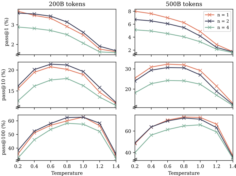
## Chart: Pass@k vs. Temperature for Different n Values
### Overview
The image presents a 2x2 grid of line charts. Each chart visualizes the relationship between "Temperature" (x-axis) and "pass@k" (y-axis) for different values of 'n' (represented by different colored lines). The charts are separated based on the "tokens" used: 200B tokens in the left column and 500B tokens in the right column. The pass@k metric is shown for k=1, k=10, and k=100 across the rows.
### Components/Axes
* **X-axis:** Temperature, ranging from approximately 0.2 to 1.4.
* **Y-axis:** pass@k (%), with scales varying for each chart:
* Top row (pass@1): 0 to 8%
* Middle row (pass@10): 0 to 30%
* Bottom row (pass@100): 40 to 60%
* **Legend:** Located in the top-right corner of the rightmost charts. It defines the line colors for different 'n' values:
* n = 1 (brown/orange)
* n = 2 (red)
* n = 4 (green)
* **Titles:** Each chart has a title indicating the token count (200B or 500B) and the pass@k metric being displayed.
### Detailed Analysis or Content Details
**Top Row (pass@1):**
* **200B tokens:**
* n=1 (brown): Line starts at approximately 3.2%, peaks around 0.6 with approximately 3.8%, then decreases to approximately 2.2% at 1.4.
* n=2 (red): Line starts at approximately 2.8%, peaks around 0.6 with approximately 3.6%, then decreases to approximately 2.0% at 1.4.
* n=4 (green): Line starts at approximately 1.8%, decreases to approximately 1.5% at 0.6, then increases to approximately 2.0% at 1.4.
* **500B tokens:**
* n=1 (brown): Line starts at approximately 5.2%, decreases to approximately 4.0% at 0.6, then increases to approximately 4.8% at 1.4.
* n=2 (red): Line starts at approximately 6.0%, decreases to approximately 5.0% at 0.6, then increases to approximately 5.6% at 1.4.
* n=4 (green): Line starts at approximately 3.0%, increases to approximately 4.0% at 0.6, then decreases to approximately 3.2% at 1.4.
**Middle Row (pass@10):**
* **200B tokens:**
* n=1 (brown): Line starts at approximately 11%, peaks around 0.6 with approximately 17%, then decreases to approximately 13% at 1.4.
* n=2 (red): Line starts at approximately 13%, peaks around 0.6 with approximately 19%, then decreases to approximately 15% at 1.4.
* n=4 (green): Line starts at approximately 8%, increases to approximately 12% at 0.6, then decreases to approximately 10% at 1.4.
* **500B tokens:**
* n=1 (brown): Line starts at approximately 18%, peaks around 0.8 with approximately 26%, then decreases to approximately 20% at 1.4.
* n=2 (red): Line starts at approximately 22%, peaks around 0.8 with approximately 28%, then decreases to approximately 22% at 1.4.
* n=4 (green): Line starts at approximately 12%, increases to approximately 18% at 0.8, then decreases to approximately 14% at 1.4.
**Bottom Row (pass@100):**
* **200B tokens:**
* n=1 (brown): Line starts at approximately 48%, increases to approximately 56% at 0.6, then decreases to approximately 52% at 1.4.
* n=2 (red): Line starts at approximately 52%, increases to approximately 58% at 0.6, then decreases to approximately 54% at 1.4.
* n=4 (green): Line starts at approximately 42%, increases to approximately 50% at 0.6, then decreases to approximately 46% at 1.4.
* **500B tokens:**
* n=1 (brown): Line starts at approximately 54%, remains relatively flat around 58-60% between 0.4 and 1.2, then decreases to approximately 56% at 1.4.
* n=2 (red): Line starts at approximately 58%, remains relatively flat around 60-62% between 0.4 and 1.2, then decreases to approximately 58% at 1.4.
* n=4 (green): Line starts at approximately 48%, increases to approximately 54% at 0.6, then remains relatively flat around 54-56% between 0.6 and 1.4.
### Key Observations
* Generally, increasing the temperature from 0.2 to 0.6 improves the pass@k rate for all values of 'n' and all token counts, especially for pass@10 and pass@100.
* Beyond a temperature of 0.6, the pass@k rate tends to decrease with increasing temperature.
* Higher values of 'n' (n=2 and n=4) generally result in higher pass@k rates compared to n=1.
* The 500B token charts show a more stable pass@k rate at higher temperatures (between 0.6 and 1.2) for pass@100, compared to the 200B token charts.
* The pass@1 metric shows the lowest overall pass rates, consistently below 8%.
### Interpretation
The charts demonstrate the impact of temperature and 'n' value on the performance of a model, as measured by the pass@k metric. The optimal temperature appears to be around 0.6, where the pass@k rate peaks for most configurations. Increasing 'n' generally improves performance, suggesting that considering more options during generation leads to better results. The difference between 200B and 500B token models is most pronounced at higher pass@k values (pass@100), indicating that larger models are more robust and maintain performance better at higher temperatures. The relatively low pass@1 rates suggest that generating the single most likely token is not a reliable indicator of overall model quality. The flattening of the curves for the 500B token model at higher temperatures and pass@100 suggests a saturation point where further increasing temperature does not yield significant improvements. This data could be used to tune the generation parameters of the model to maximize performance based on the desired level of accuracy (k) and computational resources (token count).