## Bar Charts: Autonomy and Wellbeing Utility Distributions
### Overview
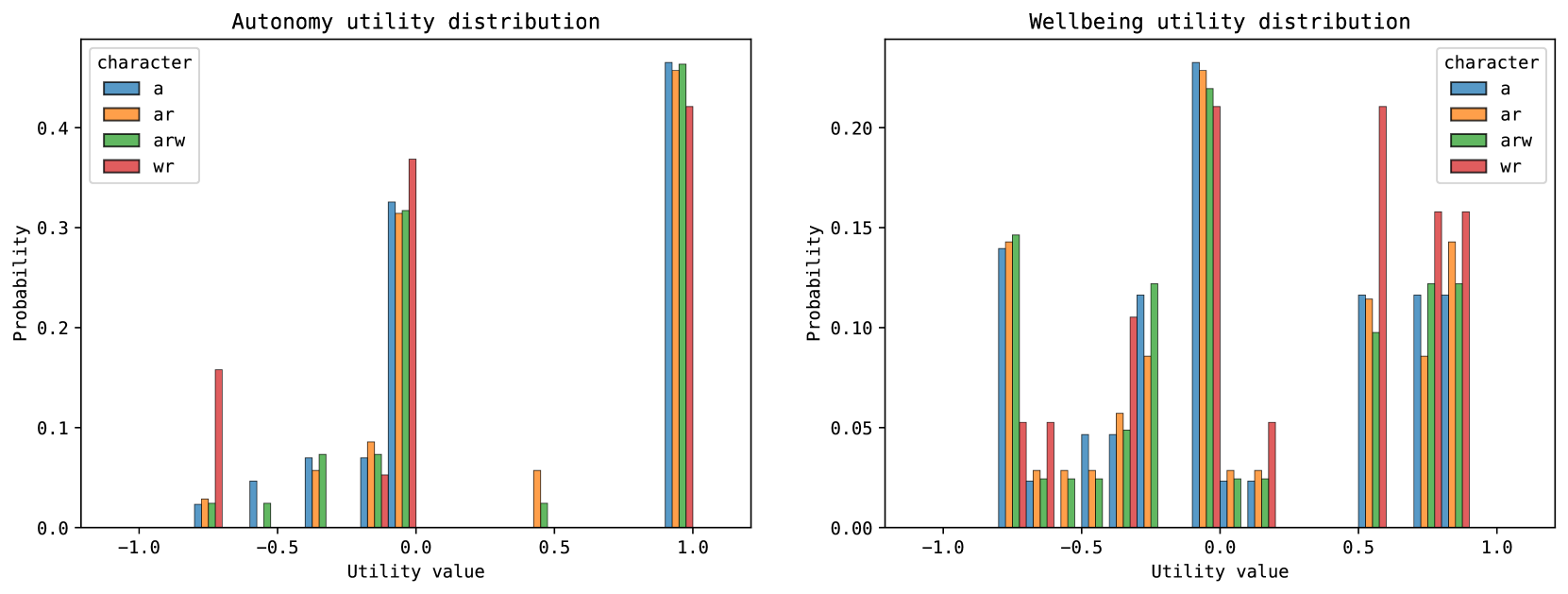
The image displays two side-by-side bar charts comparing probability distributions of utility values for four different character types (`a`, `ar`, `arw`, `wr`). The left chart is titled "Autonomy utility distribution," and the right chart is titled "Wellbeing utility distribution." Both charts share the same axes labels and legend structure.
### Components/Axes
* **Chart Titles:**
* Left: "Autonomy utility distribution"
* Right: "Wellbeing utility distribution"
* **X-Axis (Both Charts):** Labeled "Utility value." The axis spans from -1.0 to 1.0, with major tick marks at -1.0, -0.5, 0.0, 0.5, and 1.0.
* **Y-Axis (Both Charts):** Labeled "Probability." The scale ranges from 0.0 to approximately 0.45 for the Autonomy chart and 0.0 to approximately 0.25 for the Wellbeing chart.
* **Legend (Both Charts):** Located in the top-left corner of each chart. It defines four categories under the header "character":
* `a` (Blue)
* `ar` (Orange)
* `arw` (Green)
* `wr` (Red)
### Detailed Analysis
#### **Autonomy Utility Distribution (Left Chart)**
The distribution is highly polarized, with the vast majority of probability mass concentrated at the extreme positive utility value of 1.0. There are minor probabilities at other discrete utility values.
* **Utility Value ~ -0.75:**
* `a` (Blue): ~0.02
* `ar` (Orange): ~0.03
* `arw` (Green): ~0.02
* `wr` (Red): ~0.16 (Significantly higher than others at this point)
* **Utility Value ~ -0.5:**
* `a` (Blue): ~0.05
* `arw` (Green): ~0.02
* **Utility Value ~ -0.25:**
* `a` (Blue): ~0.07
* `ar` (Orange): ~0.06
* `arw` (Green): ~0.07
* **Utility Value ~ 0.0:**
* `a` (Blue): ~0.32
* `ar` (Orange): ~0.31
* `arw` (Green): ~0.31
* `wr` (Red): ~0.37
* **Utility Value ~ 0.5:**
* `ar` (Orange): ~0.06
* `arw` (Green): ~0.02
* **Utility Value ~ 1.0:**
* `a` (Blue): ~0.46
* `ar` (Orange): ~0.46
* `arw` (Green): ~0.46
* `wr` (Red): ~0.42
**Trend Verification:** The data series for all characters show a dominant, sharp peak at utility value 1.0. A secondary, smaller peak exists at utility value 0.0. The `wr` character shows a unique, notable probability at the negative utility value of -0.75.
#### **Wellbeing Utility Distribution (Right Chart)**
The distribution is more dispersed and multi-modal compared to the Autonomy chart. Significant probabilities are observed across a wider range of utility values, with notable peaks at 0.0 and 0.75.
* **Utility Value ~ -0.75:**
* `a` (Blue): ~0.14
* `ar` (Orange): ~0.14
* `arw` (Green): ~0.15
* `wr` (Red): ~0.05
* **Utility Value ~ -0.5:**
* `a` (Blue): ~0.02
* `ar` (Orange): ~0.03
* `arw` (Green): ~0.03
* `wr` (Red): ~0.05
* **Utility Value ~ -0.25:**
* `a` (Blue): ~0.05
* `ar` (Orange): ~0.03
* `arw` (Green): ~0.03
* `wr` (Red): ~0.03
* **Utility Value ~ 0.0:**
* `a` (Blue): ~0.12
* `ar` (Orange): ~0.09
* `arw` (Green): ~0.12
* `wr` (Red): ~0.11
* **Utility Value ~ 0.25:**
* `a` (Blue): ~0.23
* `ar` (Orange): ~0.23
* `arw` (Green): ~0.22
* `wr` (Red): ~0.21
* **Utility Value ~ 0.5:**
* `a` (Blue): ~0.03
* `ar` (Orange): ~0.03
* `arw` (Green): ~0.03
* `wr` (Red): ~0.05
* **Utility Value ~ 0.75:**
* `a` (Blue): ~0.12
* `ar` (Orange): ~0.09
* `arw` (Green): ~0.12
* `wr` (Red): ~0.21 (The highest peak for `wr` in this chart)
* **Utility Value ~ 1.0:**
* `a` (Blue): ~0.12
* `ar` (Orange): ~0.14
* `arw` (Green): ~0.12
* `wr` (Red): ~0.16
**Trend Verification:** The distributions for `a`, `ar`, and `arw` are relatively similar, with a major peak at utility 0.25 and secondary peaks at -0.75, 0.0, 0.75, and 1.0. The `wr` character's distribution is distinct, with its highest peak at utility 0.75 and a significant presence at 1.0.
### Key Observations
1. **Polarization vs. Dispersion:** Autonomy utility is heavily polarized towards the maximum value (1.0), suggesting a near-certain outcome of high autonomy. Wellbeing utility is far more uncertain and distributed across positive and negative values.
2. **Character (`wr`) Anomaly:** The `wr` character consistently shows different patterns. In Autonomy, it has a unique negative utility probability. In Wellbeing, it has the highest probability at utility 0.75, diverging from the other three characters.
3. **Clustering at Zero:** Both charts show a notable probability cluster around utility value 0.0, indicating a non-trivial chance of neutral outcomes for both autonomy and wellbeing.
4. **Negative Utility:** Negative utility values are possible for both metrics but are more probable and varied in the Wellbeing distribution.
### Interpretation
The data suggests a fundamental difference in the predictability and outcome profiles of Autonomy versus Wellbeing for the modeled characters.
* **Autonomy** appears to be a more "binary" or guaranteed positive outcome. The system or model being analyzed seems to ensure high autonomy (utility ~1.0) with high probability, regardless of character type. The only significant deviation is for the `wr` character, which carries a small but distinct risk of a negative autonomy outcome.
* **Wellbeing** is a more complex and uncertain metric. Outcomes are spread across a spectrum, indicating that achieving high wellbeing is less guaranteed and more sensitive to the character type or underlying conditions. The `wr` character, while at risk for lower autonomy, shows a higher propensity for achieving relatively high wellbeing (utility 0.75) compared to others.
* **Implication:** This could model a scenario or system where granting autonomy is a straightforward policy with predictable results, but fostering wellbeing involves trade-offs, uncertainties, and variable outcomes depending on the subject's characteristics. The `wr` profile might represent a group that sacrifices some autonomy security for a different pathway to wellbeing.