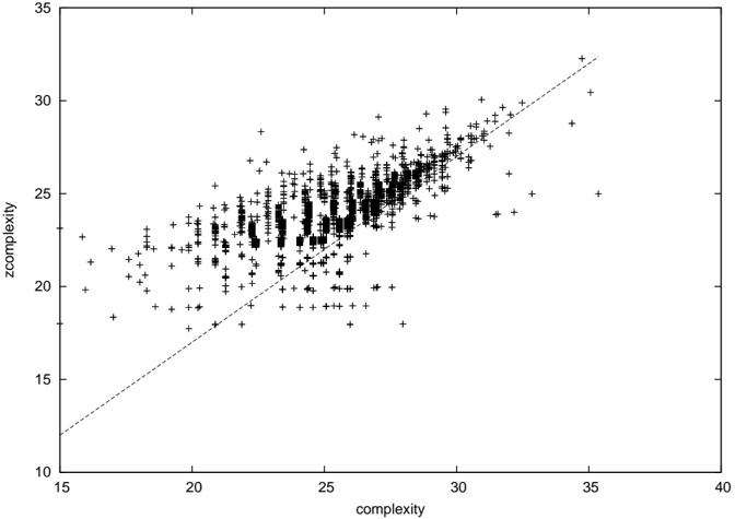
## Scatter Plot: Complexity vs. zcomplexity
### Overview
The image is a scatter plot showing the relationship between two variables: "complexity" on the x-axis and "zcomplexity" on the y-axis. The plot contains numerous data points, represented by plus signs, and a dashed line that appears to indicate a trend or a reference line.
### Components/Axes
* **X-axis:** "complexity" with a scale from 15 to 40, marked at intervals of 5 (15, 20, 25, 30, 35, 40).
* **Y-axis:** "zcomplexity" with a scale from 10 to 35, marked at intervals of 5 (10, 15, 20, 25, 30, 35).
* **Data Points:** Represented by '+' symbols.
* **Trend Line:** A dashed line extending from approximately (16, 12) to (36, 32).
### Detailed Analysis
The data points are clustered, showing a positive correlation between "complexity" and "zcomplexity." The density of points is higher in the region where both complexity and zcomplexity are between 20 and 30.
* **Trend Line:** The dashed line starts at approximately x=16, y=12 and extends to x=36, y=32. It suggests a linear relationship where zcomplexity increases with complexity.
* **Data Point Distribution:**
* For complexity values between 20 and 25, zcomplexity values range from approximately 18 to 28.
* For complexity values between 25 and 30, zcomplexity values range from approximately 22 to 30.
* For complexity values between 30 and 35, zcomplexity values range from approximately 25 to 32.
### Key Observations
* There is a positive correlation between "complexity" and "zcomplexity."
* The data points are more densely clustered in the middle range of both axes (20-30).
* There are fewer data points at the extreme ends of the axes.
* The dashed line suggests a linear relationship, but the scatter of the points indicates that the relationship is not perfectly linear.
### Interpretation
The scatter plot suggests that as "complexity" increases, "zcomplexity" also tends to increase. The dashed line provides a visual guide to this trend. However, the spread of the data points around the line indicates that there are other factors influencing "zcomplexity" besides "complexity." The clustering of points in the middle range suggests that the majority of the data falls within a certain range of complexity and zcomplexity values. The plot could be used to identify outliers or to develop a model to predict "zcomplexity" based on "complexity," although the model would need to account for the variability in the data.