\n
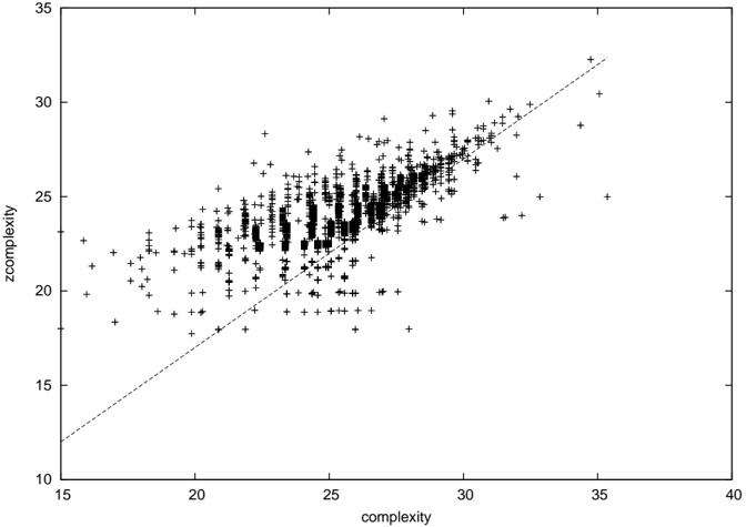
## Scatter Plot: Complexity vs. Zcomplexity
### Overview
The image presents a scatter plot visualizing the relationship between two variables: "complexity" and "zcomplexity". The plot consists of numerous data points represented by '+' symbols, distributed across a two-dimensional plane. A diagonal line is also present, likely representing a line of equality or a reference point.
### Components/Axes
* **X-axis:** Labeled "complexity", ranging from approximately 15 to 40. The scale is linear with tick marks at intervals of 5.
* **Y-axis:** Labeled "zcomplexity", ranging from approximately 15 to 35. The scale is linear with tick marks at intervals of 5.
* **Data Points:** Represented by '+' symbols, scattered throughout the plot area.
* **Diagonal Line:** A dashed black line extending from the bottom-left to the top-right of the plot. It appears to represent the line where complexity equals zcomplexity.
### Detailed Analysis
The data points exhibit a generally positive correlation between "complexity" and "zcomplexity". As "complexity" increases, "zcomplexity" tends to increase as well. However, the relationship is not perfectly linear, and there is significant scatter around the general trend.
* **Data Distribution:** The data points are most densely clustered in the region where "complexity" is between 22 and 35, and "zcomplexity" is between 20 and 30. There is a sparser distribution of points at lower values of both variables.
* **Trend Verification:** The overall trend is upward and to the right.
* **Approximate Data Points (sampled):**
* (16, 18)
* (18, 20)
* (20, 21)
* (22, 22)
* (24, 23)
* (26, 25)
* (28, 27)
* (30, 28)
* (32, 30)
* (34, 31)
* (36, 32)
* (25, 20)
* (25, 26)
* (30, 22)
* (30, 29)
### Key Observations
* The data points generally fall above the diagonal line, suggesting that "zcomplexity" is often greater than "complexity".
* There is a noticeable spread of data points around the trend line, indicating variability in the relationship between the two variables.
* The density of points increases as both "complexity" and "zcomplexity" increase.
* There are a few outliers, particularly at lower values of "complexity", where "zcomplexity" is relatively high.
### Interpretation
The scatter plot suggests a positive correlation between "complexity" and "zcomplexity", but the relationship is not perfectly deterministic. The fact that most data points fall above the line of equality indicates that "zcomplexity" tends to be higher than "complexity". This could imply that "zcomplexity" incorporates additional factors or a different measurement scale compared to "complexity". The scatter around the trend line suggests that other variables or random noise influence the relationship between the two measures. The increasing density of points at higher values could indicate that the relationship becomes more consistent as the complexity increases. The outliers might represent cases where the underlying assumptions or measurement methods are not fully applicable.
Without further context about what "complexity" and "zcomplexity" represent, it's difficult to draw more specific conclusions. However, the plot provides valuable insights into the general relationship between these two variables and highlights areas where further investigation might be warranted.