\n
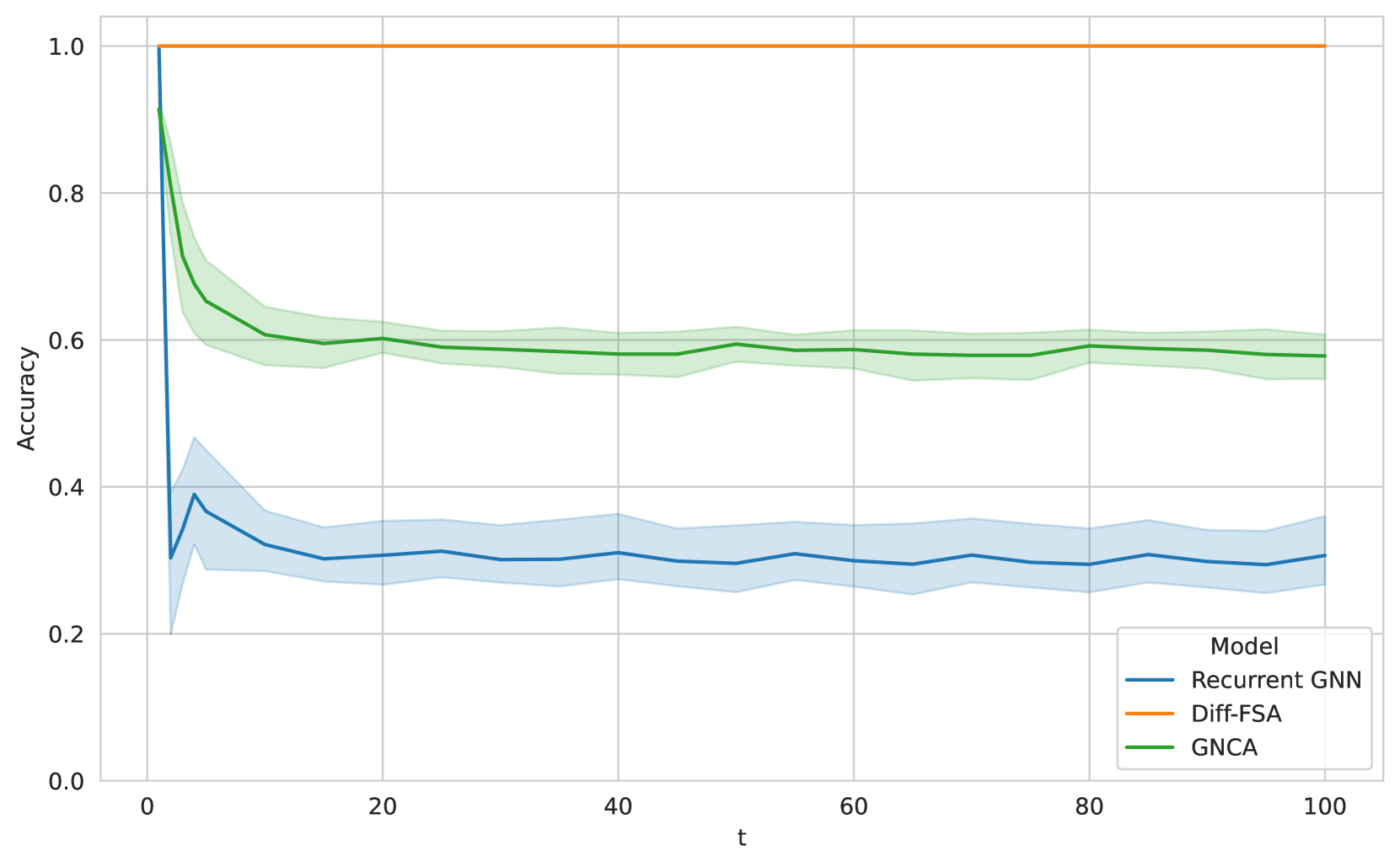
## Line Chart: Model Accuracy Over Time
### Overview
This image presents a line chart comparing the accuracy of three different models – Recurrent GNN, Diff-FSA, and GNCA – over time (represented by 't'). The chart displays the accuracy on the y-axis and time on the x-axis. Each model's performance is represented by a colored line, with shaded areas indicating the uncertainty or variance around the mean accuracy.
### Components/Axes
* **X-axis:** Labeled "t", representing time. The scale ranges from approximately 0 to 100.
* **Y-axis:** Labeled "Accuracy", representing the model's accuracy. The scale ranges from 0.0 to 1.0.
* **Legend:** Located in the bottom-right corner, identifying the models:
* "Recurrent GNN" (Blue)
* "Diff-FSA" (Orange)
* "GNCA" (Green)
* **Data Series:** Three lines representing the accuracy of each model over time, with shaded regions representing uncertainty.
* **Grid:** A light gray grid is present to aid in reading values.
### Detailed Analysis
* **Recurrent GNN (Blue):** The line starts at approximately 0.35 at t=0, initially increases slightly to around 0.40 by t=5, then fluctuates around 0.30-0.35 with some oscillations until t=100. The shaded region indicates a significant amount of variance, particularly in the early stages.
* **Diff-FSA (Orange):** This line starts at approximately 0.95 at t=0 and decreases rapidly to around 0.80 by t=5. It continues to decrease, leveling off around 0.60-0.65 from t=40 to t=100. The shaded region is relatively narrow, indicating lower variance compared to the Recurrent GNN.
* **GNCA (Green):** The line begins at approximately 0.85 at t=0 and decreases steadily to around 0.60 by t=10. It then plateaus, remaining relatively stable between 0.55 and 0.65 from t=20 to t=100. The shaded region is moderate in width, suggesting a moderate level of variance.
### Key Observations
* GNCA and Diff-FSA start with significantly higher accuracy than Recurrent GNN.
* Recurrent GNN exhibits the highest variance in accuracy throughout the observed time period.
* Diff-FSA shows the most rapid initial decrease in accuracy.
* GNCA demonstrates the most stable accuracy over the longer term (t > 20).
* All three models show a decreasing trend in accuracy over time, although GNCA and Diff-FSA stabilize after an initial drop.
### Interpretation
The chart suggests that while GNCA and Diff-FSA initially outperform the Recurrent GNN, all models experience a decline in accuracy as time progresses. The Recurrent GNN's performance is less consistent, as indicated by the wider shaded region, suggesting it is more sensitive to variations in the data or training process. The stabilization of GNCA and Diff-FSA after the initial drop could indicate that they reach a point of diminishing returns or converge to a stable state. The initial high accuracy of Diff-FSA followed by a rapid decline might suggest a strong initial fit to the training data that doesn't generalize well over time. The consistent decline of the Recurrent GNN could be due to issues with vanishing gradients or difficulty in capturing long-range dependencies. The data suggests that GNCA might be the most robust model in the long run, given its relatively stable accuracy. Further investigation would be needed to understand the underlying reasons for these performance differences and to explore potential strategies for improving the accuracy and stability of each model.