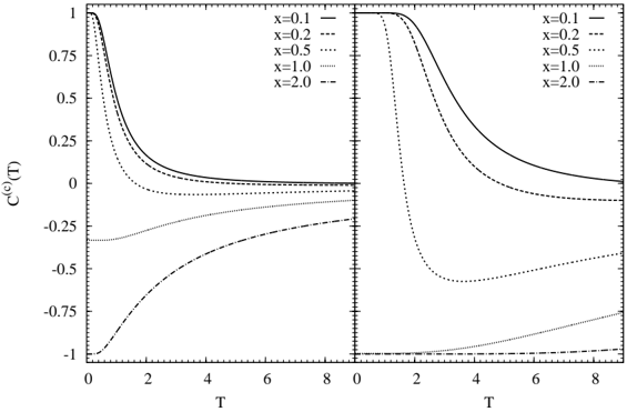
## Line Charts: Correlation vs. Temperature
### Overview
The image presents two line charts side-by-side, displaying the relationship between a correlation function C^(c)(T) and temperature (T) for different values of a parameter 'x'. The left chart shows a gradual change in correlation with temperature, while the right chart exhibits a more abrupt transition.
### Components/Axes
* **Y-axis (Left and Right Charts):** C^(c)(T), ranging from -1 to 1, with markers at -1, -0.75, -0.5, -0.25, 0, 0.25, 0.5, 0.75, and 1.
* **X-axis (Left and Right Charts):** T (Temperature), ranging from 0 to 8, with markers at intervals of 2.
* **Legend (Top-Right):** Identifies the line styles corresponding to different values of 'x':
* x = 0.1: Solid line
* x = 0.2: Dashed line
* x = 0.5: Dotted line
* x = 1.0: Dotted-dashed line
* x = 2.0: Dashed-dashed line
### Detailed Analysis
**Left Chart:**
* **x = 0.1 (Solid Line):** Starts at approximately 1 and decreases to approximately 0.05 as T increases from 0 to 8.
* **x = 0.2 (Dashed Line):** Starts at approximately 0.8 and decreases to approximately 0.02 as T increases from 0 to 8.
* **x = 0.5 (Dotted Line):** Starts at approximately 0.3 and decreases to approximately -0.25 as T increases from 0 to 8.
* **x = 1.0 (Dotted-Dashed Line):** Starts at approximately -0.3 and increases to approximately -0.1 as T increases from 0 to 8.
* **x = 2.0 (Dashed-Dashed Line):** Starts at approximately -1 and increases to approximately -0.1 as T increases from 0 to 8.
**Right Chart:**
* **x = 0.1 (Solid Line):** Remains at approximately 1 until T reaches approximately 1, then decreases to approximately 0.15 as T increases to 8.
* **x = 0.2 (Dashed Line):** Remains at approximately 1 until T reaches approximately 1, then decreases to approximately 0.05 as T increases to 8.
* **x = 0.5 (Dotted Line):** Remains at approximately 1 until T reaches approximately 0.5, then decreases to approximately -0.6 as T increases to 2, then increases to approximately 0.01 as T increases to 8.
* **x = 1.0 (Dotted-Dashed Line):** Starts at approximately -1 and increases to approximately 0.01 as T increases from 0 to 8.
* **x = 2.0 (Dashed-Dashed Line):** Starts at approximately -1 and increases to approximately 0.01 as T increases from 0 to 8.
### Key Observations
* In the left chart, the correlation function C^(c)(T) generally decreases with increasing temperature for x = 0.1, 0.2, and 0.5, while it increases for x = 1.0 and 2.0.
* In the right chart, the correlation function C^(c)(T) exhibits a more abrupt change around T = 1 for x = 0.1, 0.2, and 0.5. For x = 1.0 and 2.0, the correlation function increases with temperature.
* The value of 'x' significantly influences the behavior of the correlation function with respect to temperature.
### Interpretation
The charts illustrate how the correlation function C^(c)(T) changes with temperature for different values of the parameter 'x'. The left chart shows a more gradual response to temperature changes, while the right chart indicates a critical temperature around T = 1 where the correlation function undergoes a more rapid transition, particularly for lower values of 'x'. The parameter 'x' appears to control the sensitivity of the correlation function to temperature changes and the overall magnitude of the correlation. The data suggests that for lower 'x' values, the system maintains a high correlation until a certain temperature threshold is reached, after which the correlation rapidly diminishes. Conversely, for higher 'x' values, the correlation starts at a negative value and gradually increases with temperature.