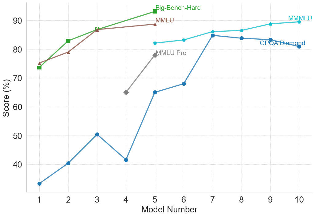
## Multi-Line Chart: AI Model Benchmark Performance Comparison
### Overview
This image is a multi-line chart comparing the performance scores (in percentage) of different AI models across five distinct benchmarks. The chart plots "Score (%)" on the vertical axis against "Model Number" (1 through 10) on the horizontal axis. Each line represents a different benchmark, identified by a unique color and marker shape. The overall trend shows that model performance generally increases with higher model numbers, though the rate of improvement and absolute scores vary significantly by benchmark.
### Components/Axes
* **Chart Type:** Multi-line chart with markers.
* **X-Axis (Horizontal):**
* **Label:** "Model Number"
* **Scale:** Linear, integer values from 1 to 10.
* **Y-Axis (Vertical):**
* **Label:** "Score (%)"
* **Scale:** Linear, ranging from 30 to 90, with major gridlines every 10 units (40, 50, 60, 70, 80, 90).
* **Legend:** Positioned in the top-right quadrant of the chart area. It lists five benchmarks with corresponding colors and markers:
1. **Big-Bench-Hard:** Green line with square markers (■).
2. **MMLU:** Brown line with upward-pointing triangle markers (▲).
3. **MMLU Pro:** Gray line with diamond markers (◆).
4. **MMMLU:** Cyan (light blue) line with circle markers (●).
5. **GPQA Diamond:** Blue line with circle markers (●).
* **Grid:** A light gray, dotted grid is present for both horizontal and vertical axes.
### Detailed Analysis
**Data Series and Trends (with approximate values):**
1. **Big-Bench-Hard (Green, ■):**
* **Trend:** Steep, consistent upward slope from Model 1 to Model 5.
* **Data Points:**
* Model 1: ~74%
* Model 2: ~83%
* Model 3: ~87%
* Model 4: ~88% (estimated, point lies between 80 and 90, closer to 90)
* Model 5: ~93% (highest point on the entire chart)
2. **MMLU (Brown, ▲):**
* **Trend:** Steady upward slope, parallel to but slightly below Big-Bench-Hard for Models 1-3, then plateaus.
* **Data Points:**
* Model 1: ~75%
* Model 2: ~79%
* Model 3: ~87% (appears to converge with Big-Bench-Hard at this point)
* Model 4: ~88% (estimated, very close to Big-Bench-Hard)
* Model 5: ~89%
3. **MMLU Pro (Gray, ◆):**
* **Trend:** Sharp increase over a short range (Models 4-5).
* **Data Points:**
* Model 4: ~65%
* Model 5: ~78%
4. **MMMLU (Cyan, ●):**
* **Trend:** Gradual, consistent upward slope from Model 5 to Model 10.
* **Data Points:**
* Model 5: ~82%
* Model 6: ~83%
* Model 7: ~86%
* Model 8: ~87%
* Model 9: ~89%
* Model 10: ~90%
5. **GPQA Diamond (Blue, ●):**
* **Trend:** Volatile but overall upward trend. Starts very low, experiences a significant dip at Model 4, then rises sharply to a peak at Model 7 before a slight decline.
* **Data Points:**
* Model 1: ~33%
* Model 2: ~40%
* Model 3: ~50%
* Model 4: ~42% (notable dip)
* Model 5: ~65%
* Model 6: ~68%
* Model 7: ~85% (peak for this series)
* Model 8: ~84%
* Model 9: ~83%
* Model 10: ~81%
### Key Observations
* **Performance Hierarchy:** For the models where data is available (Models 1-5), Big-Bench-Hard and MMLU consistently yield the highest scores, followed by MMLU Pro, with GPQA Diamond being the most challenging (lowest scores).
* **Convergence:** The scores for Big-Bench-Hard and MMLU are nearly identical for Models 3, 4, and 5.
* **Significant Outlier:** The GPQA Diamond score for Model 4 (~42%) is a clear outlier, breaking its upward trend and falling below its score for Model 3 (~50%).
* **Benchmark Range:** The spread of scores is widest at Model 1 (from ~33% to ~75%) and narrows considerably by Model 5 (from ~65% to ~93%).
* **Late-Stage Plateau:** The MMMLU and GPQA Diamond benchmarks show a plateau or slight decline in scores for the highest model numbers (8-10), suggesting potential performance saturation on these tasks.
### Interpretation
This chart visualizes the progression of AI model capabilities across a suite of standardized benchmarks. The "Model Number" likely represents a sequence of increasingly capable or larger models from a single family or a chronological release order.
The data suggests several insights:
1. **Benchmark Difficulty:** The benchmarks are not equally difficult. GPQA Diamond appears to be the most challenging, especially for earlier models, while Big-Bench-Hard and MMLU are more readily mastered by mid-sequence models.
2. **Non-Linear Progression:** Model improvement is not uniform across all tasks. The sharp rise in GPQA Diamond scores from Model 4 to 7 indicates a breakthrough in the specific capabilities that benchmark tests (likely complex reasoning or domain-specific knowledge). Conversely, the dip at Model 4 for GPQA Diamond could indicate a model that was optimized for other benchmarks at the expense of this one.
3. **Ceiling Effects:** The flattening of the MMMLU and GPQA Diamond curves at the high end suggests that current models may be approaching the performance ceiling for these particular evaluations, or that further architectural changes yield diminishing returns on these tasks.
4. **Comparative Analysis:** The chart allows for direct comparison of how a single model (e.g., Model 5) performs across different challenges. Model 5 excels at Big-Bench-Hard (~93%) but finds GPQA Diamond significantly harder (~65%), highlighting its relative strengths and weaknesses.
In essence, the chart documents a narrative of advancing AI performance, where each successive model generally improves, but the path is uneven, with different benchmarks revealing different facets of capability growth and limitation.