TECHNICAL ASSET FINGERPRINT
84d125a616c35831334bb29b
Click to view fullscreen
Press ESC or click to close
FOUND IN PAPERS
EXPERT: gemini-2.5-flash-free VERSION 1
RUNTIME: google-free/gemini-2.5-flash
INTEL_VERIFIED
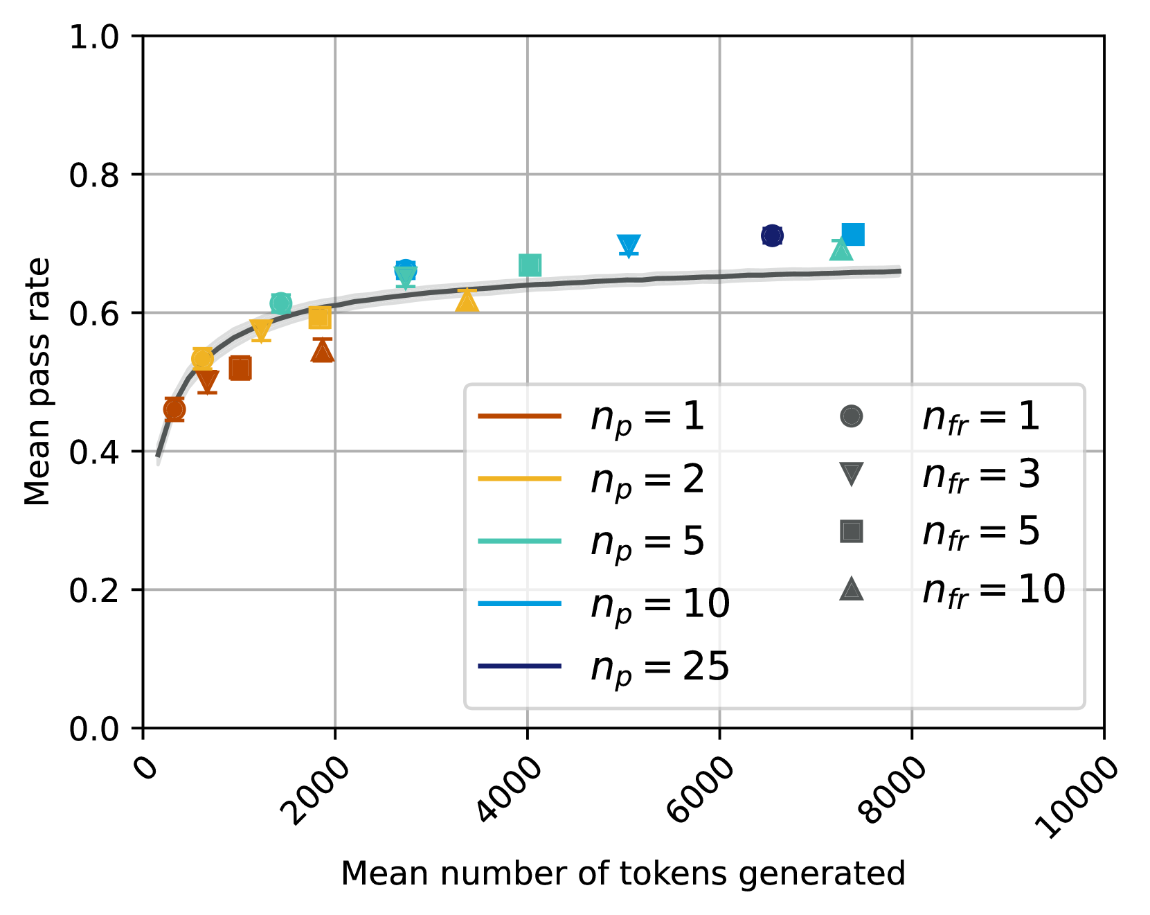
## Chart Type: Scatter Plot with Fitted Curve: Mean Pass Rate vs. Mean Number of Tokens Generated
### Overview
This image displays a scatter plot illustrating the relationship between the "Mean number of tokens generated" on the x-axis and the "Mean pass rate" on the y-axis. The plot includes a fitted curve with a confidence interval, representing the overall trend. Individual data points are categorized by two parameters, `n_p` (represented by color) and `n_fr` (represented by marker shape), as detailed in the legend. The chart primarily shows how different configurations of these parameters affect the pass rate and the computational cost in terms of tokens generated.
### Components/Axes
The chart is structured with a main plotting area, an x-axis at the bottom, a y-axis on the left, and a legend positioned in the bottom-center-right of the plotting area.
* **X-axis Label**: "Mean number of tokens generated"
* **X-axis Range**: From 0 to 10000.
* **X-axis Major Ticks**: 0, 2000, 4000, 6000, 8000, 10000. The tick labels are rotated approximately 45 degrees counter-clockwise.
* **Y-axis Label**: "Mean pass rate"
* **Y-axis Range**: From 0.0 to 1.0.
* **Y-axis Major Ticks**: 0.0, 0.2, 0.4, 0.6, 0.8, 1.0.
* **Legend**: Located within the plot area, spanning from approximately X=3000 to X=8000 and Y=0.05 to Y=0.35. It is divided into two columns:
* **Left Column (Line styles, representing `n_p` values):**
* Brown line: `n_p = 1`
* Orange/Gold line: `n_p = 2`
* Teal/Light Green line: `n_p = 5`
* Light Blue line: `n_p = 10`
* Dark Blue/Indigo line: `n_p = 25`
* **Right Column (Marker shapes, representing `n_fr` values):**
* Gray circle: `n_fr = 1`
* Gray downward triangle: `n_fr = 3`
* Gray square: `n_fr = 5`
* Gray upward triangle: `n_fr = 10`
### Detailed Analysis
The chart displays a dark gray fitted curve with a lighter gray shaded confidence interval, representing the overall trend. Superimposed on this curve are 20 individual data points, each colored according to its `n_p` value and shaped according to its `n_fr` value.
**Fitted Curve Trend and Approximate Values:**
The dark gray fitted curve shows a clear positive correlation: as the "Mean number of tokens generated" increases, the "Mean pass rate" also increases. The rate of increase is steep initially and then gradually flattens out, suggesting diminishing returns. The light gray band around the curve indicates a confidence interval.
* At X ≈ 0, Y ≈ 0.40
* At X ≈ 1000, Y ≈ 0.55
* At X ≈ 2000, Y ≈ 0.60
* At X ≈ 4000, Y ≈ 0.63
* At X ≈ 6000, Y ≈ 0.65
* At X ≈ 8000, Y ≈ 0.66
**Individual Data Points (Scatter Plot):**
The data points generally follow the trend of the fitted curve. Each point represents a unique combination of `n_p` and `n_fr`.
* **`n_p = 1` (Brown points):**
* Circle (`n_fr = 1`): (X ≈ 450, Y ≈ 0.45)
* Downward Triangle (`n_fr = 3`): (X ≈ 700, Y ≈ 0.48)
* Square (`n_fr = 5`): (X ≈ 1000, Y ≈ 0.51)
* Upward Triangle (`n_fr = 10`): (X ≈ 1500, Y ≈ 0.53)
* **`n_p = 2` (Orange/Gold points):**
* Circle (`n_fr = 1`): (X ≈ 600, Y ≈ 0.50)
* Downward Triangle (`n_fr = 3`): (X ≈ 1000, Y ≈ 0.53)
* Square (`n_fr = 5`): (X ≈ 1500, Y ≈ 0.58)
* Upward Triangle (`n_fr = 10`): (X ≈ 2000, Y ≈ 0.60)
* **`n_p = 5` (Teal/Light Green points):**
* Circle (`n_fr = 1`): (X ≈ 1000, Y ≈ 0.58)
* Downward Triangle (`n_fr = 3`): (X ≈ 1500, Y ≈ 0.61)
* Square (`n_fr = 5`): (X ≈ 2500, Y ≈ 0.65)
* Upward Triangle (`n_fr = 10`): (X ≈ 3500, Y ≈ 0.62)
* **`n_p = 10` (Light Blue points):**
* Circle (`n_fr = 1`): (X ≈ 1500, Y ≈ 0.60)
* Downward Triangle (`n_fr = 3`): (X ≈ 2500, Y ≈ 0.68)
* Square (`n_fr = 5`): (X ≈ 4500, Y ≈ 0.69)
* Upward Triangle (`n_fr = 10`): (X ≈ 7500, Y ≈ 0.69)
* **`n_p = 25` (Dark Blue/Indigo points):**
* Circle (`n_fr = 1`): (X ≈ 2000, Y ≈ 0.62)
* Downward Triangle (`n_fr = 3`): (X ≈ 3000, Y ≈ 0.67)
* Square (`n_fr = 5`): (X ≈ 5500, Y ≈ 0.70)
* Upward Triangle (`n_fr = 10`): (X ≈ 7000, Y ≈ 0.71)
### Key Observations
1. **General Trend**: There is a clear positive correlation between the mean number of tokens generated and the mean pass rate. The pass rate increases rapidly at lower token counts and then plateaus, indicating diminishing returns for generating more tokens beyond a certain point.
2. **Effect of `n_p`**: Higher values of `n_p` (represented by colors shifting from brown to dark blue) generally correspond to higher mean pass rates for a given range of tokens generated. For instance, `n_p=25` points achieve pass rates around 0.70-0.71, while `n_p=1` points peak around 0.53.
3. **Effect of `n_fr`**: Within each `n_p` group (i.e., for points of the same color), increasing `n_fr` (represented by marker shapes from circle to upward triangle) generally leads to a higher "Mean number of tokens generated." This suggests `n_fr` directly influences the output length or computational effort.
4. **Interaction of `n_p` and `n_fr`**: For a fixed `n_p`, increasing `n_fr` tends to move the data point to the right (more tokens generated) and generally upwards (higher pass rate), following the overall curve.
5. **Outlier/Anomaly**: The teal upward triangle point (`n_p = 5`, `n_fr = 10`) is located at approximately (X ≈ 3500, Y ≈ 0.62). This point appears to have a slightly lower pass rate compared to the general trend of increasing pass rate with increasing `n_fr` for `n_p=5` (where `n_fr=5` is at Y ≈ 0.65). It also falls slightly below the fitted curve, suggesting a potential deviation from the expected performance for this specific configuration.
### Interpretation
The data presented in this chart likely illustrates the performance characteristics of a system (e.g., a language model or code generation system) where `n_p` and `n_fr` are configurable parameters.
* **Performance vs. Cost Trade-off**: The chart fundamentally demonstrates a trade-off. To achieve a higher "Mean pass rate" (better performance), one generally needs to increase the "Mean number of tokens generated" (higher computational cost or longer output).
* **Role of `n_p`**: The parameter `n_p` appears to be a critical factor in determining the *potential maximum pass rate*. Higher `n_p` values enable the system to achieve significantly better performance, suggesting it might relate to the number of parallel attempts, diverse candidates, or overall model capacity. Increasing `n_p` shifts the performance curve upwards.
* **Role of `n_fr`**: The parameter `n_fr` seems to control the *granularity or extent of generation* for each `n_p` setting. Higher `n_fr` values lead to more tokens being generated, which in turn generally contributes to a higher pass rate, but also increases the computational burden. It scales the x-axis for a given `n_p`.
* **Diminishing Returns**: The flattening of the curve indicates that there's a point where further increasing the number of tokens generated yields only marginal improvements in the pass rate. This is crucial for optimizing resource allocation.
* **Potential for Optimization**: The observed outlier (`n_p=5, n_fr=10`) suggests that simply increasing `n_fr` might not always lead to monotonic improvements, especially for intermediate `n_p` values. There might be an optimal `n_fr` for each `n_p` beyond which performance either plateaus or even slightly degrades due to factors like increased noise, irrelevant output, or computational overhead without corresponding quality gains. This highlights the need for careful tuning of both parameters.
* **Practical Implications**: For practical deployment, one would need to balance the desired pass rate with the acceptable computational cost (tokens generated). If high pass rates are critical, higher `n_p` values are necessary. If computational efficiency is paramount, lower `n_p` and `n_fr` values might be chosen, accepting a lower pass rate.
DECODING INTELLIGENCE...