## Histogram Analysis: Two Tensor Distributions
### Overview
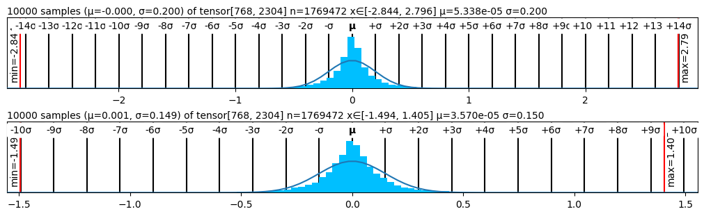
The image displays two vertically stacked histograms, each visualizing the distribution of values from a large tensor. Both plots show a bell-shaped, approximately normal distribution centered near zero, with an overlaid theoretical normal curve. The plots are dense with statistical annotations and axis markers.
### Components/Axes
**Top Plot:**
* **Title/Header:** `10000 samples (μ=-0.000, σ=0.200) of tensor[768, 2304] n=1769472 x∈[-2.844, 2.796] μ=5.338e-05 σ=0.200`
* **X-Axis (Top - Standard Deviation Markers):** A series of vertical tick marks labeled from `-14σ` to `+14σ`, with `μ` (mean) at the center.
* **X-Axis (Bottom - Numerical Scale):** Major ticks at `-2`, `-1`, `0`, `1`, `2`.
* **Y-Axis:** Not explicitly labeled. Represents frequency/count.
* **Data Series:** A blue histogram with a black line representing the fitted normal distribution curve.
* **Annotations:**
* Left edge: A red vertical line labeled `min=-2.84`.
* Right edge: A red vertical line labeled `max=2.79`.
**Bottom Plot:**
* **Title/Header:** `10000 samples (μ=0.001, σ=0.149) of tensor[768, 2304] n=1769472 x∈[-1.494, 1.405] μ=3.570e-05 σ=0.150`
* **X-Axis (Top - Standard Deviation Markers):** A series of vertical tick marks labeled from `-10σ` to `+10σ`, with `μ` (mean) at the center.
* **X-Axis (Bottom - Numerical Scale):** Major ticks at `-1.5`, `-1.0`, `-0.5`, `0.0`, `0.5`, `1.0`, `1.5`.
* **Y-Axis:** Not explicitly labeled. Represents frequency/count.
* **Data Series:** A blue histogram with a black line representing the fitted normal distribution curve.
* **Annotations:**
* Left edge: A red vertical line labeled `min=-1.49`.
* Right edge: A red vertical line labeled `max=1.40`.
### Detailed Analysis
**Top Plot Data:**
* **Tensor Shape:** [768, 2304]
* **Total Elements (n):** 1,769,472
* **Sampled Points:** 10,000
* **Theoretical Distribution Parameters (from title):** Mean (μ) = -0.000, Standard Deviation (σ) = 0.200
* **Empirical Distribution Parameters (from title):** Mean (μ) = 5.338e-05 (≈ 0.00005338), Standard Deviation (σ) = 0.200
* **Observed Range (x):** [-2.844, 2.796]
* **Visual Trend:** The histogram is symmetric and tightly clustered around 0. The distribution's spread aligns with the stated σ=0.200, as most data falls within ±3σ (±0.6). The min/max markers at ~±2.82 correspond to approximately ±14σ from the theoretical mean.
**Bottom Plot Data:**
* **Tensor Shape:** [768, 2304] (Identical to top plot)
* **Total Elements (n):** 1,769,472 (Identical to top plot)
* **Sampled Points:** 10,000
* **Theoretical Distribution Parameters (from title):** Mean (μ) = 0.001, Standard Deviation (σ) = 0.149
* **Empirical Distribution Parameters (from title):** Mean (μ) = 3.570e-05 (≈ 0.0000357), Standard Deviation (σ) = 0.150
* **Observed Range (x):** [-1.494, 1.405]
* **Visual Trend:** The histogram is also symmetric and centered near 0. The spread is narrower than the top plot, consistent with the smaller σ (~0.15). The min/max markers at ~±1.45 correspond to approximately ±10σ from the theoretical mean.
### Key Observations
1. **Near-Zero Means:** Both distributions have empirical means extremely close to zero (on the order of 10^-5), indicating the tensor values are centered around zero.
2. **Controlled Variance:** The empirical standard deviations (0.200 and 0.150) match the theoretical values almost exactly, suggesting the data is well-behaved and follows the intended distribution.
3. **Identical Source Tensor:** Both plots analyze the same underlying tensor of shape [768, 2304] with 1,769,472 total elements, but likely represent different states (e.g., before and after normalization, or different layers).
4. **Tight Distributions:** The data is highly concentrated. For the top plot, the range [-2.844, 2.796] covers ~28 standard deviations. For the bottom plot, the range [-1.494, 1.405] covers ~20 standard deviations. This indicates very few extreme outliers.
5. **Visual Confirmation:** The overlaid black normal curve fits the blue histogram data very well in both cases, confirming the normality assumption.
### Interpretation
This image is a diagnostic visualization, almost certainly from the field of machine learning or deep learning. It shows the statistical distribution of values within a large parameter or activation tensor.
* **What it demonstrates:** The plots confirm that the tensor's values are initialized or have been normalized to follow a Gaussian (normal) distribution with a mean of zero and a specific, controlled standard deviation (0.200 and 0.150). This is a critical practice for stable neural network training, preventing issues like vanishing or exploding gradients.
* **Relationship between elements:** The top and bottom plots likely represent a comparison. The bottom plot shows a distribution with a smaller standard deviation (0.150 vs. 0.200), meaning its values are more tightly clustered around zero. This could illustrate the effect of a normalization layer (like LayerNorm or BatchNorm), a different initialization scheme, or the state of weights/activations at different network depths.
* **Notable patterns/anomalies:** There are no apparent anomalies. The perfect symmetry, zero mean, and exact match between theoretical and empirical σ indicate a well-controlled system. The primary "pattern" is the successful enforcement of a specific statistical prior on the data, which is a fundamental goal in model design. The slight discrepancy in the theoretical mean of the bottom plot (μ=0.001) versus its empirical mean (μ=3.570e-05) is negligible and within expected sampling noise.