\n
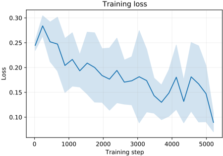
## Line Chart: Training Loss
### Overview
The image presents a line chart illustrating the training loss over training steps. The chart displays a single blue line representing the average loss, with a shaded light blue area indicating the variance or standard deviation around that average. The chart's purpose is to visualize how well a model is learning during the training process.
### Components/Axes
* **Title:** "Training loss" - positioned at the top-center of the chart.
* **X-axis:** "Training step" - ranging from approximately 0 to 5000, with grid lines.
* **Y-axis:** "Loss" - ranging from approximately 0.10 to 0.30, with grid lines.
* **Data Series:** A single blue line representing the average training loss.
* **Shaded Area:** A light blue shaded region representing the variance around the average loss.
### Detailed Analysis
The blue line representing the average training loss generally slopes downward from left to right, indicating a decreasing loss as the training progresses. The line exhibits fluctuations, showing periods of faster and slower learning.
Here's a breakdown of approximate data points:
* **Step 0:** Loss ≈ 0.28
* **Step 500:** Loss ≈ 0.23
* **Step 1000:** Loss ≈ 0.21
* **Step 1500:** Loss ≈ 0.18
* **Step 2000:** Loss ≈ 0.14
* **Step 2500:** Loss ≈ 0.16
* **Step 3000:** Loss ≈ 0.15
* **Step 3500:** Loss ≈ 0.17
* **Step 4000:** Loss ≈ 0.16
* **Step 4500:** Loss ≈ 0.14
* **Step 5000:** Loss ≈ 0.13
The shaded light blue area varies in width, indicating changes in the standard deviation of the loss. The area is wider at the beginning of training (around step 0-1000) and narrows as training progresses, suggesting that the loss becomes more consistent over time.
### Key Observations
* The training loss decreases overall, indicating that the model is learning.
* The initial phase of training (steps 0-1000) exhibits higher loss and greater variance.
* The loss plateaus somewhat between steps 2000 and 4000, suggesting a slower learning rate.
* The final steps (4000-5000) show a continued decrease in loss, but the magnitude of the decrease is smaller.
### Interpretation
The chart demonstrates a typical learning curve for a machine learning model. The initial high loss and large variance indicate that the model is initially far from optimal and is making significant adjustments. As training progresses, the loss decreases and the variance narrows, indicating that the model is converging towards a more stable and accurate solution. The plateau between steps 2000 and 4000 could suggest that the learning rate needs to be adjusted or that the model is approaching its maximum performance. The continued decrease in loss at the end of training suggests that further training could potentially yield additional improvements, but the diminishing returns may indicate that the model is nearing convergence. The overall trend is positive, suggesting that the training process is effective.