## World Map: Distribution of Measurement Data Types and Temporal Coverage
### Overview
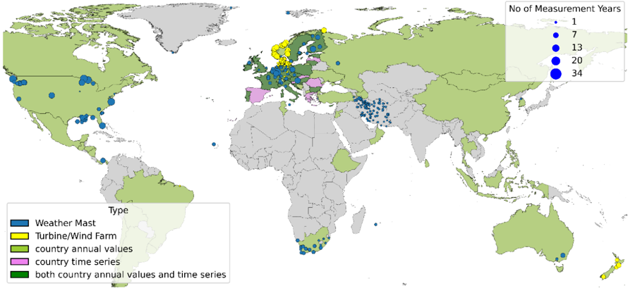
The image is a world map with colored dots representing different types of environmental measurement data and their temporal coverage. The map uses a color-coded legend to distinguish between data types (Weather Mast, Turbine/Wind Farm, country annual values, country time series, and both) and a scale to indicate the number of measurement years (1, 7, 13, 34). The spatial distribution of these data points highlights regional patterns in data collection.
### Components/Axes
- **Legend (Left Side)**:
- **Blue**: Weather Mast
- **Yellow**: Turbine/Wind Farm
- **Green**: Country annual values
- **Pink**: Country time series
- **Dark Green**: Both country annual values and time series
- **Scale (Right Side)**:
- **Dot Size**: Number of measurement years (1, 7, 13, 34)
- **Color**: Data type (as per legend)
- **Map**:
- **Countries**: Colored based on data type (green for "country annual values," pink for "country time series," etc.)
- **Dots**: Placed over countries to indicate specific measurement locations (e.g., Weather Masts, Turbine/Wind Farms).
### Detailed Analysis
- **Weather Mast (Blue)**:
- Concentrated in North America (e.g., United States, Canada), Europe (e.g., Germany, France), and parts of Asia (e.g., China, India).
- Dot sizes vary: 1–34 measurement years, with larger dots (34 years) in Europe and North America.
- **Turbine/Wind Farm (Yellow)**:
- Dominant in Europe (e.g., Germany, Denmark, Spain) and Australia.
- Dot sizes: 1–34 years, with larger dots in Europe.
- **Country Annual Values (Green)**:
- Widespread across all continents, with higher density in Europe, North America, and Asia.
- Dot sizes: 1–34 years, with larger dots in Europe and North America.
- **Country Time Series (Pink)**:
- Limited to Europe (e.g., Germany, France) and parts of Asia (e.g., China).
- Dot sizes: 1–34 years, with larger dots in Europe.
- **Both Country Annual Values and Time Series (Dark Green)**:
- Rare, with only a few dots in Europe (e.g., Germany, France) and North America (e.g., United States).
### Key Observations
1. **Europe Dominates Wind Energy Data**:
- Yellow (Turbine/Wind Farm) and pink (country time series) dots are most concentrated in Europe, suggesting a focus on renewable energy infrastructure and long-term data collection.
2. **North America Has Mixed Data Types**:
- Blue (Weather Mast) and green (country annual values) dots are prevalent, indicating a balance between weather monitoring and annual environmental data.
3. **Temporal Coverage**:
- Larger dots (34 years) are primarily in Europe and North America, reflecting longer-term data collection efforts.
4. **Sparse Data in Africa and South America**:
- Fewer dots overall, with smaller sizes (1–7 years), suggesting limited measurement infrastructure or shorter data collection periods.
### Interpretation
The map reveals a clear regional disparity in environmental data collection. Europe’s dominance in wind energy (yellow dots) and time series data (pink) aligns with its leadership in renewable energy policies. North America’s mix of Weather Masts (blue) and annual values (green) highlights a focus on both real-time weather monitoring and aggregated environmental metrics. The scarcity of data in Africa and South America (smaller dots, fewer years) may indicate underdeveloped infrastructure or prioritization of other data types. The presence of "both" data types (dark green) in Europe and North America suggests integrated approaches to environmental monitoring, combining historical trends with real-time measurements. This spatial and temporal distribution underscores the importance of regional policies and resource allocation in shaping environmental data ecosystems.