## Heatmap: Targets vs. Outputs Over Time
### Overview
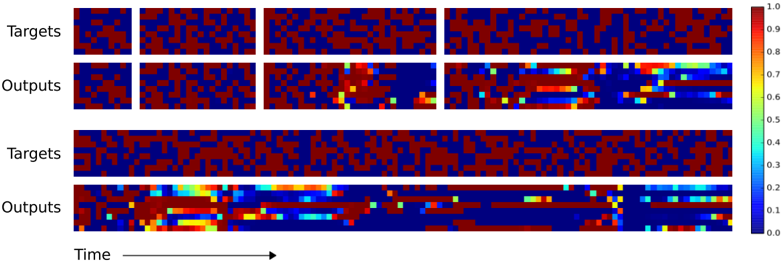
The image presents a series of heatmaps comparing "Targets" and "Outputs" over time. The heatmaps use a color gradient from blue (0.0) to red (1.0) to represent the magnitude of values. There are two sets of "Targets" and "Outputs" heatmaps displayed. The x-axis represents "Time," and the y-axis is not explicitly labeled but represents different data points or features.
### Components/Axes
* **Y-Axis Labels:** "Targets", "Outputs" (repeated twice)
* **X-Axis Label:** "Time" (with an arrow indicating direction)
* **Color Scale:** A vertical color bar on the right side of the image, ranging from 0.0 (blue) to 1.0 (red), with increments of 0.1.
### Detailed Analysis
The image is divided into two main sections, each containing a "Targets" heatmap and a corresponding "Outputs" heatmap.
**First Section (Top):**
* **Targets:** The "Targets" heatmap shows a seemingly random distribution of high (red) and low (blue) values. There are two distinct blocks separated by a white vertical line.
* **Outputs:** The "Outputs" heatmap shows a similar random distribution initially, but as "Time" progresses, there are regions where the values become more consistently high (red and yellow). There are also two distinct blocks separated by a white vertical line.
**Second Section (Bottom):**
* **Targets:** The "Targets" heatmap again shows a seemingly random distribution of high (red) and low (blue) values.
* **Outputs:** The "Outputs" heatmap shows a similar pattern to the first section. Initially, there is a random distribution, but as "Time" progresses, there are regions where the values become more consistently high (red and yellow).
**Color Scale Values:**
* Red: 1.0
* Orange-Red: ~0.8-0.9
* Yellow: ~0.6-0.7
* Green: ~0.4-0.5
* Light Blue: ~0.2-0.3
* Dark Blue: 0.0-0.1
### Key Observations
* The "Targets" heatmaps appear to be relatively static and random across both sections.
* The "Outputs" heatmaps show a change over "Time," with some regions transitioning from low (blue) to high (red/yellow) values.
* The two sections seem to represent different trials or instances of the same process.
* The white vertical lines in the first section of "Targets" and "Outputs" suggest a break or separation in the data.
### Interpretation
The image likely represents the comparison of desired "Targets" with the actual "Outputs" of a system or model over time. The "Targets" represent the desired state, while the "Outputs" represent the actual state achieved by the system. The change in the "Outputs" heatmaps over time suggests that the system is learning or adapting to match the "Targets." The differences between the two sections indicate that the system's performance may vary across different trials or initial conditions. The presence of high values (red) in the "Outputs" heatmaps indicates that the system is successfully matching the "Targets" in those regions. The white lines in the first section could indicate a reset or change in the input data.