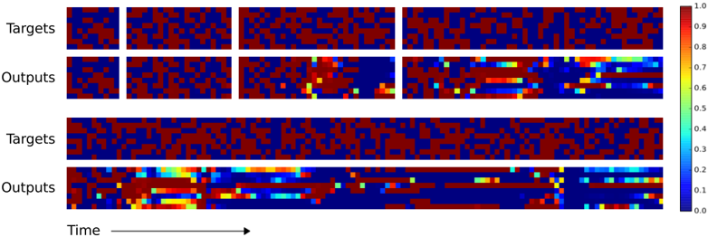
## Heatmap Visualization: Target vs Output Data Over Time
### Overview
The image presents a comparative heatmap visualization of "Targets" and "Outputs" across a temporal dimension. Two distinct sections are displayed:
1. **Top Section**: Four smaller heatmaps (2x2 grid) comparing Targets (top row) and Outputs (bottom row)
2. **Bottom Section**: Two elongated heatmaps (1x2 grid) showing extended temporal data for Targets (top) and Outputs (bottom)
### Components/Axes
- **Y-Axis**:
- Labels: "Targets" (top row) and "Outputs" (bottom row)
- Spatial Position: Top row for Targets, bottom row for Outputs
- **X-Axis**:
- Label: "Time" with rightward arrow indicating progression
- Spatial Position: Bottom of all heatmaps
- **Color Legend**:
- Scale: 0.0 (blue) to 1.0 (red)
- Position: Right side of image
- Gradient: Blue → Green → Yellow → Red
### Detailed Analysis
#### Top Section (2x2 Grid)
- **Targets (Top Row)**:
- Four heatmaps show predominantly red (0.8-1.0) and blue (0.0-0.2) regions
- Minimal intermediate values (green/yellow)
- Spatial Pattern: Clustered red regions with isolated blue patches
- **Outputs (Bottom Row)**:
- Introduces yellow (0.6-0.8) and green (0.4-0.6) regions
- Spatial Pattern: Red regions persist but with localized yellow/green transitions
- Notable: Bottom-right heatmap shows most extensive color diversity
#### Bottom Section (1x2 Grid)
- **Targets (Top Row)**:
- Uniform red/blue distribution with no intermediate values
- Spatial Pattern: Consistent clustering of red regions across time
- **Outputs (Bottom Row)**:
- Dominant yellow/green regions (0.4-0.8) with residual red/blue
- Spatial Pattern:
- Left heatmap: Gradual transition from red to yellow
- Right heatmap: Concentrated yellow/green with trailing blue regions
- Temporal Progression: Increased color diversity toward the right
### Key Observations
1. **Color Transition**: Outputs consistently show more intermediate values (yellow/green) than Targets
2. **Temporal Dynamics**:
- Left-side heatmaps (earlier time) show gradual Output changes
- Right-side heatmaps (later time) exhibit more pronounced Output diversity
3. **Spatial Correlation**:
- Outputs maintain red regions from Targets but introduce new color zones
- Bottom-right Output heatmap shows most significant divergence from Targets
### Interpretation
The visualization suggests a system processing input data (Targets) over time, producing modified outputs with:
- **Intermediate Value Introduction**: Outputs demonstrate 0.4-0.8 range activity absent in Targets
- **Temporal Evolution**: Output complexity increases over time, evidenced by expanding yellow/green regions
- **Spatial Transformation**: Outputs preserve some Target characteristics (red regions) while adding new patterns (yellow/green)
Notable anomalies include the abrupt blue regions in Outputs (bottom-right heatmap), potentially indicating system resets or error states. The consistent red regions across both Targets and Outputs suggest preserved core data elements through processing.