## Diagram: Data Flow and Prediction Logic
### Overview
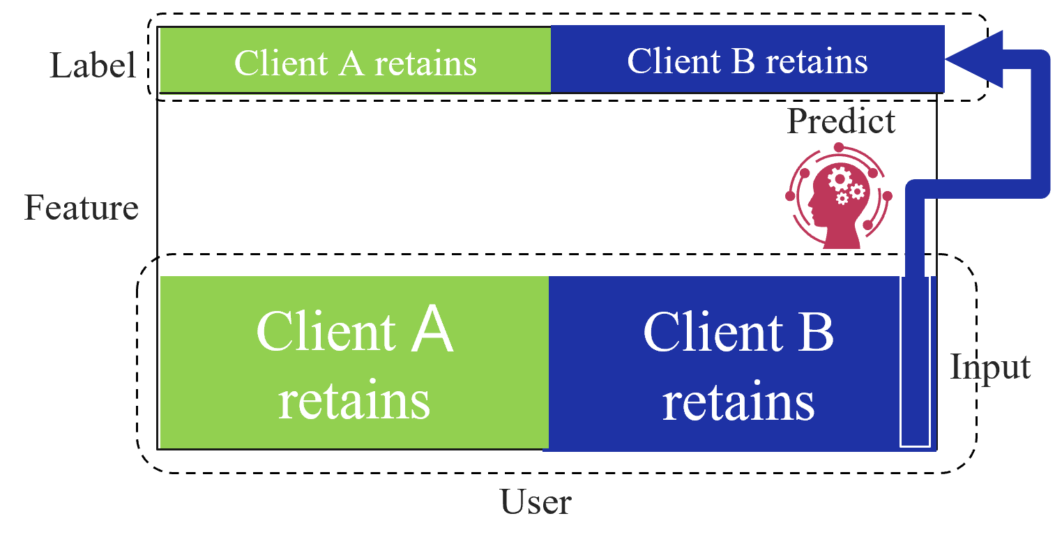
This diagram illustrates a data processing or machine learning workflow involving two primary data containers: "Label" and "User." It depicts a process where "Input" data, likely derived from the "User" section, is processed through a "Predict" mechanism to influence or align with the "Label" section. The diagram uses color-coded segments to distinguish between two categories: "Client A" and "Client B."
### Components/Axes
* **Top Box ("Label"):** A rectangular container with a dashed border. It contains a horizontal bar divided into two segments:
* **Left Segment (Green):** Labeled "Client A retains."
* **Right Segment (Dark Blue):** Labeled "Client B retains."
* **Bottom Box ("User"):** A larger rectangular container with a dashed border. It contains a horizontal bar divided into two segments:
* **Left Segment (Green):** Labeled "Client A retains."
* **Right Segment (Dark Blue):** Labeled "Client B retains."
* **Flow Path ("Input"):** A thick blue arrow originating from the right side of the "User" box, extending upward, and turning left to point directly into the "Client B retains" segment of the "Label" box.
* **Icon ("Predict"):** A red icon depicting a human head silhouette containing gears, positioned between the "Label" and "User" boxes, slightly to the right of center.
* **Labels:**
* "Label": Positioned to the left of the top box.
* "Feature": Positioned to the left of the empty space between the two boxes.
* "User": Positioned below the bottom box.
* "Predict": Positioned above the icon.
* "Input": Positioned to the right of the bottom box, near the start of the arrow.
### Detailed Analysis
* **Spatial Grounding:**
* The "Label" box is positioned at the top of the diagram.
* The "User" box is positioned at the bottom of the diagram.
* The "Feature" label is vertically centered between the two boxes on the far left.
* The "Input" arrow creates a vertical connection on the right side, linking the "User" domain to the "Label" domain.
* **Color Coding:**
* **Green:** Represents "Client A retains" in both the "Label" and "User" sections.
* **Dark Blue:** Represents "Client B retains" in both the "Label" and "User" sections.
* **Flow Logic:** The "Input" arrow specifically targets the "Client B retains" section of the "Label" box. This implies that the "Input" is a feature vector or data stream derived from the "User" that is being fed into the "Predict" function to generate or validate the "Client B" label.
### Key Observations
* **Symmetry:** Both the "Label" and "User" boxes share the same internal structure (Client A/Client B split), suggesting a mapping or comparison between these two datasets.
* **Targeted Flow:** The "Input" arrow does not interact with the "Client A" segments; it is exclusively routed to the "Client B" segment of the "Label" box.
* **Icon Placement:** The "Predict" icon acts as a bridge or transformation layer between the "User" data and the "Label" data.
### Interpretation
This diagram represents a supervised learning or data classification pipeline.
* **"User"** likely represents the raw input data or features available for a specific user.
* **"Label"** represents the ground truth or the target classification that the system aims to predict.
* **"Predict"** represents the model or inference engine.
* **The Logic:** The diagram demonstrates that the system is specifically processing "Client B" data. The "Input" (likely a feature set) is being passed through the "Predict" engine to determine or verify the "Client B" retention status. The exclusion of "Client A" from the "Input" flow suggests that the current process is either specific to "Client B" or that "Client A" is handled by a separate, unshown process. The "Feature" label on the left suggests that the entire diagram is a visualization of a "Feature" engineering or prediction step within a larger system architecture.