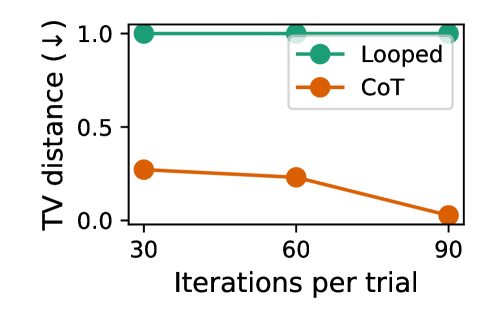
## Line Chart: TV Distance vs. Iterations per Trial
### Overview
The image is a line chart comparing two methods ("Looped" and "CoT") across three iterations per trial (30, 60, 90). The y-axis measures "TV distance" (ranging from 0.0 to 1.0), while the x-axis represents "Iterations per trial." The chart includes a legend in the top-right corner, with green circles for "Looped" and orange circles for "CoT."
### Components/Axes
- **X-axis (Horizontal)**: Labeled "Iterations per trial," with markers at 30, 60, and 90.
- **Y-axis (Vertical)**: Labeled "TV distance (↓)," scaled from 0.0 to 1.0 in increments of 0.5.
- **Legend**: Located in the top-right corner, with:
- Green circles labeled "Looped"
- Orange circles labeled "CoT"
### Detailed Analysis
1. **Looped (Green Line)**:
- **Trend**: Constant at 1.0 across all iterations (30, 60, 90).
- **Data Points**: Three green circles aligned horizontally at y = 1.0.
2. **CoT (Orange Line)**:
- **Trend**: Decreasing linearly from 30 to 90 iterations.
- **Data Points**:
- At 30 iterations: ~0.3 (orange circle).
- At 60 iterations: ~0.2 (orange circle).
- At 90 iterations: ~0.0 (orange circle).
### Key Observations
- The "Looped" method maintains a maximum TV distance of 1.0 throughout all iterations, showing no improvement.
- The "CoT" method demonstrates a consistent reduction in TV distance, dropping from ~0.3 at 30 iterations to ~0.0 at 90 iterations.
- The orange line (CoT) slopes downward, indicating a negative correlation between iterations and TV distance.
### Interpretation
The data suggests that the "CoT" method significantly improves performance (as measured by TV distance) with increasing iterations, while the "Looped" method remains static and ineffective. The stark contrast implies that CoT adapts or optimizes over time, whereas Looped lacks such capability. The TV distance metric likely quantifies deviation from a target, with lower values indicating better performance. This trend could inform iterative optimization strategies in technical workflows.