\n
## Bar Chart: Mean Values by Layer with CoT Accuracy Reference
### Overview
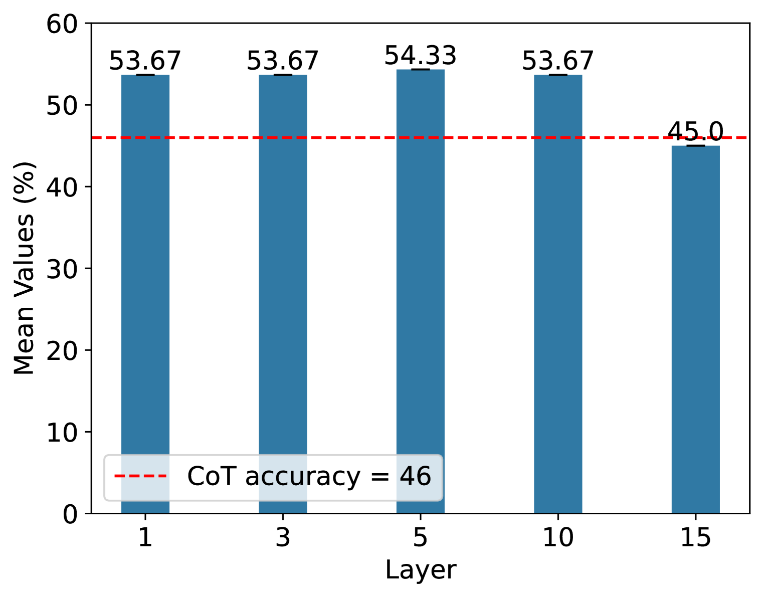
The image displays a vertical bar chart comparing "Mean Values (%)" across five distinct layers (1, 3, 5, 10, and 15). A horizontal red dashed line serves as a benchmark, labeled as "CoT accuracy = 46". The chart is presented on a white background with a simple, clean aesthetic.
### Components/Axes
* **Chart Type:** Vertical Bar Chart.
* **X-Axis (Horizontal):**
* **Label:** "Layer"
* **Categories/Markers:** 1, 3, 5, 10, 15. These are discrete, non-sequential numerical labels.
* **Y-Axis (Vertical):**
* **Label:** "Mean Values (%)"
* **Scale:** Linear scale from 0 to 60, with major tick marks at intervals of 10 (0, 10, 20, 30, 40, 50, 60).
* **Data Series (Bars):**
* Five blue bars, one for each layer category on the x-axis.
* Each bar has its exact numerical value annotated directly above it.
* **Reference Line & Legend:**
* A red dashed horizontal line spans the width of the chart.
* **Legend:** Located in the bottom-left corner of the plot area, inside a light gray box. It contains a sample of the red dashed line and the text "CoT accuracy = 46".
* The line is positioned at the y-axis value of 46.
### Detailed Analysis
**Data Points (Mean Values %):**
* **Layer 1:** 53.67
* **Layer 3:** 53.67
* **Layer 5:** 54.33
* **Layer 10:** 53.67
* **Layer 15:** 45.0
**Trend Verification:**
The visual trend shows a relatively stable, high plateau for the first four data points (Layers 1, 3, 5, 10), with a very slight peak at Layer 5. This is followed by a distinct and significant drop at the final data point (Layer 15).
**Spatial Grounding & Cross-Reference:**
* The legend is positioned in the **bottom-left** of the chart area.
* The red dashed reference line, corresponding to the legend, is placed at y=46.
* The bar for **Layer 15** (value 45.0) is the only bar whose top is visually below this red reference line. All other bars (Layers 1, 3, 5, 10) are clearly above it.
### Key Observations
1. **Performance Plateau:** Layers 1, 3, and 10 have identical mean values of 53.67%. Layer 5 is marginally higher at 54.33%. This indicates consistent performance across these four layers.
2. **Significant Drop at Layer 15:** There is a notable decrease in the mean value at Layer 15 to 45.0%, which is 8.67 percentage points lower than the plateau value.
3. **Benchmark Comparison:** The "CoT accuracy" benchmark is set at 46%. Layers 1, 3, 5, and 10 all perform above this benchmark (by ~7.7 to 8.3 percentage points). Layer 15 performs slightly below this benchmark (by 1 percentage point).
### Interpretation
This chart likely illustrates the performance (mean accuracy or a similar metric) of a model or system at different internal layers, compared to a Chain-of-Thought (CoT) reasoning accuracy baseline.
* **What the data suggests:** The system's performance is robust and consistent through its earlier and middle layers (1 through 10), consistently outperforming the CoT accuracy benchmark. However, performance degrades at a later layer (15), falling just below the benchmark.
* **Relationship between elements:** The red "CoT accuracy" line acts as a critical performance threshold. The chart's primary narrative is the comparison of layer-wise performance against this threshold. The drop at Layer 15 is the most salient feature, suggesting a potential point of failure, information loss, or a shift in the processing role at that depth in the model.
* **Notable anomaly:** The identical values for Layers 1, 3, and 10 are striking. This could indicate that the measured property is stable across these depths, or it might suggest a measurement or reporting artifact (e.g., values rounded to two decimal places from a common underlying value).
* **Implication:** If "Layer" corresponds to depth in a neural network, the findings imply that the model's representations relevant to this metric are well-maintained up to layer 10 but deteriorate by layer 15. This could inform decisions about where to extract features or apply interventions within the model architecture.