## Heatmap Array: Processing Order and Data Structure Impact
### Overview
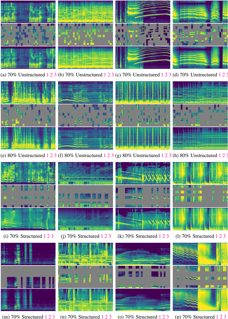
The image displays a 4x4 grid of heatmaps (16 total) comparing visual patterns across different data structure configurations and processing orders. Each heatmap is labeled with a percentage (70% or 80%) and a sequence identifier (1, 2, or 3), suggesting variations in data composition and processing stages.
### Components/Axes
- **Rows**: Labeled with percentages (70%, 80%, 70%) indicating data structure composition.
- **Columns**: Labeled with "Unstructured" or "Structured" followed by order numbers (1, 2, 3).
- **Color Gradient**: Blue-to-yellow scale (no explicit legend, but titles imply quantitative representation).
- **Spatial Layout**:
- Top row: 70% Unstructured (1, 2, 3)
- Second row: 80% Unstructured (1, 2, 3)
- Third row: 70% Structured (1, 2, 3)
- Bottom row: 70% Structured (1, 2, 3)
### Detailed Analysis
1. **Unstructured Data Trends**:
- **70% Unstructured (a, b, c)**:
- Horizontal yellow stripes dominate (a), vertical bands (b), and diagonal patterns (c).
- 80% Unstructured (e, f, g) shows increased vertical striping (e), fragmented blocks (f), and intensified diagonal gradients (g).
- **Structured Data (i, j, k, l, m, n, o, p)**:
- Structured 1 (i, m): Vertical yellow bands with gray interruptions.
- Structured 2 (j, n): Horizontal yellow stripes with gray gaps.
- Structured 3 (k, o, p): Diagonal yellow patterns with varying density.
2. **Order-Specific Patterns**:
- Order 1 (a, e, i, m): Vertical/horizontal dominance.
- Order 2 (b, f, j, n): Fragmented or alternating patterns.
- Order 3 (c, g, k, o, p): Diagonal complexity increases.
### Key Observations
- **Color Intensity**: Yellow regions (likely high values) cluster in specific zones, suggesting metric concentration.
- **Structured vs. Unstructured**: Structured data heatmaps (i-p) show more geometric regularity than unstructured counterparts.
- **Order Impact**: Processing order 3 consistently introduces diagonal complexity across all data types.
- **Percentage Effect**: 80% unstructured data (e, f, g) exhibits more chaotic patterns than 70% variants.
### Interpretation
The heatmaps likely represent a performance metric (e.g., accuracy, error rate) influenced by:
1. **Data Structure**: Structured data (i-p) shows predictable geometric patterns, implying stability.
2. **Processing Order**: Order 3 introduces diagonal complexity, possibly indicating iterative refinement or error propagation.
3. **Unstructured Data Threshold**: Higher unstructured content (80%) correlates with fragmented patterns, suggesting reduced model confidence or increased noise.
The absence of a legend limits quantitative interpretation, but the visual trends strongly suggest that structured data and specific processing orders optimize performance metrics. The diagonal patterns in order 3 heatmaps (c, g, k, o, p) may represent a critical transition phase in the processing pipeline.