## Pie Charts: Category and Difficulty Distribution
### Overview
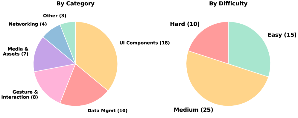
The image contains two pie charts. The left pie chart shows the distribution of items by category, while the right pie chart shows the distribution of items by difficulty. Each slice of the pie charts represents a different category or difficulty level, with the size of the slice proportional to the number of items in that category or difficulty level.
### Components/Axes
**Left Pie Chart: By Category**
* **Title:** By Category
* **Categories:**
* UI Components: 18 (Orange)
* Data Mgmt: 10 (Reddish-Pink)
* Gesture & Interaction: 8 (Pink)
* Media & Assets: 7 (Purple)
* Networking: 4 (Light Blue)
* Other: 3 (Light Green)
**Right Pie Chart: By Difficulty**
* **Title:** By Difficulty
* **Difficulty Levels:**
* Medium: 25 (Orange)
* Easy: 15 (Light Green)
* Hard: 10 (Reddish-Pink)
### Detailed Analysis
**Left Pie Chart: By Category**
* UI Components (Orange): 18 items, largest slice.
* Data Mgmt (Reddish-Pink): 10 items.
* Gesture & Interaction (Pink): 8 items.
* Media & Assets (Purple): 7 items.
* Networking (Light Blue): 4 items.
* Other (Light Green): 3 items, smallest slice.
**Right Pie Chart: By Difficulty**
* Medium (Orange): 25 items, largest slice.
* Easy (Light Green): 15 items.
* Hard (Reddish-Pink): 10 items, smallest slice.
### Key Observations
* In the "By Category" chart, "UI Components" has the highest number of items, significantly more than other categories.
* In the "By Difficulty" chart, "Medium" difficulty has the highest number of items. "Hard" difficulty has the least.
### Interpretation
The pie charts provide a visual representation of the distribution of items across different categories and difficulty levels. The "By Category" chart suggests that "UI Components" are a significant focus area, while the "By Difficulty" chart indicates that most items are of "Medium" difficulty. This could imply that the system or project being analyzed has a strong emphasis on user interface elements and a moderate level of complexity overall. The relatively small number of items in the "Other" category suggests that the defined categories are comprehensive. The "By Difficulty" chart shows that there are more "Easy" items than "Hard" items, which could indicate a focus on user-friendliness or accessibility.