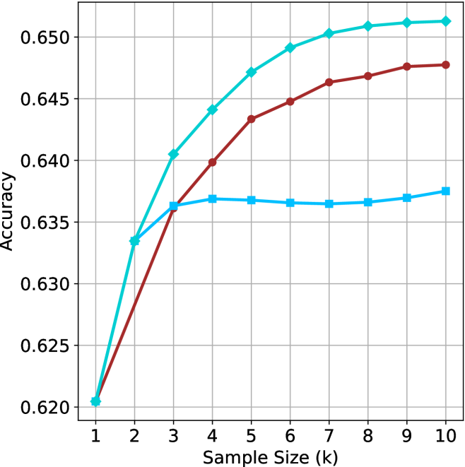
## Line Chart: Accuracy vs. Sample Size (k)
### Overview
The image displays a line chart plotting "Accuracy" on the vertical Y-axis against "Sample Size (k)" on the horizontal X-axis. The chart compares the performance of three distinct data series, represented by lines of different colors and markers, as the sample size increases from 1 to 10 (in thousands, denoted by 'k'). The overall trend for all series is an increase in accuracy with sample size, though the rate of improvement and final plateau differ significantly.
### Components/Axes
* **Chart Type:** Line chart with markers.
* **X-Axis:**
* **Label:** "Sample Size (k)"
* **Scale:** Linear, from 1 to 10.
* **Tick Marks:** Integers 1 through 10.
* **Y-Axis:**
* **Label:** "Accuracy"
* **Scale:** Linear, from 0.620 to 0.650.
* **Tick Marks:** 0.620, 0.625, 0.630, 0.635, 0.640, 0.645, 0.650.
* **Grid:** A light gray grid is present, with vertical lines at each integer X-value and horizontal lines at each 0.005 Y-interval.
* **Legend:** **No explicit legend is present in the image.** The three series are distinguished solely by line color and marker shape.
* **Data Series (Identified by Color and Marker):**
1. **Cyan Line with Diamond Markers:** The top-performing series.
2. **Red (Maroon) Line with Circle Markers:** The middle-performing series.
3. **Blue Line with Square Markers:** The lowest-performing series after the initial rise.
### Detailed Analysis
**Trend Verification & Data Point Extraction (Approximate Values):**
* **Cyan Line (Diamond Markers):**
* **Trend:** Shows a strong, steady logarithmic growth. It rises sharply from k=1 to k=5, then the rate of increase slows, approaching a plateau near the top of the chart.
* **Data Points (k, Accuracy):**
* (1, ~0.620)
* (2, ~0.633)
* (3, ~0.640)
* (4, ~0.644)
* (5, ~0.647)
* (6, ~0.649)
* (7, ~0.650)
* (8, ~0.651)
* (9, ~0.651)
* (10, ~0.651)
* **Red Line (Circle Markers):**
* **Trend:** Shows steady, near-linear growth that begins to taper off after k=6. It consistently performs below the cyan line but above the blue line after k=3.
* **Data Points (k, Accuracy):**
* (1, ~0.620)
* (2, ~0.627)
* (3, ~0.636)
* (4, ~0.640)
* (5, ~0.643)
* (6, ~0.645)
* (7, ~0.646)
* (8, ~0.647)
* (9, ~0.648)
* (10, ~0.648)
* **Blue Line (Square Markers):**
* **Trend:** Exhibits a rapid initial increase from k=1 to k=3, after which it plateaus abruptly. From k=3 to k=10, its accuracy remains nearly constant, showing minimal improvement with additional samples.
* **Data Points (k, Accuracy):**
* (1, ~0.620)
* (2, ~0.634)
* (3, ~0.636)
* (4, ~0.637)
* (5, ~0.637)
* (6, ~0.6365)
* (7, ~0.6365)
* (8, ~0.6365)
* (9, ~0.637)
* (10, ~0.6375)
### Key Observations
1. **Common Starting Point:** All three models/series begin at approximately the same accuracy (~0.620) when the sample size is minimal (k=1).
2. **Divergent Growth Paths:** The performance diverges immediately after k=1. The cyan series shows the most efficient learning curve, the red series shows moderate learning, and the blue series learns quickly but then stops improving.
3. **Plateau Points:** The blue series plateaus very early (around k=3). The red series begins to plateau after k=6. The cyan series shows signs of plateauing after k=7 but continues a very slight upward trend.
4. **Final Performance Hierarchy:** At the maximum sample size shown (k=10), the clear performance order is: Cyan (~0.651) > Red (~0.648) > Blue (~0.6375). The gap between the best (cyan) and worst (blue) is approximately 0.0135 in accuracy.
### Interpretation
This chart likely compares the sample efficiency of three different machine learning models, algorithms, or training strategies. The data suggests:
* **The "Cyan" method** is the most robust and scalable. It continues to effectively leverage additional data across the entire range tested, making it the best choice if large datasets are available.
* **The "Red" method** is a solid, consistent performer that benefits from more data but with diminishing returns. It may represent a good balance between complexity and performance.
* **The "Blue" method** appears to have a low capacity or hits a fundamental performance ceiling very quickly. Adding more data beyond a small threshold (k≈3) provides negligible benefit. This could indicate a simpler model, one prone to early overfitting, or one that is not designed to scale with data volume.
The **Peircean investigative** reading reveals a story of **divergent potential**. Starting from an identical point of ignorance (low accuracy at k=1), the three entities reveal their inherent capabilities through their interaction with experience (increasing data). The cyan entity demonstrates a high capacity for growth and adaptation, the red entity shows steady but limited growth, and the blue entity reveals a fixed, limited nature. The chart is a visual testament to the principle that initial conditions do not determine final outcomes; the underlying architecture or strategy does.