## Line Chart: Accuracy vs. Sample Size
### Overview
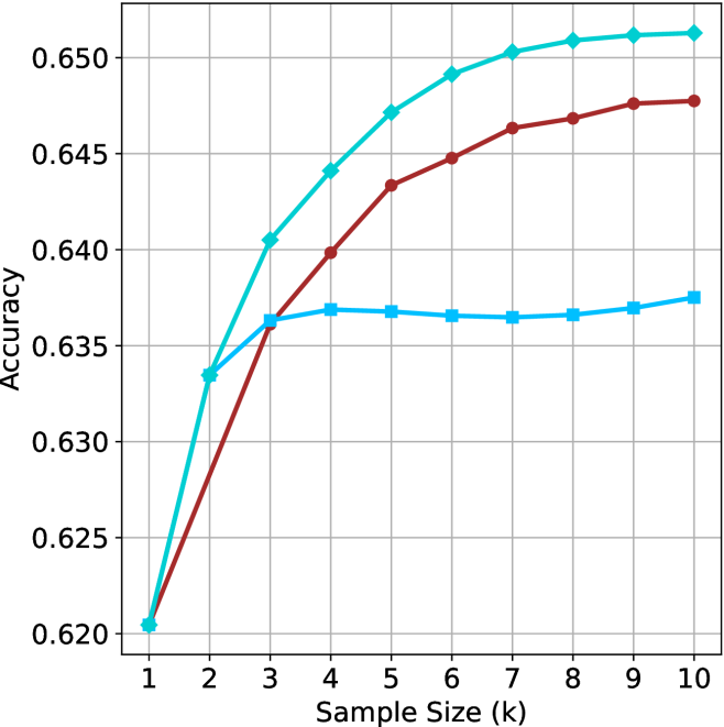
This image is a line chart illustrating the performance (Accuracy) of three distinct data series as a function of "Sample Size (k)." The chart tracks performance from a sample size of 1 to 10. There are three distinct lines plotted, each using a different color and marker shape. **Note: The chart lacks a legend, making it impossible to identify what specific models or methods the three lines represent.**
### Components/Axes
* **X-Axis:** Labeled "Sample Size (k)". The scale is linear, ranging from 1 to 10, with integer tick marks.
* **Y-Axis:** Labeled "Accuracy". The scale ranges from 0.620 to 0.650, with grid lines at intervals of 0.005.
* **Grid:** A standard rectangular grid is present, with vertical lines at each integer on the X-axis and horizontal lines at each labeled increment on the Y-axis.
* **Data Series (identified by visual characteristics):**
* **Series A (Top):** Teal/Cyan line with diamond markers.
* **Series B (Middle):** Dark Red/Maroon line with circle markers.
* **Series C (Bottom):** Light Blue line with square markers.
### Detailed Analysis
All three series originate from the same starting point at Sample Size 1, with an accuracy of approximately 0.6205.
#### Series A (Teal/Cyan, Diamond markers)
* **Trend:** This series exhibits the strongest upward trajectory. It rises steeply from k=1 to k=4, then continues to rise at a slower, tapering rate, suggesting diminishing returns as the sample size increases.
* **Data Points (Approximate):**
* k=1: 0.6205
* k=2: 0.6335
* k=3: 0.6405
* k=4: 0.6440
* k=5: 0.6470
* k=6: 0.6490
* k=7: 0.6502
* k=8: 0.6508
* k=9: 0.6511
* k=10: 0.6512
#### Series B (Dark Red/Maroon, Circle markers)
* **Trend:** This series shows a consistent, steady upward slope throughout the entire range. It does not exhibit the sharp plateau seen in Series C, nor the rapid initial acceleration of Series A. It crosses Series C at approximately k=3.
* **Data Points (Approximate):**
* k=1: 0.6205
* k=2: 0.6275
* k=3: 0.6360
* k=4: 0.6398
* k=5: 0.6433
* k=6: 0.6447
* k=7: 0.6463
* k=8: 0.6468
* k=9: 0.6475
* k=10: 0.6477
#### Series C (Light Blue, Square markers)
* **Trend:** This series shows a sharp increase from k=1 to k=3, after which it hits a distinct plateau. From k=3 to k=10, the accuracy remains relatively stagnant, fluctuating only slightly within a very narrow range (approx. 0.636 to 0.637).
* **Data Points (Approximate):**
* k=1: 0.6205
* k=2: 0.6335
* k=3: 0.6363
* k=4: 0.6368
* k=5: 0.6367
* k=6: 0.6365
* k=7: 0.6364
* k=8: 0.6366
* k=9: 0.6369
* k=10: 0.6375
### Key Observations
* **Common Origin:** All three methods perform identically at the smallest sample size (k=1).
* **Divergence:** The methods diverge significantly after k=2.
* **Performance Ceiling:** Series C (Light Blue) demonstrates a clear "saturation point" or performance ceiling at k=3, suggesting that adding more data beyond this point provides negligible benefit for this specific method.
* **Superiority:** Series A (Teal) is the most effective method across the entire range from k=2 to k=10.
### Interpretation
This chart is characteristic of a machine learning model evaluation, likely comparing different algorithms or architectures under varying data availability constraints (e.g., few-shot learning).
* **Series A** represents a model that benefits significantly from increased data, showing the best scaling behavior.
* **Series C** represents a model that is highly efficient with very small amounts of data (reaching its peak quickly) but lacks the capacity to leverage larger datasets, hitting a hard performance wall.
* **Series B** represents a balanced approach that continues to improve steadily, though it does not reach the peak accuracy of Series A within the observed range.
The absence of a legend is a critical omission, as it prevents the identification of which specific model corresponds to which behavior. Without the legend, the data is descriptive of *trends* but lacks the *context* required to draw conclusions about specific model architectures.